On completing this course in Interactive Systems Design, you should understand:
These notes supplement the briefer bullet points that structure the lecture material (see the Course Index ).
The following two books are also recommended as background:
Introduction and Motivation
Why bother?
This chapter presents some of the motivation for and background to Human Computer interaction (HCI) and Interactive Systems Design, in particular.
We will discuss broad trends in the development of computer applications.
These developments have created the comparatively recent problems associated with mass-market systems.
They have also created many niche markets where the users are specialists in their particular field but have little or no interest in information technology.
Here are a few reasons why we should `bother' about HCI:
- Too often HCI is considered as an afterthought on the development process.
As with most things in large projects, the later you leave it the worse it gets.
- If the interface is wrong then users suffer from high fatigue, stress, irritation, medical problems (backs, wrists, eyes).
Clients suffer from high training costs, fast staff turnover, long learning periods and extented training.
Developers suffer from poor customer reaction, high maintenance costs, penalty clauses and increased development costs.
Glossary
Textbooks on human computer interaction are full of jargon.
Here are a few of the more general terms that you might come across in the rest of this course.
HCI - Human Computer Interaction is concerned with studying and improving the many factors that influence the effectiveness and efficiency of computer use.
It combines techniques from psychology, sociology, physiology, engineering, computer science, linguistics...
Ergonomics is the study of work.
The term is most widely used in the United Kingdom and Europe, in contrast to the United States and the Pacific basin where the term `Human Factors' is more popular (see below).
Ergonomics has traditionally involved the design of the `total working environment'; this includes the height of the chair, table etc.
Health and safety legislation, such as the UK Display Screen Equipment Regulations (1992), is increasingly blurring the distinction between HCI and ergonomics.
In order to design effective user interfaces, we must consider wider working practices.
For instance, the design of a tele-sales system must consider the interaction between the computer application, the telephone equipment and any additional paper documentation.
Human Factors is used to describe the study of user interfaces in their working context.
It addresses the `entire person' and includes:
- physiology, our physical characteristics such as height and reach.
- perception, our ability to sense information, such as hearing loss and visual impairment.
- cognition, the way we process data, such as the information we extract from a display.
It has much in common with ergonomics but often is used to refer to HCI in the context of safety-critical applications.
Physiological problems etc have a greater potential for disaster in these systems.
`Usability' and `ease of use' are often put in quotation marks.
They are too vague to be meaningful.
Do we mean that a system is easy to use for novices or experts?
Do we mean that they have low learning times or lead to few errors?
As a rule of thumb, if you claim a system is easy to use there will always be at least one client or user who will contradict you.
To avoid this, it is useful to back claims with more specific evidence.
This may be increasingly important as the market becomes increasingly discriminating.
Historical Context
The Middle Ages
The early history of computing can be traced back to the narrow aims of mathematicians, logicians and astronomers.
They had particular calculations that needed to be performed.
The Persian astrologer, Al-Kashi (1393-1449) built a device to calculate the conjunction of the planets.
Records of this work survived and were transported to Europe, although the device itself was lost.
The German mathematician, Wilhelm Schickard (1592-1635) developed a much less sophisticated tool to perform simple addition and subtraction.
The Schickard machine was destroyed during the 30 Years War.
Blaise Pascal (1612-1662) was forced to replicate much of Schickard's work but only succeeded in building an even more simplified version of his machine.
There was no gradual improvement in our knowledge over time.
War, famine, plague interrupted the development of mechanical computing devices.
This, combined with the primitive nature of the hardware, meant that user interfaces were almost non-existent.
The systems were used by the people who built them.
There was little of no incentive to improve HCI.
The Eighteenth And Nineteenth Century.
The agricultural and industrial revolutions in Western Europe created the need for external markets and external sources of raw materials.
This greatly increased the level of trade that was already conducted for spices, gold, slaves etc.
This, in turn, led to a rapid expansion in the merchant navies maintained by many countries.
In the past, the captains of these ships relied upon local knowledge and expertise.
They always plied the same route.
As trade developed, this expertise became less important.
Ships were sent to the cargo could, rather than vice versa.
As a result, there was an increasing concern to produce accurate maps and navigation charts.
These involved the calculation of precise distances, longitudes etc.
The demand for navigational aids fuelled the development of computing devices.
Babbage's (1791-1871) early attempts were funded by the Navy Board.
As in previous centuries, the difference engine was designed to calculate a specific function (6th degree polynomials):
a + bN + cN^{2} + dN^{3} + eN^{4} + fN^{5} + gN^{6}
In contrast, however, Babbage's second machine was a more general computer.
This created the problem of how to supply the machine with it's program.
Punched cards were used and became perhaps the first solution to a user interface problem.
The idea was so popular that this style of interaction dominated computer use for the next century.
The Early Twentieth Century.
The economic pressures for trade increased with the rise of mass production techniques on the east coast of the United States.
This also had the effect of drawing migrants from famines in both Ireland and Scandinavia.
The rapid influx of people caused severe problems for the United States government.
They wanted to monitor this flow in order to avoid the introduction of epidemics from particular parts of the world.
They were also concerned to build a profile of the population for tax reasons.
As a result, Herman Hollerith (1860-1929) was recruited by the American census office to develop a computational device to calculate general statistics for the immigrant population.
These arely attempts led to the foundation of the Computer-Tabulating-Recording Company (1911).
This was possibly the first and the biggest computer company.
In 1914, Thomas J. Watson (Snr) joins and builds it into the International Business Machine's Corporation.
IBM provide greater detail on their early history.
The important point here is that economic and political factors were intervening to create a greater market for computing devices.
The term `computer' was originally used to describe the people who manually performed these calculations in the early twentieth century.
In these early machines, the style of interaction was still based around the techniques pioneered in Babbage's analytical engine.
Sequences of instructions were produced on punched cards.
These were entered in batch mode, the jobs were prepared in advance and `interaction' was minimal.
The Mid Twentieth Century.
The Second World War created another set of `narrow' applications for computing devices.
In particular, Alan Turing was employed to break the German encryption techniques.
The Colossus (1943) was perhaps the first truly interactive computer.
The operator could type input through a keyboard and gain output via a teleprinter.
Many of the Colossus techniques were also introduced in the ENIAC machine produced by J.W. Mauchly and J.P. Eckert in the United States.
As with Colossus, the impetus for this work came from the military.
In this case they were interested in ballistic calculations.
To program the machine, you had to physically manipulate 200 plugs and 100-200 relays.
Here is a picture of the Manchester Mark I from about this period (warning: this is a high resolution image and may take some time to download).
By this time, the first machine languages were beginning to appear.
These systems were intended to hide the details of the underlying hardware from programmers.
In previous approaches, you were required to understand the physical machine.
This for the first time created a new class of novice users.
People who wanted to learn how to program but who did not want a detailed understanding of the underlying mechanisms.
Turning Points
1981
Before this point, personal computers were used by enthusiasts.
They were sold in kits and were distributed through magazines and electronic shops.
This meant that their user population consisted almost entirely of experts.
They understood the underlying hardware and software mechanisms because they had built most of it.
Many people thought that they were `toys'.
In the late seventies, this attitude began to change as the demand for their low-end systems began to increase.
In 1981, IBM introduced their first PC together with DOS (Disk Operating System)
.
Little has changed in the underlying architecture of this system since it's introduction.
The relatively low cost and the ease with which small-scale `clusters' could be built (even if they weren't networked) vastly expanded the user population.
A cycle set in, where more people were introduced to computers.
Increasing amounts of work were transferred to these systems and this forced yet more people to use the applications.
As a result, `casual users' began to appear for the first time.
These are people whose work occasionally requires the use of a computer but who spend most of their working life away from a terminal.
This user group found, and still find PC's hard to use.
In particular, the textual language required to operate DOS is perceived to be complex and obscure.
1982
In 1982, XEROX introduced their STAR user interface.
This marks what many people believe as the beginning of HCI as a conscious design activity by software companies.
As a response to the increasing use of PC's by casual users and in office environments, Xerox began to explore more `intuitive' means of presenting the files, directories and devices that were represented by obscure pieces of text in Dos.
Files were represented by icons and were deleted by dragging them over a wastebasket.
Initial attempts to support the `desktop metaphor' pushed graphical facilities and processor speeds to their limit.
The Apple company had been founded by Steve Jobs & Steve Wozniak in 1976.
Initially, they produce a series of kit machines similar to those that led to the IBM PC.
They hit upon the idea of pushing the code needed to represent the desktop into hardware.
Graphics and device handling were burned into ROM (read only memory).
This led to a higher degree of consistency because it became less easy to change the look and feel of the interface.
Apple provide greater detail on their early history.
The Future
The history of computation has seen a number of major themes:
- The first is that the user population is growing.
One way of illustrating this is the number of users on the Internet.
In 1980 there were 100 sites registered, in 1990 there were 100,000 sites, in 1994 the number had reached 100,000,000.
This means that there is now a huge, international market for even relatively specialised products.
Providing that users can actually operate the system...
- The application range is growing.
From very specialised devices for calculating navigational aids and ballistic trajectories we now have general purpose computing devices.
These systems are being applied to a vast range of user tasks.
The problem now is that we are currently very poor at matching the systems we build to the user's needs.
- Degree of expertise is growing.
Users are more discriminating than they once were.
The introduction of graphical presentation facilities has `increased the stakes' in user interface design.
The impact of multimedia and the games industry is such that many text-based user interfaces lack the appeal of more `interactive' systems.
It is now less easy to satisfy many user groups.
All of these trends indicate the user interface design will of critical importance in an increasingly competitive marketplace.
A number of future directions can be predicted for the development of user interfaces:
- Distributed systems.
The development of innovative user interfaces is increasing access to distributed information sources.
People `surfing' the net are no longer just programmers looking for interesting pieces of code.
The old technology of the File Transfer Protocol (FTP) and telnet have been replaced by systems such as Mosaic and its commercial variant Netscape.
Guiness, NASA, Sony are all on the `web'.
(For people in the UK, see Sainsbury's and Tescos).
- Multimedia interfaces.
Text is still the most significant form of interaction with computer systems.
Increasingly, however, we have the problem of integrating it into graphical, video and audio information sources.
The technology is relatively straightforward, the design is not.
- Advanced Operating Systems
Many of the changes described above are being driven by changes in the underlying computer architecture.
Increasing demands are made upon processing resources by graphical and multimedia styles of interaction.
These demands are being met by the introduction of MACH, OS2, WindowsNT etc to replace DOS.
Such operating systems provide facilities for manipulating multimedia documents.
- HCI development environments.
On top of the new generations of operating systems, there are new generations of interface development software.
Many of these environments extend the graphical interaction techniques of the Apple desktop to the construction of the interface itself.
For perhaps the first time, users may be able to customise their working environment.
This creates opportunities but also carries high risks if many different users must all operate the same application at different times.
Without design skills we will lose the opportunities that are being created by this technology.
Many multimedia `titles' have already been abandoned because they do not meet the user requirements.
The remainder of this course will provide you with the user interface design techniques that are needed to make the most of these emerging technologies.
Never Trust Designers' Intuition...
This section isn't intended as an attack on commercial software designers.
Instead, it argues that you should always question designers' intuition about the usability of interactive systems.
There are very few systems whose designers are typical of the user population.
One of the reasons for this is the sheer diversity of many user populations:
- expertise.
The way in which a system is designed, built and sold differs if the intended users are to be `experts' or `novices'.
In the former case, designers must build upon existing skills.
Issues such as consistency with previous interfaces are absolutely critical.
In the latter case, designers must provide a higher level of support.
They must also anticipate some of the learning errors that can arise during interaction.
It is difficult to begin the development process if designers are unaware about such general characteristics of their user population.
- age.
The average age of the user population affects interface design.
Age can affect the amount of expertise that may be assumed.
In many instances, it affects the flexibility and tolerance of the user group.
This does not always mean that younger users will be more flexible.
They are likely to have used a wider range of systems and may have higher expectations.
Age also determines the level of perceptual and cognitive resources that are to be expected from potential users.
By this we mean that our ability to sense (perception) and process (cognition) information declines over time.
Many user interfaces fail to take these factors into account.
This can create particular problems in safety-critical systems where user interface design may be assessed by the Health and Safety Executive.
- disability.
In many European nations, including Sweden and Norway, there is a statutory obligation to provide access for blind users when designing computer systems.
This user population must also be considered when supplying products to the U.S. government.
Section 508 of the US Rehabilitation Amendments Act (1986) applies to all products in government offices, bought or rented.
Such considerations will have a profound impact upon the development of your user interface if these groups are within your target market.
- nationality.
Interface development and documentation are affected by the particular characteristics of their eventual market.
It is important to allow for help facilities in several different languages.
Command languages may have to be changed.
For example, `hit e to exit' may not translate into the target language (`taper s pour sortir'?).
One of the things that emerges from this analysis is that interface designers must understand their user population.
They can only do this if they talk to their marketing department.
Further constraints may be imposed by regulatory authorities and by government directives.
Designing For Novices?
The original idea behind the Apple Macintosh desktop was that novice and casual users should find it relatively easy to learn how to operate the system.
This, as we have seen, was largely a reaction to the problems that people experienced when learning how to use the DOS command language.
Apple chose to exploit a WIMP style of interaction (Windows, Icons, Mice and Pointing devices).
The justification for this is that users do not have the cognitive load of remembering obscure command names.
Instead frequent operations, such as deleting a file, can be done graphically.
Commands are easy to find because they are accessible through menus.
You don't have to remember their names because you can find them by exploiting the options under a menu heading.
Apple also chose to 'grey out' items that were unavailable.
This helps novice users to learn when to use particular commands.
So far, so good.
An inevitable consequence of having a large novice population is, however, that some of them will carry on to become expert users.
This creates problems because WIMPs can be frustrating during frequent use.
The user has to move their hand away from the keyboard.
They have to find the mouse, typically hidden under 20 or 30 paper documents, and pull it over to the appropriate menu etc etc.
In the Macintosh this has led to the use of keyboard accelerators.
By hitting chords (this involves pressing several keys at the same time), users can by-pass the menu structure and directly issue commands from the keyboard.
This saves a lot of time but some of the chords are far more obscure than in DOS, (shift, command, 3, to print the image of my desktop!).
The success of the Macintosh can partly be explained by the support it provides at both ends of the expertise spectrum.
Novices quickly turn into experts if your interface is well-designed.
Designing For Experts?
The UNIX operating system was essentially developed by Thompson and Ritchie for expert users.
Its command line style of interaction supports high-speed interaction without the need for menu exploration.
By making the command language configurable, users can create their own specialised commands.
Such facilities create problems for novice users who must continually re-learn the local dialects created by generations of user-defined scripts.
In the opposite manner to the Apple Macintosh, the success of UNIX as a platform for expert users meant that increasing numbers of people were being expected to learn the system.
Some of these were `novices' in the classic sense.
They were intermittent users who only wanted to exploit programs or results that were generated on UNIX machines.
At the same time, expert users became familiar with some of the advantages that WIMP interfaces provide for particular tasks, such as reading news or composing letters.
In consequence, window managers were developed to provide the graphical environment of the Macintosh and Windows together with the flexibility of the UNIX command language.
The moral of UNIX and the Macintosh is that if your system is successful you will need to support both novices and experts.
When first designing your system, however, you must be aware of the existing level of computer literacy in the target population.
UNIX would not have been appropriate for many of the users who were first introduced to the Macintosh.
Conversely, a WIMP style of interaction would not have been appropriate for the scientific and high-volume data entry tasks that were first supported by UNIX.
Nobody becomes an expert if your interface is poorly designed, they just stop using it.
A Model Of Interaction
Donald Norman is Emeritus Professor at Apple's research laboratories.
One of his most important ideas is that human-computer interaction is based around two gulfs that separate the user from their system.
The Gulf Of Execution
Users approach a system with a set of goals: `print the letter', `send mail to my boss' etc.
At a more detailed level they develop intentions: `I'll send the mail now'.
These intentions have to be broken down into a series of action specifications.
By this we mean the step that the user has to go through to satisfy their intentions: first I'll have to open the mail program then I'll have to edit a new message...
These steps must be performed using the interface facilities provided by the system.
The model would be of little benefit if it didn't provide designers with a framework for understanding why things occasionally `go wrong' in user interfaces.
For example, problems might arise if users have inappropriate goals and intentions: `I'll print out an executable file' or `I'll remove my operating system'.
Other problems can arise through inappropriate action specifications: `First, I'll delete this old file, then I'll see if I can find my really important collection of e-mail addresses'.
Finally, there may be problems with the interface mechanisms themselves.
The bottom line from this analysis is that in order to understand good and effective interface design we must also understand the goals and intentions of our users.
Mistakes, errors and frustration can occur even if we have high-quality interaction mechanisms.
The Gulf Of Evaluation
The second component of the model is the gulf of evaluation.
Once the user has issued a command they must determine whether they have achieved the desired result.
They must do this by observing some change in the state of the display.
For instance, an icon may appear, a dialogue box may be presented or the prompt may return.
Interface designers must not only implement such changes they must also carefully consider whether users will be able to interpret them correctly.
It's no good presenting an icon if nobody knows what it means.
Even if the user can interpret the display correctly, they must then be able to interpret whether their command has been successful.
For example, when I print a document from my PC I occasionally get a message stating `Memory violation during printing'.
I can interpret this as a message about a problem with my print job.
I do not have sufficient information, however, to evaluate this is a serious problem of not without referring to manuals and on-line documentation.
As with the gulf of execution, the gulf of evaluation illustrates the point that usability problems can occur even in systems with well designed displays.
If users cannot interpret and evaluate the information on their screen then issues of presentation and layout are irrelevant.
Different Models
One of the biggest dangers when designing a user interface is to lapse into `introspection'.
Users' tasks are, typically, very different from those anticipated by most designers.
For example, I frequently use the picture drawing tool in my word processing package to produce graphs and tables.
The designer of this system probably never anticipated that someone would use their tool for this purpose.
These different patterns of usage lead to different goals and intentions.
I want to be able to measure angles in my drawing tool so that I can integrate complex graphics in my pie charts.
Why do such irritations occur?
The package includes both a spreadsheet and a graphics application.
I want to be able to use the drawing tools with the graphs from the spreadsheet and vice versa.
My model or idea of the system is as a tool that will help me to complete my task: I want to combine graphs and pictures.
The designers' model of the system was different.
Their view was one in which a distinction existed between drawing a picture in the graphics tool and drawing a chart in the spreadsheet.
It might have been possible to avoid this problem if they had been more aware of my model for an ideal system.
The Designer's System Model
There might seem to be a trivial distinction between the designer's view of a system and the users' model of their interface.
Common sense and previous experience should help development teams to bridge this divide.
Unfortunately, designers are often the last to spot usability problems.
They may be so bound up in the details of implementation that they miss critical details.
Many of the techniques in HCI are intended to avoid such problems.
Questionnaires, prototyping, evaluations are all intended to help designers find out about the user's model of their system.
The User's Mental Model
It is important to emphasise that the users' model of a system will be very different from that of a system designer.
Their view of an application is heavily influenced by their tasks, by their goals and intentions.
For instance, users may be concerned with letters, documents and printers.
They are, typically, less concerned about the disk scheduling algorithms and device drivers that support their system.
Clearly, if a designer continues to thing in terms of engineering abstractions rather than the objects and operations in the users' task then they are unlikely to produce successful interfaces.
The biggest danger in user interface design is to pretend that you are a `typical' user.
Tasks.
The previous model of interaction included the `gulf of execution'.
Users' aims and intentions are satisfied by operating the user interface.
These aims and intentions are derived from their tasks.
A task is a high-level activity that motivates the user to operate their computer system in the first place.
Identifying these tasks is a critical design activity.
Traditionally, research in HCI has been heavily dominated by techniques for task analysis.
Most of these approaches exploit some form of hierarchical structuring:
1. Arrange a meeting:
	1.1. Suggest a date:
	1.2. Book participants:
		1.2.1 Check participants free:
			1.2.1.1 if yes then to 1.3
			1.2.1.2 if no then to 1.1
	1.3 Book room:
		1.3.1 Check room free:
			1.3.1.1 if yes then exit
			1.3.1.2 if no then to 1.1
These structuring techniques do not answer the question of where user tasks come from in the first place.
How can designers actually find out about users' goals and objectives when operating a system?
In the subsequent sections we will review some techniques for requirements elicitation.
These can be used to gain information about tasks prior to the detail development of an interface.
It is important to note that task analysis is like many other design activities.
It is essentially a cyclic process.
The introduction of a computer system will often change the nature of a users' task completely.
At its best, information technology re-distributes tasks between the system and the user.
Therefore, do not rely upon previous questionnaires etc to provide evidence about operator tasks for subsequent generations of user interfaces.
The Marketing Department's Model
There are some fundamental principles in human-computer interaction.
The most important of these is know your user.
Their characteristics help to determine the most appropriate style of user interfaces.
Their tasks must be supported by your system.
It must be possible to map their goals and intentions through your user interfaces.
They must be able to interpret and evaluate the displays that you present.
Having said all that, the second principle of human-computer interaction is know your marketing department.
It takes time to understand your users.
If the marketing department impose tight deadlines then this may be impossible.
The best that you can do is exploit some basic guidelines (we'll discuss these in later sections).
These are rules of thumb or heuristics that have guided the development of successful interfaces in previous systems.
The worst thing that you can do is design the interface as if you were the intended user.
Get other people to try your system as you develop it from initial design to final implementation.
A second reason for communicating with the marketing department is that a successful user interface can drive the commercial exploitation of your products.
The recommendations of a satisfied user population provide important propaganda for continued investment in HCI.
This implies that designers must maintain some contact with their users after software has been delivered.
If these links are not maintained then companies sacrifice valuable opportunities for gathering evidence about future interfaces.
An additional benefit of such after-delivery contacts is that they increase participation in systems development.
Even horrendous displays can be well received providing the operators' feel as though they have a `stake' in the system.
User Centred Design
In the previous talks we identified some important differences between designers and users.
It was argued that the designer's model of an interface may be very different from that of their users.
Engineering concepts, such as bytes or records, must be mapped into user abstractions, files and folders.
It was also argued that designers must appreciate the differences between different groups of users.
In particular, the way in which we design a user interface can be profoundly affected by the distinctions between novices and experts.
In this section we will explain why differences exist between novices and experts.
We will also explore some of the other differences in a user population that must be considered when developing and installing computer systems.
In particular, we will identify the effects that perception, cognition and physiology can have upon human performance.
The discussion will be pitched at a general level to provide a complete overview of the main problems that these differences can cause.
It is important to emphasise that not al of this information will be relevant to all commercial problems.
For instance, the developers of a mass market database system may have little or no control over the workstation layout of their users.
In other contexts, particularly if you are asked to install equipment within your own organisation, these factors are under your personal control.
Once we have identified the key characteristics that distinguish different users we will be well prepared to discuss some of the more concrete ways in which they can be recruited to support the development lifecycle.
The next section will present practical techniques for eliciting the perceptual, cognitive and physiological requirements that constrain many user interfaces.
Perception, Cognition And Physiology
We can characterise user resources into three categories.
Perception: the way that they detect information in their environment.
Cognition: the way that they process that information.
Physiology: the way in which they move and interact with physical objects in their environment.
Perception
Perception involves the use of our senses to detect information.
We have to make sure that people can see or hear displays if they are to use them.
In some environments this causes huge problems.
For instance, most aircraft produce over 15 audible warnings.
It is relatively easy to confuse them under stress.
Background noise can be over 100db.
Although such observations may be worrying for the business traveller, what significance do they have for more general HCI design?
We must ensure that signals are redundant.
If we display critical information by small changes to the screen then many people will not detect the change.
If you rely upon audio signals to inform users about critical events then you exclude deaf consumers.
You may irritate users in large offices and baffle users who have the sound turned down.
It's no use displaying it if people can't see it or hear it in their normal working environment.
Cognition
The study of cognition focuses upon two different phenomena: short and long term memory.
Short term memory has a relatively low capacity.
We'll find out exactly how much in a moment.
It is fast, if we have something on our mind then we can talk about it almost instantly: what do the letter HCI stand for?
If we have to trawl it up from our long term memory it may involve several moments thought: name the seven dwarfs?
Short term memory also has a relatively short retention period.
This is because we actually have to work to keep items in it.
Long term memory, in contrast, has a relatively high capacity.
As its name suggests it can store information over a much longer period of time.
Access is much slower.
Clearly from the previous observations, we should like to design interfaces that make efficient use of short term memory.
Users should only be required to remember a few items of information and they should not be forced to trawl back through dim and distant memories of traing programs in order to operate the system.
An increasingly common trick in user interface design is to support short term memory by representing additional information on the display or on index cards.
This is effectively what a menu does: it provides fast access to a list of commands that do not have to be memories.
In contrast, help facilities are more like long term memory.
We have to load them and trawl through them to find the information that we need.
Do not rely on help facilities to substitute for poor interface design. They can be very irritating, slow to access and rely upon good indexing.
Seven is often regarded as the `magic number' in HCI.
We can see this all around us.
Important information is kept within the seven item boundary.
For instance, postcodes have up to seven components G12 8QT etc.
In some cases, it is necessary to break this rule.
In these circumstances, the information is broken up into components with less than seven items.
In the United Kingdom, phone number are usually divided in this way, (0141) 339 8855.
As a rule of thumb or guideline, never expect the user to hold more than seven items of information at any one time.
It follows that users will have difficulty in remembering the contents of menus with over ten items.
Command languages with many different options will need additional visual cues if operators are to learn them.
Why is is seven the magic number?
It is as easy for users to hold seven words in short term memory as it is for them to hold seven unrelated items.
Additional information can be held but only if users employ techniques such as chunking.
This involves the grouping of information into meaningful sections.
It can also involve the use of mnemonics and acronyms to prompt the user to recall additional detail.
All of this involves work on the user's part.
This can jeopardise the success of a user interface.
As mentioned, it takes effort to hold things in short term memory.
We all experience a sense of relief when it is freed up.
For example, you may have felt this when you finished reciting the remembered items in the previous exercise.
As a result of the strain of maintaining short term memory, users often hurry to finish some tasks.
They want to experience the sense of when they achieve their objective, this is called closure:
This haste can lead to error.
The early cash dispensers suffered from this problem.
Users experienced a sense of closure when they satisfied their objective of withdrawing money.
They then walked away and left their cards in the machine.
As a result cash will now not be dispensed until you take your card.
An important aim for user interface design is to reduce the load on short term memory.
We can do this by recording information `in world' not `in the head'.
This involves the use of prompts on the display and the provision of paper documentation.
Beware, however, it is very easy for users to lose these vital pieces of paper...
People make mistakes if they can't wait to finish using your system.
Knowledge, Rules and Skills
Some people may only have partial information about how to complete a task.
In other words, they may only have formed part of the hierarchy shown on the previous page.
This, typically, is the situation of a novice user.
They will need procedural information about what to do next.
Experts will have well formed task models and may not need this guidance.
It follows, therefore, that for novel tasks designers may have greater flexibility in the way that they implement their interface.
In more established applications, expert users will have well developed task structures and may not adapt so quickly to any changes that you might make.
Up to this point we have been rather vague about the differences that exist between different elements in a user population.
A number of models, such as the one shown opposite, have been developed to provide a more precise explanation.
It shows the differences between the different degrees of information that people might have about an interactive system.
In the worst case, they may only be able to use general knowledge to help them understand the system.
Designers can exploit this to support novice users.
For example, in the Apple desktop inexperienced users can apply their general knowledge in several ways ; `To undelete a file I'll empty the wastebin...'.
This is a dangerous approach, however, if this knowledge fails then users are reduced to making guesses.
The second level of interaction introduces the idea that users exploit rules to guide their use of a system.
This approach is slightly more informed than the use of general knowledge.
For example, users will make inferences based on previous experience.
This implies that, whenever possible, designers should develop systems that are consistent.
Similar operations should be performed in a similar manner.
If this approach is adopted then users can apply the rules learned with one system to help them operate another.
'To print this page, I go to through file menu and select the option labelled Print one'
There are two forms of consistency:
- internal consistency refers to similar operations being performed in a similar manner within an application.
This is easy to achieve if designers have control over the finished product.
- external consistency refers to similar operations being performed in a similar manner between several applications.
This is hard to achieve as it involves the design of systems that the designer may not have an involvement in.
This is the reason why companies such as Apple and IBM publish user interface guidelines.
Operating a user interface by referring to rules learned in other systems can be hard work.
Users have to `work out' when they can apply their expertise.
It also demands a high level of experience with computer applications.
Over time users will acquire the expertise that is required to operate a system.
They will no longer need to think about previous experience with other systems and will become skilled in the use of the system.
This typifies expert use of an application.
Errors
When we operate a system, we gradually move from general knowledge to rules and then to skills.
Users with greater expertise will be able to enter the process at a higher level.
Ideally, we all want to work at the skill level.
We don't want to spend time thinking about use of previous systems or trawling our general knowledge.
The more we work at the knowledge and rule level the more uncertain we are about things.
Users don't want to be forced to make guesses.
They introduce inefficiency and can consume lots of time in `repair' tasks when things go wrong, for instance if we delete a file by accident.
The more we have to think about using the interface the less cognitive and perceptual resources we will have available for our main task.
Physiology
Physiology involves the study of the human anatomy.
It might seem strange to include this in a course on user interface design but it can have a critical impact upon the design of a successful system.
As a minimum requirement users must be able to view the display, reach the input devices etc.
A number of factors may intervene to restrict prevent operators from achieving this:
- paper documentation.
If your manuals are badly designed and produced then users can become extremely irritated within a few seconds of starting with the system.
I know of at least two systems ran into problems with this.
Documentation must not be so bulky that it dominates the users working environment.
It must lie open without breaking the spine.
- other users, cups of coffee etc.
You cannot rely upon system operators to prevent bad things from happening.
Unexpected events in the environment can create the potential for disaster.
There was a US patient monitoring system that relied upon a touch screen until a consultant brushed against it...
It is important to note that interfaces often tend to reflect the assumptions that their designers make about the physiological characteristics of their users.
Buttons are designed so that an `average' user can easily select them with a mouse or a tracker-ball.
Unfortunately, there is no such thing as an average user.
Some users have the physiological capacity to make fine grained selections but other do not.
Increasingly, there is international legislation to improve access through these systems.
Even if systems are unaffected by these issues it is good to remember that workplace pressures, of time and concentration, may reduce the physiological ability of users.
Don't make interface objects so small that they cannot be selected by a user in a hurry, carrying a stack of books.
Don't make disastrous options so easy to select that they can be started by accident
Designers often have relatively little influence on the working environments of their users.
If you are lucky enough to have some power, here are a few guidelines:
- Visual display units.
They should always be within the visual angle of the user.
In other words, even relatively short periods of rotation on the neck can lea to long periods of pain in the shoulders and lower back.
- Keyboards
Prolonged periods of data entry place heavy stress upon the wrist and upper arm.
A large range of low-cost wrist supports are now available.
They are a lot cheaper than the expense of employing and re-training new members of staff.
Current attention focuses upon the problems of RSI - repetitive strain injury and carpal tunnel syndrome.
Frequent breaks can help to reduce the likelihood of these conditions.
- Chairs and office furniture:
It's no good providing a really good user interface if your employees spend most of their time with a chiropractor.
It really is worth investing in well designed chairs.
Lower back support is particularly important.
The Health and Safety Executive produce a number of posters and leaflets on good posture for computer operation.
If you are unconvinced about the importance of this issue ask how many of your staff have suffered or do suffer from back pain.
- Placement of work materials.
Finally, it is important that users are able to operate their system in conjunction with other sources of information and documentation.
Repeated gaze transfers lead to neck and back problems.
Paper and book stands can reduce this.
It also pays to consider the possible sources of distraction in the working environment:
- Noise.
Distraction can be caused by the sounds of other workers (phone calls, beeps); pieces of equipment (fans, printers) etc.
There are a number of low cost solutions, for example you may introduce screens around desks or cover devices such as printers.
Higher cost solutions involve the use of white noise to mask intermittent beeps.
Another technique that is widely employed involves voice mail and help-desk support to reduce telephone noise.
- Light.
There is a difficult problem cause by light distraction.
Its impact can be reduced by blinds and artificial lighting.
This cuts down the level of light in the room.
A side-effect of this is that over-time there may be increased problems of fatigue and drowsiness amongst users.
Many Japanese firms have invested in high-intensity lighting systems to avoid this problem.
Lower cost solutions involve moving furniture or using polarising filters.
A number of regulatory initiatives are affecting the way in which large firms organise the use of computer equipment:
- British Standard 7179 part 4:
On Legibility And Design Of Keyboards.
- European Directive:
Work With Display Screen Equipment.
- Health And Safety
(Display Screen Equipment) Regulations 1992.
Relatively little seems to have been to enforce these regulation but it may be only a matter of time before compensation is claimed for industrial injury in this area.
There are a number of urban myths about the impact of computer systems on human physiology:
- Eyesight.
Computer use does not damage your eyes or eyesight.
It may, however, make you aware of existing defects.
- Epilepsy.
Computer use does not appear to induce epileptic attacks.
Television can trigger some photosensitive epilepsy but VDUs do not seem to have the same effect.
I do not know what the effect of multimedia video systems will be upon this illness.
- Radiation.
The National Radiological Protection Board advises that VDU's do not `significantly' increase the risk of radiation related illnesses.
Previous talks have discussed the differences between designers and users.
We have identified the characteristics that distinguish novices from experts.
We have also discussed the finite perceptual, cognitive and physiological resources that users must deploy during interaction.
Armed with this information, we can now discuss specific techniques for improving the design of human-computer interfaces.
HCI and Software Development
The previous sections have introduced the differences between designers and users.
They have also identified the cognitive, perceptual and physiological limitations that affect interaction with complex systems.
In this talk we will discuss the role of HCI within the software engineering lifecycle.
We will introduce a model of interface development and we will link that to the `classic' stages in project management.
We will then go on to discuss the difference between guidelines and principles.
Finally, we will look at more process based models of HCI design.
In other words, rather than forcing designers to look at a series of rules when designing an interface, as in the guideline approach, you get them to go through a series of activities or processes.
The Software Engineering Life Cycle
The software engineering lifecycle helps to divide development into a number of different stages.
Its usefulness is as a reference model and not as a detailed framework for project management.
In many contexts, it may not be possible to follow all of the stages mentioned in exactly the order presented.
Having said that, it does accurately describe many development projects and can be used to identify different activities during interface design:
- Requirements elicitation.
This involves the identification of the various priorities that different parties will have for new pieces of software.
Engineers must also identify the wider constraints that affect the system.
The first half of this talk will cover the key techniques of interviewing and questionnaires.
- Specification.
This involves the high level representation of a design.
Key techniques include systems analysis and design methodologies as well as formal methods.
The second half of this talk will explore the semi-formal QOC notation.
- Design.
This involves the more detailed selection of particular options from amongst a range of alternative techniques.
The next set of talks will discuss a wide range of dialogue styles that might be used during interface design.
- Implementation.
Building the system to the required standard.
- Testing.
This centres upon the evaluation of a system.
The course will end with practical exercises in evaluation techniques.
- Maintenance.
It is, typically, not enough to deliver a system.
The results of testing may force modifications to an initial system.
This also will be covered in the final stages of the course.
The `classic' software engineering lifecycle does not represent user interface design as a core activity.
It has some role in requirements elicitation and testing.
It is not clear whether the developers of such a model intended HCI to go on alongside systems engineering.
This is the approach adopted by Boeing's concurrent engineering techniques.
Or is it seen as a specialist activity that might occur after the implementation has been developed?
Such unresolved questions have led a number of analysts to develop different models for HCI projects.
It is critically important to decide where `HCI' activities lie in the project structure. If they are relegated to the end of the development process then they are first in the firing line when budgets are cut and deadlines shortened.
The HCI Lifecycle.
One of the problems with the traditional model for software development is that it does not clearly identify a role for HCI at any point in development.
User interface concerns are `mixed in' with wider development activities.
This may result in one of two problems.
Either HCI is ignored or it is relegated to an afterthought during the later stages of design.
In either case, the consequences can be disastrous.
If HCI is ignored then there is a good chance that problems will occur in the testing and maintenance stages.
If HCI is relegated until late in the development cycle then it may prove very expensive to `massage' application functionality into a form that can be readily accessed by the user.
In either case the cost of introducing `usability' issues will rise, the later you postpone it in the development cycle.
Williges and Williges have produced an alternative model of development to rectify the problems in the `classic' model of software engineering.
Here, interface design drives the whole process.
This is the current model being adopted by Apple.
Software engineers are being laid off in favour of more interface consultants.
The argument is that by spotting user requirements early in the development cycle there will be less of a demand for code generation and modification.
Only time will tell if this is a cost-effective strategy.
In the meantime, it is important to understand the various techniques that can be used to support interface development early in the lifecycle of a project.
The following pages describe techniques that can be used to gain requirements for an interactive system `straight from the horses mouth'.
The development of good user interface designs may boil down to an unattractive choice between sacking programmers to hire HCI specialists or investing in existing personnel to train them in interface design techniques.
Mechanisms for HCI in Software Development
It is important to identify the mechanisms or techniques that can be used to introduce HCI into the software development lifecycle.
Since the early 1980's, most commercial organisations have introduced HCI through the use of guidelines.
These are lists of rules about when and where to do things, or not to do things, in an interface.
For instance, a guideline might be not to have more than ten items in a menu.
Another guideline might be to avoid clutter on a graphical user interface.
The problem with guideline is that you need a large number of rules in order to cover all of the possible interface problems that might crop up.
Also, it's difficult to know what to do when you have to break a guideline.
For instance, what do you do if you have a menu of eleven items?
An alternative approach is to develop generic principles.
These provide a more abstract approach than guidelines.
For example, the principle of predictability states that the user should always be able to work out the probable effects of their commands from the information on the screen.
This is more abstract because it doesn't explicitly mention what the system is or what the screen looks like.
The problem with principles is that people often find them difficult to apply.
How do I help the user to predict the effects of their commands?
More recently, companies have been looking at the process of introducing HCI into software development.
In particular, they are concerned to document the steps that they take to elicit the users requirements and to test the system.
This has been largely brought about by the movement to conform with the International Standards Organisations ISO9000 standard.
This sets out approved procedures for software development.
Many software ourchasers now expect their suppliers to be 'ISO9000 conformant'.
Guidelines.
The most famous set of guidelines were developed by Smith and Mosier on behalf of the Mitre Corporation.
Unsurprisingly, these are know as the Smith and Mosier guidelines.
They now include several thousand rules and you really need a hypertext tool to use them.
They have been adapted for use by the US military and by NASA.
An example of one of Smith and Mosier's guidelines is:
1.6.2 DATA ENTRY: Graphics - Drawing
When users must create symmetric graphic elements, provide a means for specifying a reflection (mirror image) of existing elements.
Several companies have also developed their own style guides.
These are similar to the Smith and Mosier guidelines because they simply list do's and dont's for interface design.
They are slightly different from Smith and Mosier because there are commercial motivations behind them, they are not simply intended to enhance the usability of the interface.
Apple's guidelines help you to produce a system that looks and feels like other Apple products.
Microsoft's Window's guidelines help you to produce a system that looks and feels like a Window's products.
The point here is that once your workforce have become accustomed to one style of interface then you will be encouraged to buy other systems that are consistent with the first one.
In other words, you will buy more Microsoft products, more Apple products and so on.
Guidelines and style guides help you to identify good and bad options for your interface.
They also restrict the range of techniqus that you can use and still 'conform' to a particular style.
The Limitations of Guidelines.
Guidelines can be very difficult to apply.
In many ways, they are only really as good as the person who is using them.
This is a critical point because many companies view guidelines as a panacea.
The way to improve an interface is not just to draft a set of rules about how many menu items to use of what colours make good backgrounds.
This course emphasises the point that users' tasks and basic psychological characteristics MUST be taken into account.
Unless you understand these factors then guidelines have no meaning.
For example, the Apple guidelines state that:
``People rely on the standard Macintosh user interface for consistency.
Don't copy other platforms' user interface elements or behaviours in the Macintosh because they may confuce users who aren't familliar with them.''
This simple guidelines glosses over all of the important points about the differences between novices and experts.
Using inconsistent features removes an expert's skills in using the previous system.
Unless the programmer/designer understands such additional justifications then the true importance of the guideline may be lost.
Apple recognise some of the problems in using guidelines whent they state that:
``There are times when the standard user interface doesn't cover the needs of your application.
This is true in the following situations:
you are creating a new feature for which no element or behaviour exists.   In this case you can extend the Macintosh user interface in a prescribed way;
An existing element does almost everything you need it to, but a little modification that improves its function makes the difference to your application...''
The Apple Guidelines, go on to present a number of more generic guidelines, or principles, that can then be used to guide these novel interfaces.
Principles.
Principles provide an alternative approach to guidelines.
The basic idea is that you cannot possible predict all of the problems that arise during interface design.
If you try to do this, you end up with thousands and thousands of guidelines.
Instead, principles focus upon problems that are common to many different systems.
For example, the principle of observability states that the user must be able to observe an effect on the display for all of the input that they enter.
The principle of predictability states that a user should be able to predict the effects of their commands from the information displayed and a minimal knowledge of previous input.
Principles can help to design many different interfaces.
They establish goals for the development team.
In other words, companies can specify that designers should implement predictable and observable systems without specifying the exact means of achieving these objectives.
Principles, therefore, impose less constraints than guidelines.
The problem is that, although principles provide design objectives, they don't help with the details of interface development.
Also, how can one test whether or not an interface is predictable and observable?
Standards.
For the last decade or so, there as been a move to introduce standrads into interface design.
Initially, these focussed upon when and where to use particular pieces of hardware.
For example, Systems Concepts reviewed the British Standard's Institute's standards in this area as follows:
BS EN 29241-1:1993 (ISO 9241) Part 1 General Introduction
The purpose of this standard is to introduce the multi-part standard for the ergonomic
requirements for the use of visual display terminals for office tasks and explain some of the basic
underlying principles. It describes the basis of the user performance approach and gives an
overview of all parts currently published and of the anticipated content of those in preparation. It
then provides some guidance on how to use the standard and describes how conformance to parts
of BS EN 29241 should be reported.
Not exactly gripping stuff.
The problem is that it is difficult for companies to extend this approach to interface design.
As with principles and guidelines, it is impossible to describe exact 'usability' criteria for every interface and all classes of user.
As we have seen, what is good for a novice may not be good for an expert.
As a result of this, a new set of standards are being produced by the International Standrads Organisation.
The main thrust of this work is that companies must follow a set of procedures in order to be acredited.
Requirements elicitation, which we will cover in the next session, is a necessary part of any interface development.
So also is user testing, to be covered at the end of the course.
HCI and Requirements Elicitation
Gathering Information
Requirements elicitation refers to a group of techniques that can be used to establish the objectives for a user interface during the early stages of development.
In particular, it is important to find out who the potential users actually are.
These may be different from the people who are actually paying for the system.
The objectives for these two different groups may also be different.
One may have concerns over their job security.
The other may have concerns over the cost-productivity consequences of the product.
Above all, it is important not to lose the support of your users during the early stages of interface development.
For example, if you start off by asking questions that are simplistic or ill-informed then users may become antagonistic or irritated by someone from outside the organisation, with little knowledge of their tasks, being asked to design a system for them.
Many requirements elicitation techniques are, therefore, intended to gain maximum information about the context of the system without forcing the designer to ask stupid questions.
For example, focus groups and questionnaires can be used to gather initial evidence.
Once the designers has become more famillair with the general application domain, they may then use interviews and more direct techniques to gather detailed requirements.
User interface requirements form part of the more general, software engineering problem of requirements capture.
Here is Steve Easterbrook's NASA course on the wider aspects of requirements engineering - thanks Steve.
Requirements Elicitation Techniques
Interviews
The most obvious and widely practices technique of requirements elicitation for HCI involves the use of interviews.
There are a number of reasons why this approach is so popular:
- Low cost.
Interviews have a low cost in terms of the resources needed to set them up.
It is important to note, as the warning states below, that you should never go into an interview unprepared.
You can quickly antagonise users if you appear either to be too ignorant about their existing systems or too arrogant about your ability to improve their situation.
Never forget that there is a two way information exchange in these meetings.
The subject will gain almost as much information about you as you will about them.
- Flexible.
Interviews can either be conducted with pre-arranged sets of questions or without.
This second approach is useful when interesting issues are thrown up during the course of an analysis.
There is also a danger that interviews become side-tracked by these digressions.
- Participatory.
Perhaps the biggest advantage of interviewing techniques is that they encourage user participation during interface development.
As mentioned in earlies talks, users will forgive a lot if they feel that they have a `stake' in the system.
In order to prepare yourself for an interview you must consider the following issues:
- The purpose of the interview
The first issue to be considered is what information do you expect to obtain from the interview?
Is it a general fact finding mission or do you have specific questions that you need to ask.
If it's the former case then it is important to limit the demands that you make upon particular users.
You may have more detailed questions to ask at a later date.
The more of the user's time that you take up in an undirected information search, the more likely it is that you will antagonise them or that they will patronise you.
- The target group
The second issue is who will you choose to interview?
Clearly, there are strategic individuals in every organisation.
The IT manager, the head of planning or marketing, the section leader or project manager etc.
There are also larger groups: data entry clerks; shop-floor staff etc.
In such situations it is important that you have some criteria for selecting particular individuals.
You may wish to select a `representative sample'; in doing so you have to determine what will guide the selection policy.
Finally, you must consider whether it is better to conduct interviews with individuals or in groups.
Both approaches can be equally successful.
However, this decision cannot be made until you have an accurate assessment of the likely response from your target group.
- The nature of the interview
You must consider whether the interview is to be formal or more relaxed.
This decision can affect the style of questions that you use.
For instance, in an informal setting it may be difficult to complete a long list of pre-determined questions.
- The recording and analysis of the interview
Finally, you must decide how best to record the results of your interviews.
Video and audio tapes are commonly used, in general, it is not a good idea to rely upon your recall or to scribble down notes.
If you do use these recording techniques then be aware that a significant amount of time is required to accurately transcribe taped interviews.
Interviews are best suited to open ended discussions about the nature of existing problems abd future opportunities.
If you are noting down brief answers to simple questions it may well be more cost-effective to rely upon the use of questionnaires.
Interviewing techniques are only effective if you understand the subject's viewpoint. You must understand the pressures in their existing working environment and the forms of prejudice or bias that they might exhibit. DO NOT GO INTO AN INTERVIEW UNPREPARED FOR THESE INFLUENCES.
Rankine Charts.
Group meetings provide a means of avoiding the fact to face confrontations that can arise in personal interviews.
The idea is that you get teams of users to discuss the limitations of their existing systems.
You simply observe their discussion.
Unfortunately, any group of people will contain some individuals who are more vocal than others,
Thos means that you can come out of a requirements elicitation exercise with a very biased opinion of what all of the members of the group thought.
In other words, you only hear the opinions of the most `dominant' people in the group.
These might not be the most significant person for the success of the whole project.
Rankine charts address this problem.
You ask one of the team to draw up a seating plan that shows the names of the participants in the meeting.
Each time someone in the meeting says something, the observer draws a line from the person who made the comment to their intended audience.
At the end of the meeting, the number of lines from each person will give you some idea of their contribution to the discussion.
After the session, you can then use one-to-one interviews to make sure that everyone's views are represented.
An added benefit of this approach is that you don't have to open your mouth until you have some idea of the feelings of the users.
The meeting gives you some introduction to their views.
The draw-back is that it can be difficult to control large meetings and it can also be difficult to get people to talk freely about their attitudes towards a system if an outsider is present.
Questionnaires.
As noted, it is often more cost effective to use questionnaires if you need focussed answers to specific questions.
It is also possible to access the view of a geographically distributed user population in this way.
Questionnaires have an important weakness in that it can be difficult for the designer to judge the amount of effort that users put into the questions.
You should also anticipate a high failure rate for unreturned forms sent to key individuals in an organisation.
Don't be afraid to invest small sums in tricks and incentives.
`Free draws' can generate publicity and interest in design projects.
The major cost and investment with questionnaires occurs after they have been sent out.
You cannot recall them to make minor adjustments or to ask additional questions.
It, therefore, pays to spend a significant amount of time in preparing the forms before they are issued.
It is especially useful to have a trial run.
Here are some issues to consider when putting together a questionnaire:
- Speak the users' language.
Avoid terms or phrases that the subjects will not understand.
The only effective way of doing this is to perform a trial run.
Technical terms, phrases that have been developed within design teams, colloquial terms for specialised operations in a user's task can all cause problems and bias the results of questionnaires.
- Decide on anonymous or open surveys.
Users may often be intimidated by the possibility that their responses can be tracked back to them.
It is often essential to have a declaration of anonymity and a clear description of the intended use of the questionnaire.
Be aware that the process of open questionnaires has clear implications under the Data Protection Act if the name of the user or another unique identifier is stored on-line.
- Select appropriate questions
There are many different styles of questions that can be used.
These range from simple yes/no/don't know responses to open questions.
The former have advantages in that they are easy to analyse, 8 out of 10 owners said their cats preferred it.
The later are more flexible and may be used to expand on short answer questions.
Other styles of question allow users to rank or order their preferences amongst a number of different options.
Beware, these formats can be difficult to analyse and are often inconclusive.
Similarly, subjects may be asked to select their N top choices from a list.
In many instance, this can be simplied to a single choice: do you strongly agree, agree or strongly disagree with the following.
In this case, it is important to understand that the results will tend to cluster around the middle option.
You can't recall a questionnaire once it has been sent out.
Analysing Data For Questionnaires And Interviews
Be aware that the results of questionnaires and interviews have to be collated.
This always takes much longer than you anticipate, especially if you perform large surveys or use video recording techniques.
Delays can occur if you are kept waiting to speak to key personnel or if there are any managerial problems in collecting complete questionnaires.
It is important to remember that the techniques described above are likely to provide `qualitative' rather than `empirical' results.
By this we mean that they will provide an impression of the potential requirements for a user interface.
Finally, it is useful to communicate the results of surveys and interviews back to the people you consulted.
This again helps to keep people informed and builds their `stake' in the final interface.
A further benefit is that they can often help to interpret surprising results.
At the end of the elicitation stage you should have a good idea about user requirements.
The next stage in the development process is to use the findings as a means of informing the more detailed design of a user interface.
Rank Xerox's QOC notation provides one technique for doing this...
Specification And Initial Design
Interviews and questionnaires provide a mixed set of results about user requirements.
They do not tell you how to build and design a system.
In order to do this, designers must select the most appropriate options from a range of different alternatives.
Should we use a graphical style or a textual format?
Should we use colour or greyscale displays?
Design rationale notations, such as Rank Xerox's QOC, help to structure these development decisions.
Questions, Options And Criteria (QOC)
QOC diagrams are built by identifying the key questions that must be addressed during the development of an interactive system.
The options that answer a particular question can then by linked to it.
Finally, the criteria that support those options are linked by either solid or dotted lines.
The solid lines indicate supporting criteria.
The broken lines indicate criteria that count against a particular option.
QOC offers a number of advantages for interface development.
It can be used to represent the many different forms of decisions that have to made during the development life-cycle.
A further advantage is that designers are not forced to learn complex notations, as in SSADM or JSD.
Boeing have successfully used this approach to communicate design decisions amongst the many different members of large development teams.
If you use design notations make sure they can be translated back into a language that the user can understand...
The design of any user interface involves the selection of preferred options from a number of competing alternatives.
The benefits of using QOC are that the diagrams help to explicitly represent these options.
They provide a focus for discussion and can be used in conjunction with interviewing techniques.
Users can be asked to provide additional options or to assess the criteria that act for and against different alternatives.
This helps to increase involvement in the development process.
Perhaps more importantly it helps to make useers aware of the various constraints that effect development.
Favoured criteria may not be selected because of the additional expense, regulatory constraints, installation problems etc.
To summarise, the questions options and criteria notation provides designers with a tool for mapping out the `design space' of a user interface.
The process of identifying key questions and of eliciting the criteria for competing options is essential during the initial stages of development.
The products of this process, the diagrams themselves, are equally valuable for communicating the justifications behind design decisions.
In order to fully explore the `design space' of a user interface, we need to understand the strengths and weakness of different dialogue styles.
We need to be able to make informed judgements about graphical, tabular and textual user interfaces.
The following sections will address this issue.
Text Based Interfaces
Dialogues Styles.
The term `dialogue style' refers to the way in which users provide input and systems present output over time.
Any particular interface is liable to exploit a number of dialogue styles.
For example, menu-based interfaces use textual interaction to supply filename or device options.
Conversely, many textual interfaces exploit graphical interaction techniques in order to support multi-tasking in different windows.
Designers must determine which interaction style is most appropriate in any particular context.
In order to do this, they must assess the users' task requirements (introduced in the second and third talks) using elicitation techniques (described in the fourth talk).
In many cases, designers are constrained in their choice of dialogue style.
You may be specifically commissioned to implement a graphical user interface.
Alternatively, the hardware and presentation facilities provided by a customer may only be capable of supporting text-based interaction.
Within such constraints, however, there is still considerable scope for the use of different interaction techniques.
For example, the predominantly graphical interaction style provided by the Windows program manager still supports command language short-cuts, similar to the Macintosh accelerators mentioned earlier.
Given limited resources, it is important to target such additional support to the most `critical' areas within the interface.
Otherwise, we might end up implementing both textual and graphical styles of interaction for each interfaces.
How To Select A Dialogue Style.
What characteristics must be considered when selecting an appropriate dialogue style?
- the users' tasks.
In the mid to late eighties there was a rush to develop graphical user interfaces to many different applications.
This trend followed on the success of the Windows and Macintosh expansion.
Unfortunately, many of these systems ignored the users' tasks and ended up gathering dust.
There are many situations in which text-based interfaces are more appropriate than graphical or menu-based approaches.
For instance, high-volume data-entry tasks can be especially frustrating if the operators hands have to leave the `home area' of their keyboard to retrieve the mouse.
Conversely, complex data analysis can be extremely difficult without the graphical presentation facilities provided by spreadsheets etc.
Stage 1 in deciding upon a dialogue style is, therefore, to identify the critical tasks that are to be supported.
- the users' characteristics.
The second factor that must influence the choice of dialogue style is the users' level of expertise.
It takes time to learn textual command languages.
As we have seen, menu and graphical based user interfaces provide additional support to short and long term memory and so may be better suited to novice users.
If you can build upon existing skills, principally by making your commands consistent with other applications then textual interfaces are better suited to experts.
Remember, however, that novice become experts as general knowledge and rules become encoded as skills.
Even if you pitch your user interface at a novice's `level' then be prepared for the growth of an expert population.
However, be aware of issues such as staff turnover.
If the flow of people through an office is high then you may still have to support a significant novice population.
- the systems' characteristics.
Design is full of compromises.
I was involved in a theatre booking system that illustrates this.
The intention was to provide travel agents with direct booking facilities using graphical interaction techniques.
They could book by clicking on menus and selecting rows of seats.
The users' loved it until we moved it from our office into their sites.
The slow communications band-width over telephone lines reduced the speed to an unacceptable level at peak times.
They ended up using a text-based command language.
- the available input and output devices.
It is difficult to support audio interaction without speaker and a microphone.
It is often pointless using graphical interaction techniques without a high resolution display.
Textual Input?
In spite of the advancing application of menus and icons, text-based dialogues continue to be the main way in which people interact with computer systems.
Typing speeds are on average must faster than the times that can be achieved for similar operations using click \& point operations.
Direct comparisons are difficult to make.
The main differences in time do not seem simply to arise from the different physiological demands.
Proficient typists on QWERTY keyboards can manage approximately eighty to one hundred words per minute.
The time to pick up a mouse and move it to a specific location depend upon the position of the cursor and the size of the target object.
Instead, they stem from the different ways in which users remember textual command languages and menu based interfaces.
Expert users of graphical systems rely upon the prompts provided by the system, expert command language users will have more of this information available in long term memory.
This enables them to use techniques such as `typeahead', i.e., not waiting for the prompt before issuing additional commands.
Design Aims For Command Languages
The aims of a well-designed text-based command language are:
- consistency - command languages should not be ambiguous.
The meaning of CTRL-U should be the same in each context.
- compactness - the set of different symbols should be as small as possible.
- ease of reading and writing - although names should be meaningful they should not take forever to read and write, for instance copythefirstfileontothesecond.
- speed in learning - the shorter the command the more likely it is to be ambiguous and the longer it will take to learn.
For example, d to delete a word or to move down a line?
- low error frequencies - if users experience high error rates when using the language then you may lose any speed improvements.
The final section will talk about evaluation techniques that can be used to detect this problem.
Programming Textual Interfaces
One of the biggest advantages of text based command languages are their scripting facilities.
Numerous attempts have been made to develop graphical, iconic interfaces to programming languages and most have failed dismally.
It is relatively easy to represent objects in a graphical form, such as files, printers or folders.
It is less easy to devise graphical representations for processes, such as sorting, filtering, deleting.
If you get involved in the development of such applications it is worth while supporting scripting facilities whenever possible.
These techniques provide a flexible way for users to progress from novice to expert levels of skill.
This transition will only take place, however, if the individual components of your language are easily understood.
For example, the following command at one installation was intended to get a printout on unlined paper from an IBM 3800 laser printer:
CP TAG DEV E VTSO.LOCAL 2 OPTCD=J F=3871 X=CG12
Forming Command Languages
The names of individual commands should be combined according to some reasonable set of rules or grammar.
There are a number of set conventions for this:
- simple commands
In simple systems it is possible to associate a unique name with each action in the interface.
For instance, displaying and printing a set of statistics on network loading.
In more complex systems this leads to problems as the number of distinct commands may be very large.
The UNIX vi editor is an example of this.
To keep the number of keystrokes low, each command is associated with a single letter.
In consequence, expert users are required to remember large numbers of letter to command mappings.
- simple command plus object.
A command line consists of an operation followed by one or more objects that are affected by that operation: COPY FILE1 FILE2; PRINT FILE3.
In some circumstances, it may be useful to allow tagged entries.
Novices may find the following useful COPY FROM=FILE1 TO=FILE2.
This cuts down the problems that can arise with order dependence in such commands.
- command plus option and object
In this approach the number of distinct command names may be reduced by using special options to indicate subtle changes in the meaning of the operation.
For instance, PRINT -C3 FILE1 could produce three copies of a file.
This approach is useful because novices may only want the simple commands whilst experts can learn the more `advanced' options.
A danger with this approach is the high number of errors that may occur for infrequently used options.
- hierarchical commands
In this approach, users may type a command and then be presented with a list of further options.
Microsoft`s MS-DOS 5.0 exploited this approach, CREATE would leas you to be prompted for the filename etc.
The problem with this approach is that there are time overheads associated with traversing the hierarchy structure.
Consistency
It is absolutely vital that command languages be consistent.
Users will not be able to transfer their skills from previous systems to operate yours if it is inconsistent with other applications.
For this reason, it is a good idea to find out what systems your users have been exposed to in the past.
Consistency applies at many different levels in a command languages.
The next paragraph will discuss labelling rules.
There is also a need for consistency in the way that a command line is terminated.
A number of systems have had problems with internal inconsistency: Press RETURN to continue, Press ENTER to exit(!) etc.
The formation of the language should also be consistent.
For instance, in one convention command names should always be followed by the objects that they apply to Display file.
This typifies most command languages.
In another convention, commands must always follow objects File Display.
This typifies most graphical user interfaces.
The point here is that both approaches are acceptable providing users are not forced to switch between them at arbitrary moments during interaction.
Naming Rules
As mentioned in earlier sections, it is important that command languages should be easy to read and to write.
In order for a command to be easy to read it must bear some relationship to the action that is to be performed.
Users must be able to decode its meaning.
In order for commands to be easy to write they must be able to perform the reverse encoding.
In a pathological case, it would not be a good idea to re-name the delete command as copy.
A further aim is that command language should be precise and compact.
This involves the use of conventions to truncate or abbreviate command names.
A number of conventions have been proposed and used to shorten command names:
- fixed truncation
shortens to a fixed number of letters DEL, INS, COP, MOV.
- minimum truncation
shortens commands to a variable number of letters: DEL, INS, COPY, MOVE.
- vowel drop
removes all vowels except leading letters DLT, INSRT, CPY, MV.
- phonetics
makes abbreviations sound like the command: X to EXIT, DLT, IN, COP.
- user aliasing
allows users to associate their own names with commands: lc is ls -Laf.
In order for a command language to be successful, there must be some means of gaining feedback during the development process.
The final section will look at evaluation techniques in more detail but it is entirely possible to use interviewing and questionnaire to gain users' opinions about potential input languages.
Textual Output?
All interface designers must be aware of how to develop textual interfaces.
Even if they are primarily involved in the development of graphical systems, they will still have to present some textual information.
Many of the observations about the development of command languages still stand for the presentation of textual information.
It is clearly important that the interface uses terms that the user will recognise.
My Macintosh continues to present error messages of the form Virtual memory error: -23322111f.
This may be useful to me as an engineer but it is extremely irritating as a regular user of the system.
Design Aims For Textual Displays
The aims of a well-designed text-based displays are:
- consistency of layout - users quickly learn where to focus their attention on a display.
If the position of important text is moved then they will have to re-focus their concentration.
This lead to distraction, frustration and error.
- minimal memory load on user - users should not have to remember information from one screen when they move to another.
Again, this results in high error rates and can lead to frustration.
Tasks should be arranged so that completion occurs as soon as possible after the command has been initiated.
This leads to the `cup of tea' problem.
Start doing something, takes so long that we leave for a coffee/tea.
When we arrive back we forget what we were doing.
- input compatibility - users should not be expected to perform complex manipulations between the information presented and the commands that they have to enter into the system.
This is particularly important when people can use cut and paste techniques in windowing systems.
- low error rates - ultimately, users must deploy their finite perceptual resources to read your displays.
If you use bizarre colours and odd looking fonts this may increase the demands that are bing placed on those resources.
This will lead to higher error rates as users miss critical information.
Font Selection
Typography is the term used to describe the style and appearance of printed matter.
More recently, the term has been extended to describe the appearance of text in computer displays.
The style of text is determined by its font.
Fonts describe the shape and formation of each character.
This document is printed in Times Roman.
Other families include Geneva, Helvetic, Schoolbook etc.
Most people are familiar with them from direct manipulation text editors.
Great care is needed when making an appropriate font selection.
There are a number of guidelines to aid this process.
For example, whenever possible use a serif font in running text.
For instance, this Times Roman is a serif font.
In simple terms, serif fonts include curls and additional marks at the ends of each letter.
These are intended to lead the reader's eye along the line.
In contrast, sans-serif (e.g., Geneva) fonts appear plain and stark.
They can effectively be used for headings and bulleted points.
Beware, however, many users find the use of these plain styles to be slightly patronising.
Serif fonts on the other hand often give the impression of `official documents' or newspapers which is where they originated.
Here is a Java Applet that should enable you to select different fonts:
Fonts are stored in one of two ways.
Thy can be stored as bitmap images.
The characters are designed either on paper or by using a font design tool.
They are then scanned or downloaded into a different bitmap for each character.
This has the advantage that relatively little computation is involved in translating a document into the corresponding sequence of bitmaps.
It has the disadvantage that quality is lost as the bitmaps are enlarged to different point sizes (see below).
This occurs because bitmaps are formed from discrete pixel elements.
Any curves will, therefore, appear to be jagged as their size is increased; they show the discontinuity between pixels.
Alternatively, fonts can be stored as a number of mathematical functions.
This has the advantage that quality is preserved as the scale of the character is increased.
The continuous nature of the mathematical functions avoids the 'stair-case' effect that you get when scaling bitmap images.
This has the disadvantage that there is a computational overhead associated with fonts that are transformed in this way.
What this amounts to is that if you use an obscure font on your system, the user may not have the functions in place to provide a high-quality image.
In these circumstances, the display device will typically default to scaling a bitmap with the resulting loss of quality.
The moral is - just because it looks good on your display does not mean that it will on the users...
Point Size
The size of a character is determined by its point size.
A point is defined to be 1/72 of an inch
Clearly some sizes are more effective
than others.
It is important to remember that by altering the point size `in line' you may reduce the benefits provided by the use of serif fonts.
Tasteful Design...
It is usually not a good idea to mix font and point sizes in the same line unless you are trying to achieve a very particular effect.
Typically, changes between these styles are used to indicate some additional information, such as emphasis
.
In order for users to understand the meanings associated with different style changes you should avoid using moire than four different point sizes and more than three fonts in the same document.
This should be regarded as a rule of thumb, there may be instances where more styles are necessary.
In such cases you should conduct some form of evaluation to determine whether your design is having the desired effect.
Layout
Many of the guidelines that have been presented for textual interfaces apply equally to both printed and to computer generated information.
Here are some of the issues that you must consider:
- Logical sequencing
Users should meet items of text in the order that they have to process them.
This implies that a subject's name must appear before their address if that is the convention used in a particular job.
By using elicitation techniques, it may be possible to build up complete sequences for many activities.
This information can be used to determine when sequences of information may bebroken between displays.
Remember, however, that an aim of display design is to reduce the mental load on the user between screens.
- Grouping
Similar items of information should be grouped together.
This related to the previous point that users should not be required to perform prolonged visual searches in order to assemble necessary items of information.
- Spaciousness
Try to avoid clustering information is small areas of the screen.
As can be seen on the opposite slide, the more densely packed a display is, the harder it becomes for users to access the information that they want.
People are relatively good at using spatial cues to index the information that they want.
Packing the display reduces the opportunities to exploit this perceptual resource.
- Simplicity
Above all, displays should be simple.
If they are cluttered, full of bright colours and weird fonts then many users will interpret this complexity as reflecting the complexity of the system.
Too often, designers use presentation resources to impress their colleagues or clients without considering the impact that their decisions will have for prolonged use of the system.
One Scottish electrical distribution company bought an X wall (30 square feet of monitors) for its control room.
The colours and layout were so complex that the users suffered headaches, eye strain etc.
The system was switched off and moved to the visitors center.
Forms
Forms provide a structure for text-based interfaces.
Labels are used to prompt users for appropriate input.
Command line interfaces lack this structure.
Users are often forced to make guesses about possible input sequences.
A further advantage of forms is that they are less constraining than menus.
Rather than selecting an item from a limited range of options, you are free to choose the text that you want to enter in each field.
It would be difficult to provide a menu that lists all of the possible surnames that could be entered into a database.
It is also possible to check for erroneous data in form based interfaces.
In most cases, users will be warned if numeric data was entered in a name field.
It is important to note that forms dominate data entry applications.
These are high-volume interfaces where the speed of data entry is critical.
It is, therefore, extremely important that designers provide an optimal layout.
Tabbing between different entries in a form can be very frustrating.
As with any other dialogue style, optimal designs can only be achieved by closely considering the users' task and not simply by analysing application functionality.
Many companys offer tools that support the creation of form based interfaces.
As a consequence, they are often used in situations where command languages or menus might be more appropriate.
In order to make informed decisions about when and where to use forms, it is important that we understand their strengths and weaknesses.
Here are some advantages of form-based interaction:
- unconstrained values - they are good when a wide range of responses may be provided for a particular field.
- related queries - they are good if many related questions have to be asked about a particular subject.
Interaction progresses by gradually filling in the required information.
This would take a long time in menu-based systems.
Users might easily forget to supply vital input in a command-language interfaces.
- order independence - if users can supply information i a number of different orders then forms can be useful.
People can fill in the values that they are sure about first and gradually fill the form as more information becomes available.
In contrast, here are some weaknesses of this style of interaction:
- keyboards dependent - if keyboards are not available then there is limited scope for the values to be entered.
- relatively few data values - if there are only a few data values then it may be better to use a menu;
- ordered data entry - if the data has to be entered in a particular order then it might be better to use a prompt with a command line to remind users of the sequence.
Design Aims For Form Filling
The design aims for form filling are as follows:
- easy navigation.
It must be easy to move between forms and to move between the fields on those forms.
Most systems use the tab or arrow keys to jump between fields.
There must also be some means of moving back to correct earlier items.
- consistent labelling.
As in text-based interfaces, the naming of fields must be clear to the user.
Instead of different terms, Addr., Address, Employee Domicile stick to the one label throughout the system.
- clear format.
There must be clear space between the fields so that users can distinguish between different items of information.
It should also be clear that certain areas are for input whilst others will be filled in by the system.
- easy correction.
If an unacceptable input is received, for instance a numeral in a name, then error messages should be presented.
These should state as much information about the problem as possible.
User testing is, typically, required to determine whether these warnings can be understood.
Backspace keys and overtyping facilities should be provided to help `repair' any erroneous input.
Some form of completion signal is usually required to indicate that all the data has been successfully processed by the system.
Appearance And Composition.
The appearance of a form can be divided into three components.
The first of these is the field panel.
The field panel prompts the user and provides some indication of appropriate input formats.
In order to enter information, the user must typically select the field that they currently want to edit.
This can be done using tab keys, arrows, mouse selection etc.
The control panel, see below, provides information about this procedure.
Once the field has been selected, the label associated with each entry should provide unambiguous cues about the information that is required.
The naming techniques for each field should follow the guidelines on command naming.
Remember, that users will have to decode this information.
Space is likely to be limited on the display and so it may be necessary to provide additional sources of reference about the data to be entered in each field.
If necessary, help facilities and paper documentation should be provided to reiterate the on-screen prompts.
The form should provide information about the maximum size of input for each field.
It is absolutely vital that you provide feedback if input has been truncated.
Searching for user names on partial strings can be ``a risky business''.
It can be extremely expensive to rebuild systems once a data set is corrupted and invalid entries have been stored.
Such errors can be reduced if the same editing functions are provided throughout all of the forms in a system.
Data fields should be grouped either according to:
- task issues.
For example, the most frequently edited fields might be grouped together at the top of the form.
If they are spread around the display then the user assumes a navigational cost in moving between the various fields.
- common subjects.
For example, address information should appear near to the subjects name and reference details.
If this information is spread about the display then users will have to scan the screen to reassemble necessary details when reading the form.
Within each field, the convention seems to be to use left justification.
This helps to ensure that each input starts in the same column on the screen.
Finally, it is important to leave sufficient space between groups for users to easily identify boundaries between subjects.
The context panel provides users with information about the purpose of a particular form.
It should enable them to identify what they were doing if they have to break their data entry task, for instance in order to answer a 'phone call.
The most common way of doing this is to give each screen a name, reference number may be harder to remember unless they have some special significance.
The title should always be placed in the same position.
As mentioned in previous talks, consistent layout speeds searching tasks and may also help user to distinguish the context information from an ordinary field.
This is an important point because some areas of a form will not be editable.
If a form has been reached as part of a more elaborate dialogue, users must always be able to find out how they reached this point.
One means of doing this is to concatenate the names of the screens that have been visited to reach this point: Account_Details:User_Record:User_Address.
The final component of a form based interface is known as the control panel.
This includes information about how to navigate between and within a form.
Between forms, users must be able to identify means of leaving the current screen.
It is important that there should be some means for the user to exit without saving the information.
This must be sufficiently different from the normal quit procedure that they will never get the two commands confused.
Finally, it is important that users can correct the information that they have entered within particular fields.
Behaviour
The behaviour of forms can be classified as either advanced or simple:
- simple.
This is the conventional form.
Little error checking is performed on the field information.
Users simply select the data item and enter as appropriate.
The user presses a particular button to confirm completion or the system assumes completion when the last item has been entered (this last strategy is dangerous because it does not allow the user time to review the form).
The advantage of this approach is its flexibility.
The user is in control of the data that they enter;
- advanced.
These forms are becoming increasingly common.
Many fields have default values associated with them.
For instance, the postcode of the city in which an office is located or the present date might be entered automatically and only changed as necessary.
These systems also possess strong inference capabilities.
They can use the information from previous fields to automatically calculate the values for other fields.
For instance, the product name might be deduced from its reference number.
These dependent fields can be automatically updated if the other fields change.
The danger with such approaches is that the defaults might be incorrectly left in and that deduced values might be incorrect.
The system has greater control over the form-filling process.
This can provoke a negative reaction in many users.
As mentioned in the introduction, forms are typically used in high volume data entry tasks.
The users of these systems have a difficult and often tedious job.
Staff turn-over is high and interface designers can have a significant impact upon job satisfaction.
This is a classic area where you need user feedback in order to determine whether the layout and behaviour of your interface is sufficient.
In closing the discussion of forms, remember that users should typically get some feedback on the results of their commands within approximately two seconds.
If this does not occur then they may try corrective action: aborting the command; hitting return several times etc.
Menus.
The basic difference between menus and forms is that menus offer the user a more constrained choice from a limited number of options.
You cannot go into MacDonalds and order a Salad Nicoise, you have to pick something from the menu.
This approach offers a number of advantages over command languages.
The use of lists reminds users of their options.
This can help them to direct their activities.
Menus provide prompts that support short and long term memory.
Users do not have to search through recollections of previous interaction to recall possible commands.
Once they have remembered a command they do not have to continually remind themselves to ensure that it will not be forgotten again.
Rather that trying to remember the command to print a file, users simply go to the file menu and browse its entries.
Menus have been widely used in a vast range of applications.
The Prestel and Oracle systems have supported well over 300,000 screens.
This approach is increasingly being used in embedded applications, ranging from televisions to data-line analysers.
They provide good support for novice or intermittent users.
The on-line representation of available commands helps users to view and explore their options during interaction.
They can also be useful for experts if the command set is so large that additional support is required.
In such circumstances, it may not be possible for any individual to remember all of the commands or objects that are available through their interface.
As with form based interfaces, menus have been widely applied and often in areas where text based interaction might have been more appropriate.
For instance, I have frequently been forced to navigate through menus that offer between fifty and one hundred different options.
In order to identify appropriate uses of this dialogue style it is important to review the strengths of menu based interaction:
- contexts where users are semi-skilled.
If users are likely to be unfamiliar with an interace then menus provide a useful way of introducing available commands.
This style of interaction is particularly useful in `walk-up and use' systems that are accessible to the general public.
Similarly, they often provide a good choice for contexts that suffer from high rates of staff turn-over.
- contexts where the system constrains interaction.
Menus are useful in situations of high stress where users are liable to make mistakes in the selection of commands.
For example, input that would cause problems in the operation of an application can be greyed out to indicate that they are unavailable.
- contexts with high keystroke error rates.
Menus provide quick access to commands through mouse selection or the input of abbreviated command sequences, such as numbers to indicate menu options.
This approach is appropriate in cluttered or busy environments where users cannot easily operate a keyboard.
- educational systems.
Menus do not force users to memorise complex rules of syntax and grammar in the same way that command languages do.
Nor do they provide the `daunting' framework and structure that supports form based interaction.
For these reasons, they have been successfully applied in educational software.
The following list introduces some the weaknesses that affect menu-driven interaction:
- time critical tasks.
It can be difficult for users to navigate through several menus under time pressure.
It can be extremely irritating if you cannot find the option that you are looking for.
As the number of items grows it is possible to become `lost' within a menu.
- poor communications links.
If users only have limited communications bandwidth or poor presentation hardware then there may efficiency constraints upon the use of menu based interaction.
There are a number of solutions to this, for instance, handling graphical updates on a local machine.
This necessarily implies that interface requirements are considered during the architectural planning of the application.
- unpredictable environments
Finally, it can be dangerous to provide systems with too much control over the menu options that are available.
It can be both dangerous and frustrating if critical items are `greyed out'.
It must be possible for users to find out the reasons why a command is unavailable, otherwise the design decision may appear to be both arbitrary and unjustified.
Design Aims For Menus
The design aims for menus are as follows:
- clear structure.
In interfaces of any complexity it may be necessary to place menus within menus.
For example, the file menu must be selected to print a file.
This may produce another menu to select the destination printer and so on.
It is important that users understand the relationship between these different structures.
- clear labelling of categories
Menu items are grouped under categories or headings.
If users cannot decode these headings then it will be impossible for them to access the appropriate information.
The labelling of individual items should be organised according to the guidelines already presented for forms and command line interfaces.
- appropriate breadth and depth.
Designers are faced with a trade-off.
They can either make all menu options available from a top-level display.
This increases the breadth of the structure and forces users to remember the location of each individual item within a category.
If they cannot then there may be a significant increase in search times.
Alternatively, items may be grouped within sub-menus that are, in turn accessed from the top level display.
This increases the depth of the structure.
Users can use category information to access these sub-menus and direct their search task.
The problem here is that high navigation costs may be incurred if an entry is not found within a particular sub-sub-sub menu.
- simple selection procedure
There is a heuristic in HCI that states frequent commands should be easily performed, less frequent commands may be correspondingly harder to perform.
It is important that users can easily select the most common options.
However, it should also be the case that potentially destructive options, such as delete or re-format, should involve some confirmation.
Inadvertent selections are a continual problem in menu-driven interfaces.
Appearance And Composition.
The rules that govern the layout and appearance of menus are very similar to those that apply for forms.
We can divide their structure into a control panel, some context and the options.
The guidelines for the options are similar to those that apply to command naming in textual interfaces.
It is important that users can decode the names that are used in order to identify the commands and objects that they represent.
Given finite screen space this may involve the abbreviation mechanisms that have been described earlier: vowel drop; fixed truncation; variable truncation etc.
There is a tendency for designers to abandon the rules that guide the naming of commands elsewhere in the system.
It is much more common to see `Select 1 for insert' in a menu than it is in a textual interface.
This can be justified on the grounds that the prompt is there to remind users of the meaning associated with the number.
However, this leads to a number of problems if multiple menus are used.
The number 1 will have to be re-assigned in each successive structure.
This destroys the user's ability to memorise and exploit the encodings used to label the items in a menu.
The individual items have to be grouped under labels.
If there is only one menu then this is a trivial task.
In more complex systems, it must be possible for users to infer that a particular item is available from a particular menu.
Typically, this is done by placing the operations on an object under a menu that is labelled by the name of that object.
For example, most interfaces have options such as Print, Copy, Open under the FILE menu.
Alternatively, items may be collected under labels that reflect common operations.
Various forms of SEARCH may be found under the same menu.
Just as items may be grouped under common labels, they are also grouped within a menu.
For instance, creation operations such as Open and New are placed together in the File menu.
Again, this supports users' navigation tasks within the menu structure.
Finally, any destructive options, such as Delete should not be placed at the top of a menu.
In mouse driven systems it is relatively simple to `drop-off' the label and select this option by mistake.
As with form based interaction, menus require some context information if novice users are to understand their location in an interface.
Typically, this is done by providing each menu with a name.
In simple examples, this may remain visible throughout the interaction.
In more complex examples, the label that is used to access a sub-menu may remain visible until the user makes their selection.
This approach can be repeated for sub-sub menus Format/Page/Size or Edit/Accounts/Marketing/1996.
As in form based interfaces, a consistent layout should be exploited.
Users must know where to find the title of a menu in case any confusion occurs.
This is likely if similar menu options appear in several different places within an interface.
For instance, Open may refer to a File menu, an Application listing or a Directory.
The control panel provides guidance on operating the menu.
This may simply consist of a prompt (eg $>$ or Enter number:).
Prompts must be unambiguous.
It must be obvious to the user that they do not form part of the menu structure.
Alternatively, control information may be omitted if users have sufficient expertise to understand the selection process.
Behaviour
Menus can behave in a number of different ways.
For instance, they may simply support single selections.
Alternatively, they may provide multiple check boxes where users can pick several of the available options.
For instance, they might decide to check boxes that make a character italic, bold and underlined through the same menu.
If menus have many potential entries then they may be provided with scrolling mechanisms.
For example, my Macintosh contains many different fonts.
It is impossible to display the list on a single screen but I can use a scroll bar to move through them.
This creates significant navigational problems, it is an extremely broad structure.
It is, however, the only option when there is no meaningful way to group the items into sub-menus.
If designers were sufficiently concerned about access times they might have grouped the fonts under alphabetic labels Names A-D, Names E-G...
Finally, it is vital that designers consider the ways in which users can exit from menu structures.
In mouse-driven interfaces this may be done by simply releasing the button when it is outside the menu region.
In text-based interfaces it is usual to provide a Cancel option.
Designers also need to consider how to recover previous menu accesses when users finish their current selection.
Should they be returned to the previous menu?
Should they be returned to a `home' menu?
Graphical & Direct Manipulation Interfaces
This area could be the subject of its own course.
The last few years have seen the effective development of thousands of different styles of graphical user interfaces.
There are also a number of innovative new styles being developed in Japan and the United States.
We will only have time to review some of the major issues in this section but it should provide you with an overview of your design options.
The term graphical user interface refers to any interactive system that uses pictures or images to communicate information.
This is an extremely wide definition.
It includes keyboard-based systems that only use graphics to present data.
It also includes walk-up and use systems where users only interact by selecting portions of a graphical image.
In contrast, the term direct manipulation refers to interfaces with the following characteristics.
- both the objects and actions are visible to the user;
- the actions are rapid, reversible and incremental;
- actions are applied directly to the objects of concern rather than using the complex syntax of a command language interface.
This list was drawn up by Ben Shneiderman, the originator of the term.
It provides a narrower definition than that for graphical user interfaces as a whole.
Many Computer Aided Design and image generation systems use command languages to alter the graphics that are displayed.
It can be argued that these are graphical systems but are not direct manipulation according to Shneiderman's definition.
The distinction between graphical and direct manipulation systems becomes important when we consider their uses.
It is often claimed that graphical displays support novice users.
However, if they are forced to operate the systems through complex command languages, as with CAD applications, then this need not be the case.
In contrast, Shneiderman's previous definition of direct manipulation illustrates the benefits that this style of use is intended to offer for novice users.
Actions are to be visible and hence may be easily accessed.
They are rapid so feedback is quickly obtained about the success or failure of a command.
They are reversible and so it is possible to undo previous mistakes.
Finally, it is important to point out that some systems may be classed as direct manipulation without supporting the general use of graphical images.
For instance, many spreadsheets enable users to directly interact with the objects of interest.
Mice and other pointing devices can be used to select cell.
Operations are visible and incremental.
Values can be dragged and then dropped into their destination.
The following list reviews the strengths of graphical interaction:
- visibility.
Graphical displays can be used to represent complex relationships in data sets that would not, otherwise, have been apparent.
This use of graphics is illustrated by the bar charts and graphs that were introduced in the section on requirements elicitation.
- cross-cultural communication.
It is important that designers exploit the greatest common denominators when developing interaction techniques.
Text-based interfaces have severe limitations in a world market.
Graphical interaction techniques are not so limited.
In particular, ISO standards for common icons provide a graphical `lingua franca'.
For this reason, interfaces are increasingly borrowing symbols and icons from road signs, industrial labelling etc.
- impact and animation.
Graphical images have a greater intuitive appeal than text-based interfaces, especially if they are animated.
The use of such techniques may be beneficial in terms of the quality and quantity of information conveyed.
It may also be beneficial in improving user reaction's to the system itself.
The following list summarises the main weaknesses of graphical user interfaces:
- ``Can't see forest for the trees''.
There is a tendency to clutter graphical displays with a vast array of symbols and colours.
This creates perceptual problems and makes it difficult for users to extract necessary information.
Graphical images should be used with care and discretion if people are to understand the meanings associated with the symbols and pictures, see next point.
- ambiguity
Graphical user interfaces depend upon users being able to associate some semantic information with the image.
In other words, they have to know the meaning of the image.
From our earlier discussion, they have to bridge the gulf of evaluation.
A users' ability to do this is affected by their expertise and the context in which they find the icon.
For example, if you see a circle with two lines through it on a user interface then you would probably not understand it's meaning.
If you saw it on the back of a shirt then you might rightly recognise it as a warning not to put it in a tumble-drier.
- imprecision
There are some contexts in which graphical user interfaces simply cannot convey enough information without textual annotation.
For instance, using the picture of an expanding and shriking bar to represent the changing speed of a car is probably not a good idea when there is an important difference between 60 and 61 miles per hour...
- slow speed
Graphical presentation techniques may not be suitable if there are relatively low-bandwidth communications facilities or low quality presentation devices.
The performance problems need not relate directly to the graphical processing.
Network delays may delay the presentation of results and this violates the rapid criteria for direct manipulation.
Design Aims For Graphics & Direct Manipulation
The design aims for graphical user interfaces are as follows:
- clear semantics.
As mentioned in previous slides, it is vital that users are able to accurately interpret the meanings of graphical symbols.
This does not mean that the images actually have to resemble the objects that the user interacts with.
For instance, the icons used in road signs, the national speedlimit, clearway etc bear little resemblance to their actual purpose.
Where such abstract images are used, users will have to learn to interpret the symbols correctly.
This means that for infrequent users, it may be better to employ icons with a more direct mapping to the objects that they interact with or to sue an alternative dialogue style.
- unambiguous.
If symbols have more than one meaning then it will be difficult for user to interpret them correctly.
It is vital to check that the symbols which designers use do not have anther meaning for the users themselves.
For example, the colour red is used to indicate that something has stopped.
It is also used in electrical engineering to indicate that the circuit is live.
There must be no confusion over the use of this colour, for obvious reasons.
A related point is that designers must be careful not to intentionally overload symbols with many different meanings.
For instance, it is common to see + and - on video recorders.
These are used to move change channels, alter volume, change the time etc depending on the mode that the user is in.
This, typically, leads to lots of confusion for both novice and experienced users.
- `task fit'.
It is important that graphical user interfaces should `fit' with the overall task structure.
In particular, animated images can distract users from other tasks.
It is for this reason that highly interactive graphical displays are not, typically, found in military aircraft.
- natural interaction.
This is similar to the previous point except that it relates more narrowly to input and output mechanisms that the users must exploit.
For example, if the primary means of providing input to the system is textual and the most important information required by the user is textual then there may be few benefits to a graphical style of interaction.
Similarly, it is much more `natural' to use a direct manipulation style to sweep the area of a rectangle rather than issuing a textual command create rectangle 100, 202, 330, 400.
Appearance And Composition.
As mentioned in previous sections, there must be a natural mapping between the images on the display and the objects/operations of the users task.
This is one of the reasons why the desktop metaphor has become so prevalent.
There are dangers, however.
In the Macintosh system, the designers could think of no graphical representation for ejecting the disk.
As a compromise, this is done by dragging the disk icon to the waste-paper basket.
The same operation that is used to delete a file.
Many novice users find this slightly worrying at first; this occurs because the metaphor has had to be broken.
Throwing a disk into a waste-paper basket has a completely different meaning in the desktop than it does in the real-world.
This is an instance where, although it is possible to support the visual metaphor.
The image of the disk looks like a disk.
It is not possible to support the behavioural metaphor.
It is worth noting that there are four different types of commonly used icons in interactive systems:
- those that exactly resemble the intended objects.
These are rare but you do find the use of people's photographs in communications and conferencing systems.
- those that resemble typical objects.
For instance, the Apple trashcan doesn't look like any bin that I've ever owned but I can still recognise it.
- those that symbolise an abstract property.
The up and down arrows do not represent the arrows themselves but are used to indicate motion through a file.
- those that represent an arbitrary sign.
I'm not sure why people designed the do not tumble dry sign to be the way it is...
It may be necessary to provide additional textual labels to support novices.
The more arbitrary and abstract the symbol you use, the more training and explanation must be provided to support the user.
It may be necessary to provide additional textual labels to support novices.
There is some evidence to suggest, however, that once users have learned abstract icons they can search for them rapidly and can remember their meaning for longer than the more pictorial alternatives.
One of the most important guidelines for the composition of graphical displays is that designers should always avoid clutter.
There are a number of reasons for this:
- perceptual loading.
It can be difficult for users to take in and understand the many different objects that are presented on the screen; some may be missed entirely.
- semantic loading.
The more objects that you present on the screen at once, the more meanings users will have to disambiguate.
- searching.
The more objects you present, the harder it is for users to find the ones that they really need.
- manipulation.
The more objects there are on the screen, the smaller the average size of each object will be.
This makes it harder to select and manipulate individual screen components.
Fitt's law relates the time taken to select an object to its size and the distance from the cursor $time = log_{2(0.5+(Distance*2/Size)/10)$.
The increasingly bizarre range of icons in the tool palettes provided by direct manipulation graphics tools provide an illustration of these problems.
Graphical user interfaces perhaps present the greatest challenge to interface designers.
The rage of possible options, even for simple objects, is absolutely vast.
Previous pages have illustrated different approaches to a switch.
Scroll bars present a similar range of options.
There is the standard Macintosh version.
Other types are used in the X window managers etc.
This variety makes graphical interface design a key area for user involvement in the development process.
In many cases, the technical problems in implementing the various techniques are exactly the same.
However, if users are accustomed to one style of interface there must be sound reasons if an alternative technique is to be implemented.
Similarly, with direct manipulations systems it is vital that designers validate their choice of symbols.
Interviewing techniques and questionnaires can be used to find out what the symbols mean for the end-users.
We have emphasised, however, that context plays an important role in determining the meaning of icons.
Symbols in the context of a shirt collar may appear to be straight-forward and obvious.
In the context of a user interface they may seem bizarre and confusing.
The problem here is that in order to provide the necessary context, you may have to go ahead and develop an entirer graphical interface.
Pencil and paper prototypes provide a low-cost alternative to this approach.
As mentioned in previous exercises, this technique uses sketches of potential screen layouts.
These are shown to users who can then provide feedback on the icon design and layout.
If sufficient screens are drawn then designers can use `walk-throughs' by passing potential displays to the user as they select the various commands that are supported by the system.
These techniques can be used in addition to structured interviews to provide a valuable focus for discussion.
Always present alternative options so that users do not simply agree upon the first version that they see.
Beware: there is a danger that users will become so focused upon the prototype that they prefer it to the implementation.
Also, beware that you may not be able to implement the system that you prototype.
Keep the software team `in the loop'.
Finally, it is important to remember that by implementing direct manipulation, graphical user interfaces you may restrict your user group.
Blind users can exploit screen-readers to access textual interfaces.
These systems do not currently work for full direct manipulation systems.
If you use colour, you may make it difficult for users who are colour blind.
As a rule of thumb, colour should be used sparingly and should provide redundant information.
It should alway be possible for users to work out the information it represents from another source.
Behaviour Of Graphical User Interfaces
There are many different ways of interacting with graphical systems.
Often you are restricted to a small subset of these by existing environments.
If you are ever asked to buy a development environment then it's worth using the following checklist to see how many are supported as primitive operations on graphical objects.
It can be costly and time-consuming to implement these by hand:
- selecting.
This involves the picking of one object amongst many.
It is important that selections can be passed through several layers of objects on the screen.
As clutter increases, it becomes more difficult to perform unambiguous selections.
- positioning.
This involves moving objects in relation to other objects or to a fixed point on the screen.
The physical characteristics of input devices can effect this operation.
It is easier to position with a mouse than a tracker ball because of the nature of the feedback received from the hand movements.
It is also important to notice the feedback that the user receives during positioning operations.
Is the object carried by the cursor during the move?
Does a shadow of the object appear under the cursor while the original object remains in place until the selection is released etc?
- quantifying.
Even in graphical interfaces it will be necessary to input exact quantities.
For example, providing exact numeric values for the area of a bar in a graph.
- orienting.
It must be possible to place objects in a variety of orientations to other objects or to arbitrary planes in the display.
For example, placing two lines at right angles to each other.
- specifying.
It must be possible to specify attributes of objects.
For example, even graphical representations of files must have associated access privileges, creation dates etc.
- entering text.
As mentioned, it is rare to have purely graphical user interfaces.
- stretching.
It is possible for users to enter text to stretch the extent of existing objects.
It is more natural, however, to perform this operation graphically
- sketching.
Existing graphics systems can appear to be very poor when compared to free-hand drawing.
Many systems use bitmaps to represent curved lines in terms of individual and unconnected pixels.
The problems are similar to those with bitmapped fonts: images appear crude and curves suffer from the staircasing effect mentioned in the section on textual interfaces.
The second alternative is to represent curves using splines; mathematical functions that describe points in a line.
The problem here is that the functions rely upon control points to sections of the curve.
These points constrain the angles in the line and are extremely unnatural when attempting to sketch an image.
This is why it can be so irritating to draw curves in many of today drawing packages.
Evaluation
Why bother to evaluate?
There are a number of reasons that justify the use of evaluation techniques suring the development of interactive systems.
They provide benefits for many of the parties involved in development:
- designers.
Evaluation techniques enable designers to judge the adequacy of their designs.
It provides evidence that can be used in the marketing of a product and can convince clients that a product meets their needs.
It can also be used to inform the development process.
For example, one means of deciding whether a graphical or a textual interface is best would be to run a trial evaluation on two prototypes.
- clients.
They enable clients to make informed decisions about the software that they pay for,
Evaluation tests can also be set as mile-stones in the development process.
Practical implementations can be signed off as they pass the required stages.
- users.
Evaluation techniques provide users with the opportunity to voice their opinions and preferences.
The aim of the exercise is largely to elicit their views.
A secondary objective is to make them feel part of the development process.
The evaluation of user interfaces is closely linked to requirements elicitation.
Like the techniques introduced earlier in the course it is vital that designers have a clear set of objectives in mind before they start to evaluate an interactive system.
For example, evaluation techniques might be used to find out about:
- the user and their tasks.
For example, evaluation techniques can be used to determine whether systems actually support user tasks in the manner predicted.
Does the interface provide the relevant information when the user needs it?
IS the dialogue style appropriate for the level of expertise and confidence of the user population?
Evaluation techniques can also be used to find out how long it will take users to learn how to operate the system and its interface.
Evaluation techniques can also provide evidence about likely errors and their associated frequencies.
Finally, they can be used in conjunction with questionnaires etc to establish levels of user satisfaction with potential interfaces.
- {the system and interaction devices.
Evaluation techniques can be used to find out if users can successfully operate system hardware.
This includes physical interaction devices but also incorporates processors and disks.
Delays in the refresh rate for graphical systems can cause sever usability problems when moving between machines.
It is for this reason that many interface development companies advocate the use of low end machines for user testing.
Its a common phenomena to find that all is well on the designer's high spec. system but is completely unusable on the typical customer configuration.
- the working environment and supporting documentation.
Finally, evaluations can be carried out in the eventual work-place to determine whether the users' environment will cause any problems.
Often these final stages of analysis are high-cost.
Any changes discovered at this point will be hard to fix.
In many cases, it is easier to document the problem and provide support through training.
The critical point about evaluation is that, like software testing, the longer you leave it, the worse it gets.
If you avoid user contact during the design phase, then a large number of usability problems are liable to emerge when you do eventually deliver it to users.
The design cycle shown in the previous slide uses interface evaluation to drive the development cycle.
This may be a little extreme but it does emphasise the need for sustained contact with target users.
It also illustrates the point that there is little good in evaluating an interface if we are unwilling to change the system as a result of the findings.
By the `system', we do not necessarily mean the interface itself.
The problems that are uncovered during evaluation can be corrected through training and documentation.
Neither of these options are `cost free'.
When To Evaluate
Formative Evaluation
It is possible to stages in the evaluation of user interfaces.
The first is formative because it helps to guide or form the decisions that must be made during the development of an interactive system.
In a sense, the requirements elicitation techniques of previous sections were providing early formative evaluation.
If formative evaluation is to guide development then it must be conducted at regular intervals during the design cycle.
This implies that low cost techniques should be used whenever possible.
Pencil and paper prototypes provide a useful means of achieving this.
Alternatively, there are a range of prototyping tools that can be used to provide feedback on potential screen layouts and dialogue structures.
Formative evaluation can be used to identify the difficulties that arise when users start to operate new systems.
As mentioned, the introduction of new tools can change user tasks.
This means that interface design is essentially an iterative task as designers get closer and closer to the final delivery of the full system.
Summative Evaluation
In contrast to formative evaluation, summative evaluation takes place at the end of the design cycle.
It helps developers and clients to make the final judgements about the finished system.
Whereas formative evaluation tends to be rather exploratory; summative evaluation is often focussed upon one or two major issues.
In this sense, it is like the comparison between general software testing and more specific conformance testing.
In the case of user interfaces designers will be anxious to demonstrate that their systems meets company and international standards as well as the full contractual requirements.
The bottom line for summative evaluation should be to demonstrate that people can actually use the system in their working setting.
This necessarily involves acceptance testing.
If sufficient formative evaluation has been performed then this may be a trivial task.
If not then this becomes a critical stage in development.
A friend of mine had to re-design an automated production system where the night-staff kept reverting to manual control.
As a stop-gap the production manager had to move a camp-bed into the supervisors area to check that the system had not been switched off.
Clearly, such problems indicate wider failings in the development process if they only emerge at the acceptance testing stage.
How To Evaluate
The following pages introduce the main approaches to evaluation.
Scenario-Based Evaluation
One of the biggest issues to be decided upon before using any evaluation techniques is `what do we evaluate'?
Recent interest has focused upon the use of scenarios or sample traces of interaction to drive both the design and evaluation of interactive systems.
This approach forces designers to identify key tasks in the requirements elicitation stage.
As design progresses, these tasks are used to form a case book against which any potential interface is assessed.
Evaluation continues by showing the user what it would be like to complete these standard tests using each of the interfaces.
Typically, they are asked to comment on the proposed design in an informal way.
This can be done by presenting them with sketches or simple mock-ups of the final system.
The benefit of scenarios is that different design options can be evaluated against a common test suite.
Users are then in a good position to provide focussed feedback about the use of the system to perform critical tasks.
Direct comparisons can be made between the alternatives designs.
Scenarios also have the advantage that they help to identify and test hypotheses early in the development cycle.
This technique can be used effectively with pencil and paper prototypes.
The problems with this approach are that it can focus designers' attention upon a small selection of tasks.
Some application functionality may remain untested while users become all to familiar with a small set of examples.
A further limitation is that it is difficult to derive hard empirical data from the use of scenario based techniques.
In order to do this they must be used in conjunction with other approaches such as the more rigorous and formal experimental techniques.
Experimental Techniques
The main difference between the various approaches to interface evaluation is the degree to which designers must constrain the subject's working environment.
In experimental techniques, there is an attempt to introduce the empirical techniques of scientific disciplines.
It is, therefore, important to identify a hypothesis of argument to be tested.
The next step in this approach is to devise an appropriate experimental method.
Typically, this will involve focusing in upon some small portion of the final interface.
Subjects will be asked to perform simple tasks that can be observed over time.
In order to avoid any outside influences, tests will typically be conducted under laboratory conditions; away from telephones, faxes, other operators etc.
The experimenter must not directly interact with the user in case they bias the results.
The intention is to derive some measurable observations that can be analysed using statistical techniques.
In order for this approach to be successful, it usually requires specialist skills in HCI development or experimental psychology.
There are some notable examples that have demonstrated the success of this approach.
For instance, the cockpit instrumentation on Boeing 727s were blamed for numerous crashes.
One of Boeing's employees, Conrad Kraft, conducted a series of laboratory simulations to determine the causes of these problems.
He couldn't do tests on real aircraft and so he used a mixture of low-fidelity cardboard rigs and higher quality prototypes.
In the laboratory he was able to demonstrate that pilots over-estimated their altitude in particular attitudes when flying over dark terrain.
This led to widespread changes in the way that all commercial aircraft support ground proximity warning systems.
Similar approaches have been used to demonstrate that thumb-wheel device reduce error rates in patient monitoring systems when compared to standard input devices such as mice and keyboards.
There are a number of limitations with the experimental approach to evaluation.
For instance, by excluding distractions it is extremely likely that designers will create a false environment.
This means that the results obtained in a lab setting may not be useful during `real-world interaction'.
A related point is that by testing limited hypotheses, it may not be cost effective to perform this `classic' form of interface evaluation.
Designers may miss many more important problems that are not affected by the more constrained issues which they do examine.
Finally, these techniques are not useful if designers only require formative evaluation for half-formed hypotheses.
It is little use attempting to gain measurable results if you are uncertain what it is that you are looking for.
Cooperative evaluation techniques.
Laboratory based evaluation techniques are useful in the final stages of summative evaluation.
They can be used to demonstrate, for instance, that measurably less errors are made with the new system than with the old.
In contrast, cooperative evaluation techniques (sometimes referred to as `think-aloud' evaluation) are particularly useful during the formative stages of design.
They are less clearly hypothesis driven and are an extremely good means of eliciting user feedback on partial implementations.
The approach is extremely simple.
The experimenter sits with the user while they work their way through a series of tasks.
This can occur in the working context or in a quiet room away from the `shop-floor'.
Designers can either use pencil and paper prototyping techniques or may use partial implementations of the final interface.
The experimenter is free to talk to the user as they work on the tasks but it is obviously important that they should not be too much of a distraction.
If the users requires help then the designer should offer it and note down the context in which the problem arose, for further reference.
The main point about this exercise is that the subject should vocalise their thoughts as they work with the system.
This can seem strange at first but users quickly adapt.
It is important that records are kept of these observations, either by keeping notes or by recording the sessions for later analysis.
This low cost technique is exceptionally good for providing rough and ready feedback.
Users feel directly involved in the development process.
This often contrasts with the more experimental approaches where users feel constrained by the rules of testing.
Most designers will already be using elements of this approach in their working practices.
It is important to note, however, that vocalisations are encouraged, recorded and analysed in a rigorous manner.
Cooperative evaluation should not simply be an ad hoc walk-through.
The limitations of cooperative evaluation are that it provides qualitative feedback and not the measurable results of empirical science.
In other words, the process produces opinions and not numbers.
Cooperative evaluation is extremely bad if designers are unaware of the political and other presures that might bias a user's responses.
This is why so much time discussing different attitudes towards development.
Observational techniques.
There has been a sudden increase in interest in this area over the past three or four years.
This has largely been in response to the growing realisation that the laboratory techniques of experimental psychology cannot easily be used to investigate unconstrained use of real-world systems.
In its purest form the observational techniques of ethnomethodology suffer from exactly the opposite problems.
They are so obsessed with the tasks of daily life that it is difficult to establish any hypothesis at all.
Ethnomethodology briefly requires that a neutral observer should enter the users' working lives in an unobtrusive manner.
They should `go in' without any hypotheses and simply record what they see, although the recording process may itself bias results.
The situation is similar to that of sociologists and ethnologists visiting remote tribes in order to observe their customs before they make contact with modern technology.
The benefit of this approach is that it provides lots of useful feedback during an initial requirements analysis.
In complex situations, it may be difficult to form hypotheses about users' tasks until designer shave a clear understanding of the working problems that face their users.
This technique avoids the problems of alienation and irritation that can be created by the unthinking use of interviews and questionnaires.
The problems with this approach are that it requires a considerable amount of skill.
To enter a working context, observe working practices and yet not affect users' tasks seems to be an impossible aim.
At present, there seem to be no more pragmatic approaches to this work in the same way that cooperative evaluation developed from experimental evaluation.
There have, however, been some well-documented successes for this approach.
Lucy Suchman was able to produce important evidence about the design of photocopiers by simply recording the many problems that users had with them.
The Kitchen Sink Approach.
The final evaluation technique can be termed the `kitchen sink approach'.
Here you explicitly recognise that interface design is a major priority for product development.
Resources must be allocated in proportion to this commitment.
Scenarios may be obtained from questionnaire and interviews.
Informal cooperative evaluation techniques might be used for formative analysis, more structured laboratory experiments might be used to perform summative evaluation.

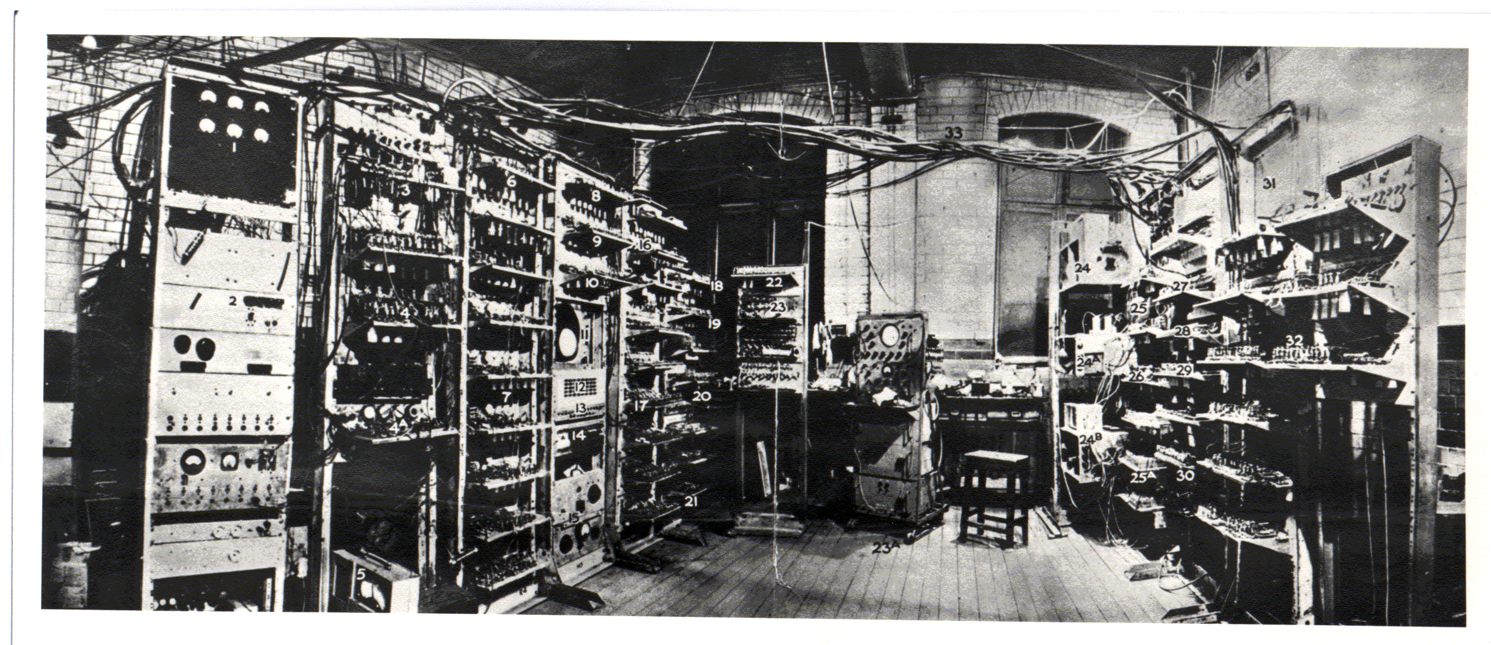