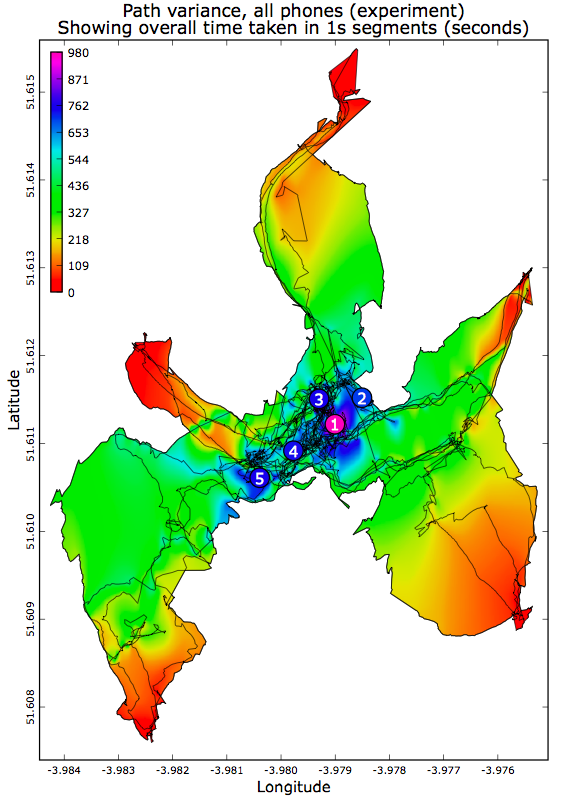
Overlaid filled path plot. The numbers indicate the final meeting point of the respective trial.
Overlaid filled path plot. The numbers indicate the final meeting point of the respective trial.
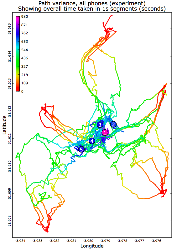
Overlaid path plot. The numbers indicate the final meeting point of the respective trial. Coloring indicates the time at which that part of the path is reached (see key at top left for color-time mapping).
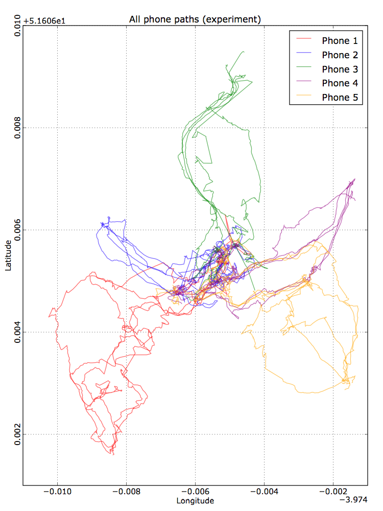
Overlaid paths, colored by participant number.
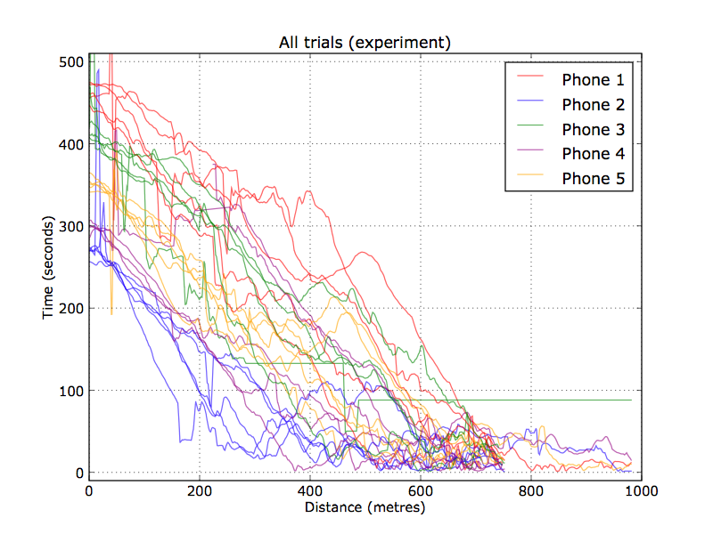
Distance to centroid versus time, coloured by participant. Some particpant starting locations resulted in consistently shorter paths.
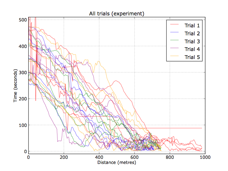
Distance to centroid versus time, coloured by trial number.