A move to Electronic Patient Records in the Community; a qualitative case study of a clinical data collection system, the problems caused by the inattention to humans and human error.
Barbara McManus,
Dept of Computing and Dept of Health Informatics, University of Central Lancashire, Preston, Lancs, PR1 2HE.
Keywords: user interface design, usability, human error, clinicians, IM&T Strategy
Abstract
With the move towards electronic patient records, many UK National Health Service (NHS) Trusts are using computers to make their workforce more clinically effective. This paper examines one such system where clinicians are using hand-held computers to maintain up-to-date records on their clients. The paper, whilst looking at the whole project management aspect to position the case study in a context, concentrates mainly on the usability aspect of the software used. The effectiveness of the system is measured using standard Human Computer Interaction (HCI) concepts. The results are considered leading us to the conclusion that Human-Computer Interaction, and usability in particular, is neither understood nor fully used by commercial software manufacturers. To use Information Technology effectively, industry and the NHS must ensure that real users and HCI experts are included in discussions and planning of future projects.
Background
Within the UK, the NHS has been rather slow in its use of technology. However this attitude has had to change in line with the UK government’s publication of Information Management and Technology (IM&T) strategies (ref. 1 and ref.2). The first IM&T Strategy (ref.1) was produced in 1992 but it was not until the later publication of the new IM&T strategy (ref.2) that clinician orientation rather than the management needs came to the forefront. The system described in this paper, although considered by the designers to be clinician-oriented, when considered from a usability perspective, is certainly not the case.
The software under consideration was written for a National Health Service (NHS) Trust in England. It is a simple data collection system and as such should be very straightforward to use. This is not the case. The designers of the systems have taken no account of the users, the tasks they need to perform or their ability (both physically and technically). As a consequence of these oversights, a simple system has become a very unusable piece of software, causing the user to make far more errors than would have been expected. This paper aims to examine the system, analyse the reasons for these problems and suggest improvements to help reduce the number of errors, thereby improving the data quality and reducing the staff stress levels.
NHS Trust: The location of this project is a National Health Service (NHS) Community Trust in the North of England. It is situated in a new town with a largely urban-based population. It employs around 400 nurses and Professionals Allied to Medicine (PAMs). The clinicians are based in a clinic, but the many visit their clients in the outlying geographical areas. Consequently for many of the clinicians the majority of their work time is spent away from the clinic, making access to client information more difficult.
Some of the clinicians have had exposure to IT mainly in GP practices with DOS (i.e. non Windows) based computer systems, yet many have not. A more detailed analysis of this can be seen in the Users section of this paper. The Trust maintains a small IT department which, when compared with similar sized industries, is rather small.
The Project
Aims & Objectives: Since the government is actively encouraging Trusts to reduce administrative costs and become more clinically effective, this project appeared to be an ideal way to achieve those aims.
With this in mind, Management Consultants were hired to consider the possibility of introducing electronic data capture to replace the paper-based data input method used at present. The main aim of their business case was that of promoting ownership of data by the use of computers by clinicians as well as the reduction of year on year revenue savings.
The Management consultants became aware of staff resistance to collecting data. This was due to the time involved in the data collection together with the perceived lack of direct benefit to the staff. The consultants, after discussions with a small section of the clinician community, produced a report arguing in favour of the use of PDAs (Personal Digital Assistants) by the clinicians to computerise many aspects of the data capture work.
The introduction of IT was intended to motivate the staff to enter accurate data; feel ownership of the information; get something back in return and ensure that the staff became comfortable with using the information. In the final report from the consultants, a range of information needs and reports were highlighted with the main focus being on the improvement of data quality.
The benefits to the Trust: Many benefits were highlighted that would accrue with the introduction of PDAs including:
However the original remit of the project, that led to the production of the report presented by the consultants, bears little resemblance to the software being analysed in this paper. Due to limited resources, a minimal system was developed to computerise a paper-based recording system called FIP dealing with client details and contacts.
A Description of the paper-based FIP: In FIP the clinicians were required to document, on paper, details of all face to face contacts with clients. These sheets were then passed to FIP clerks who entered the data via terminals onto the main computer. But because many clinicians filled in these forms on an irregular basis, the paper-based system was frequently out of date by approximately one month. An additional difficulty for the clinicians was the task of registering a new client. This entailed finding out both personal and medical details relevant to that client in order that another paper-based form could be completed and a unique FIP number could be assigned to the client.
Attempts to improve FIP: The clinicians regularly complained about FIP saying that the data was frequently to be found in various different filing cabinets, forcing them to search for all the relevant pieces of paper before filling in the FIP sheet. Computerising the FIP process was intended to give the clinicians easy access to their client’s details. These details were to be more timely than in the past and the data to be of a higher quality, with the computer data input stage being far easier than on the paper-based entry. However this proved not to be the case.
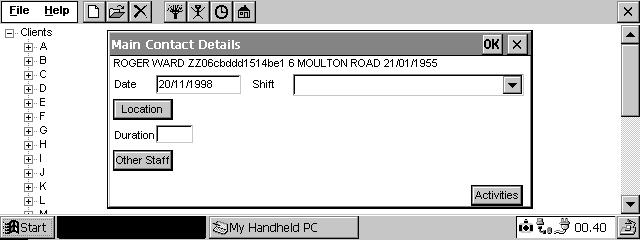
A Description of the computer-based FIP: If the client was on that clinician’s caseload on the PDA, the computerised system allowed the user to enter in and select information to document the face to face contacts with their clients. An example of the screen allowing this to take place can be seen in Figure 1 below.
For ease of viewing, full size versions of all the screens mentioned in this paper are available in the Appendix at the end.
Figure 1 - Entry form for FIP Details
However if the client was not on that clinician’s caseload on their PDA, they had to enter in and select the details that would normally be manually entered onto the paper-based registration. The clinicians frequently did not have access to all the required information and since several of the screens would not allow the user to proceed without certain mandatory fields, the clinicians needed to enter incorrect data simply to be allowed to proceed to the next screen. They then had to remember to return to that client’s record and alter the incorrect data before uploading it to the main computer.
Examples of the four linked screens can be seen below in Figures 2, 3, and 4, with the last screen being a repeat of the Main Contacts Screen, seen in Figure 1. Notice how there is no mechanism for returning to the previous screen when the clinician moved onto the following screen.
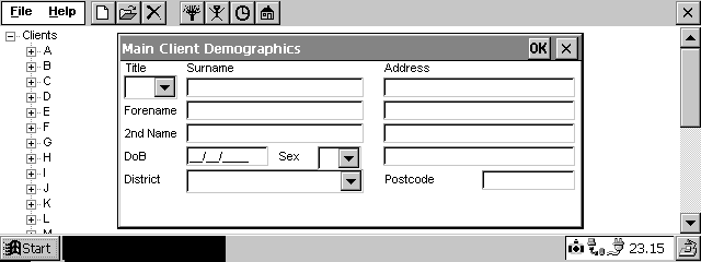
Figure 2 – New Client Registration form
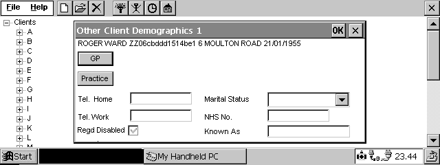
Figure 3 – GP Form generated from Figure 2
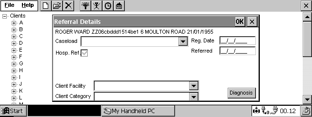
Figure 4 – Referral Form generated from Fig. 3
On a daily basis, the data was ‘uploaded’ to the main computer, with changes made by other clinicians to the clients on that clinician’s PDA, being ‘downloaded’ at the same time. This entailed linking the PDA to a specified (partner) Personal Computer (PC), which took data from the PDA, leaving no record of the Contact data entered, and sent it via a local server through to the main computer.
An initial survey of those clinicians who have ‘gone live’ show that the ‘benefits’ highlighted above are not yet being realised.
Benefit 1 is not yet realised: At present the clinicians are finding that they have less time to spend with their clients rather than more. This is due to human errors which will be highlighted in more detail later.
Benefit 2 is not yet realised: The clinicians do not have access to up to date activity data because the upload removes the contact data from that clinician’s PDA.
Benefit 3 is not yet realised: Data accuracy is not yet high: many of the clinicians are finding it extremely difficult to locate and choose the correct data selection.
Benefit 4 is not yet realised: Although the clinicians now have access to their client’s personal details on the PDA, due to the time delays in the up/down load process, this information could be three days out of date. The information which they would rather have i.e. access to previous Episodes of Care and previous face to face Contacts in this Episode of Care are not available to them on the PDAs
Benefit 5 is not yet realised: The staff morale has not improved, although it could be argued that the Trust will be seen as an up to date organisation due to the perception by outsiders that the clinicians now have ready access to client data. Nevertheless many of the clinicians are very unhappy at the Trust spending so much money on PDAs when they are being told to reduce expenditure on everyday items which they deem to be of far more importance to their job.
Benefit 6 is not yet realised: Feedback from the new users suggests that they are still finding the process rather stressful and have not yet fully accepted it, although the early adopters (i.e. the pilot study teams) are generally accepting and in some cases enjoying using the PDAs. These users are learning to cope with the problems and accept them as part of new technology.
Tendering Process: The project was put out to tender. One software house offered a price which was far lower than any other. This software house had strong associations with the developer of the main Trust system. This allowed them to put in a very competitive quote. The contract was awarded to that software house. It can be seen that an apparently open tendering system is not in reality when there is no open interface with the main system to which the PDAs are to be connected.
Software trials: A limited trial of the software had been carried out with 3 clinicians using the software for a short period of time around June. All of these clinicians were reasonably IT literate, so the software was never tested on complete novices.
Minimising the delays: The project schedule was delayed, the PDAs had already been purchased approximately one year earlier and the software was due. So rather than waste any more time, outside training providers were hired to train the 400 clinicians quickly to enable the project to ‘go live’.
Training process led to the discovery of many problems
The move to analysing the problems: The trainer had a background in HCI so, on being given a copy of the software, realised that the users would experience a large number of difficulties with the software. Having performed a brief Expert Review, the findings were fed back to the NHS Community Trust’s IT Manager who was to forward them to the software house. This did not occur due to other problems appearing.
Pilot Training started: In the meantime, pilot training with the training provider was started on 2 clinics. The first clinic’s training began. during July and the other in September. Both clinics were live by the end of October when the main part of the training started.
During the initial pilot training and the move towards those clinicians going live, many problems came to light which were perceived to be more important than ‘user interface design’ These problems focussed around the area of up/downloading. The chosen mechanism was discovered to be unsuitable and the time taken was far exceeding the agreed benchmark time of ten minutes. The software house devoted their energies to solving these problems. A new up/download mechanism was produced and the up/download time reduced although it was still exceeding the benchmarked time.
Although the highlighted usability areas were ignored, other changes were made to the software but few of these changes improved the usability of the system. In fact many of the changes made the software even harder to use and one change in particular, the linking of 4 screens to register a new client, had a very detrimental effect on the software’s usability. This particular difficulty was noted during user observation and repeated many times by a wide range of users.
Training system different from Live system: The provision of training acted to highlight a range of problems caused by the training system not being identical to the live system. The trainer only saw the training system, training the clinicians on that and assuming that the two systems were the same. It was only after a trained group returned with live data, pointing out the differences, that the trainer was able to reflect these idiosyncrasies in the training material. Furthermore, these idiosyncrasies added to the clinicians’ confusion.
Time taken to up/download was too long: As more and more clinicians went live, it became clear that the benchmark time of ten minutes to up/download the data was still not being met. One of the reasons for this was the fact that the clinicians were not up/downloading every day. Since many of them worked in the community, returning to the clinic to perform the up/download was seen as highly inconvenient. Moreover this meant that when they did up/download, since it was taking more than ten minutes for each day’s data, long queues were forming. Clinicians felt dissatisfaction not only because of the time the up/downloading was taking, but also because they were never consulted on whether ten minutes was a reasonable figure to work to. On questioning some of the clinicians it was quickly discovered that they did not find it an acceptable time scale.
As can be seen already the project had many problems even without considering the users and their (human) limitations. We shall now consider the human aspect of the problem. To analyse the system, more needs to be known about the users, the tasks they perform and the environment in which they work, so it is appropriate to consider those aspects here.
Human limitations
The Users: At the start of the training a questionnaire was issued to assess the user’s ability levels and attitudes. From the 396 who attended the training course, 183 returned the questionnaire. Of these 50 declared that they had used a computer before and were extremely happy using one; 39 had never used one before; the rest had used a computer but were feeling less that competent and confident. From these figures we can surmise that approx. 27% were IT literate being competent and confident using computers. Of the remaining 73%, 21% had never used a computer before with the other 52% having used a computer but feeling incompetent and under confident in some areas of computer use.
There is little evidence that allowance has been made for human limitations since if a user profile had been performed, it would have been obvious that the software as it had been designed would face major acceptability problems.
Mixed Ability users: The users had a wide range of ability levels both technically and generally. IT levels varied from those who had never touched either a computer or a typewriter before through to IT literate individuals. Many of these IT literate users have gained their literacy skills through the use of computer systems within the Trust with a large proportion of these systems being DOS based. As a consequence of this, these users expect the RETURN key to be used for navigating around the form on screen and a function key to be used to save the form away. Since this system was Windows CE based the TAB key could be used for navigation and the RETURN was the equivalent of tapping OK on the screen, enabling the form to be saved away. The novice users did not use the keyboard, but struggled with the use of the stylus on the small touch sensitive screen.
Age Range of Users: The users cover a wide age range from those in their twenties to late fifties, with a large proportion over forty. It is a well-known fact that eyesight starts to fail after forty years of age so the use of such a tiny screen and small font size with no enlargement facility, would cause problems to many users. However, it was the combination of the small font together with the stylus-based touch screen that caused the greatest difficulty to the older users. The small font size meant that there was a limited screen area around which the user could tap to make a selection. Added to this problem was that of the user ensuring that they did not touch elsewhere on the screen or inadvertently rest their hand on the keyboard before touching the screen with the stylus.
Had the designers performed a full user profile perhaps they would not have chosen that type of PDA or would have thought more carefully about the screen design and input method. As Bergman and Johnson (ref. 3) point out ‘All users have a range of capabilities that vary across many dimensions depending on the user and his or her life stage, task and environment. As more of the population approach their middle forties, there are increasing numbers of users peering through their bifocals at the screens.’ (Bergman E, Johnson E, ref. 3) Had the designers observed trial users interacting with the system, and recorded the errors made and inefficiencies exhibited (Fields et al, ref. 4), they may have realised the users’ difficulties and changed the system design accordingly. These should have led the designers to have considered the Microsoft Accessibility guidelines (ref. 5) for disabled users, offering the users the ability to consistently use the keyboard as an input device, a function to enlarge the font size and ensuring that commonly used Windows guidelines were adhered to.
The tasks: The clinicians who provide care in the community carry out a range of jobs associated with their job title. The clinicians include Health Visitors, Community Psychiatric Nurses, Psychologists, Speech Therapists, Physiotherapists together with the auxiliaries (helpers) which most of these clinicians employed. One task that all the clinicians were forced to perform was the completion of a daily FIP sheet. The FIP sheet contained details of all the clients (patients) seen that day: the FIP number unique to that client; the activity(ies) performed on that client; the location of the visit; the time spent with the client. The computerised version can be seen in Figure 1. Additional to this administrative task, many of the clinicians were entering data on various other computers e.g. in the (GP) General Practitioner’s Practice, Hospital etc., while also maintaining paper-based records. And in some cases these consisted of two sets – one set which was left in the client’s home and another more clinically complete set which was left at the clinic.
The designers obviously thought that the fact that this system was ‘tap to select’ would make it easy to use. However it will become obvious that vast improvements could have been made to this system for very little extra programming work.
The varied work environments: Although some clinicians were based in clinics or health centres, for many their job entailed a large amount of travelling to visit clients in their homes; a very limited period of time was spent at their base.
When the clinicians were in the clinics and health centres, they were frequently disturbed by telephone calls making intense concentration very difficult.
Understanding Human Error
Human Error and the design of computer systems tend only to be considered in passing due to the many other aspects of design that must also be considered. The majority of guidelines suggest that errors will be picked up as part of the evaluation phase, which while true does not give sufficient credence to errors and the active act of designing for errors. As Booth (ref. 6) declares, ‘errors that occur at user interfaces are potentially one of the most useful sources of information’. Well-understood human errors can give clues to the user’s incorrect view of the system, pointing to user modelling misunderstandings. One of our worst problems is the need to apportion blame when errors are made. If the search for errors were an active part of the evaluation process we would discover far more about the user’s interpretation of the software being used.
Human error is defined by Barfield (ref. 7) as ‘an error caused in some way by the user of the system’, contrasting this with a system error where there is a physical fault with the system. Tying errors to feedback and user models, he separates them into two groupings: errors of action and errors of intention. He defines an error of action as ‘an error in the translation between a user’s intention and their action and an error of intention as ‘the user doing the wrong thing on purpose’.
Norman (ref. 8) categorises errors into mistakes and slips: a person has an intent to act, if that intention is inappropriate, it is a mistake; if the action was not what was intended, it was a slip. We tend to see that slips occur more with expert users who perform an action almost in automatic mode due to their knowledge of that system or likening it to a similar system. As a result of this, slips tend not to be serious, partly because the expert user has a good enough knowledge of that or other systems. This knowledge endows him/her with confidence, allowing him to try known techniques to solve his problem.
Lewis and Norman (ref. 9) in their section on avoiding false understandings, highlight three areas for consideration:
Since both Norman and Barfield focus on the area of feedback as worthy of further note, we shall consider this with respect to our computerised FIP data collection software. Since feedback is closely related to visibility and consistency we shall use those criteria too.
Feedback
A lack of feedback together with a delayed feedback confuses the user, making them doubt the mental model that they have been building.
Selected data is not echoed to the screen: In Figure 1, tapping the Activity button allows the user to choose from a range of activities, yet when that choice is accepted by the user, it is not echoed back to the screen. The user has self doubts and taps on the button again only to see that he really had made a selection, but that the system had not shown him.
Incorrect feedback: Occasionally a field appears highlighted on screen but the program does not see it as highlighted. This confuses the user’s mental model of the system, since on other occasions when that field was highlighted they were able to perform a function on it. This is also noted in the section below on visibility.
Delayed feedback causes the user to repeat the action: On many of the screens, tapping on a button causes a further screen to appear positioned directly on top of the first screen. The user, on completing the second form taps on OK to save that data. When nothing appears to happen, the user taps on OK again thinking the first tap had not worked. But the feedback to the user had been delayed and the second tap has now been accepted as a valid action. Since the two screens are at the same position on the screen, the second tap is interpreted as tapping on the OK of the first screen. The result is that the first screen is saved too even though the user did not expect that to happen and is now confused and navigationally lost in the system. Using Figure 4 (repeated for ease of reading) to illustrate this.
Figure 4 – Referral Form generated from Fig. 3
When entering Referral details for a new client (Figure 4), the user taps on the Diagnosis button, whereupon Figure 5 below appears directly over the top of the Figure 4 screen. The user then selects and moves the relevant diagnosis to the right hand box and taps on OK. If the feedback is slow and the user taps on OK again, the second tap will activate the OK from Figure 4’s screen and, if the user has entered the mandatory fields, will close down both screens saving away the changes. If the second screen had been offset slightly to the left, not only would this give the user a better navigational view of their position within the system, but it would also mean that tapping twice in the same place would not save and close down both screens.
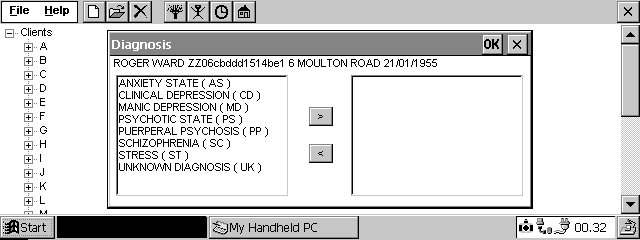
Figure 5 – Screen to select Client’s diagnosis
A further example of delayed feedback can be seen in the live system, where in Figure 1, when the user taps on the Location button, there is no feedback for eleven seconds, when eventually an egg timer icon appears to show the user that something is happening. As a result of this delay, many of the users, having on one occasion tapped twice on the button before seeing any feedback, felt that they had to tap twice on the button to see a response to their action. This is a common confusion in computer systems (Norman, ref. 8).
Visibility
Visibility is used to ensure that the user knows the permitted actions. Along with visibility goes the need to hide what the user does not need to know. Not only does this system hide what is important but it often makes visible what is unimportant and frequently confusing.
Not all highlighted words have been selected: There is often confusing information on the screen. When a user wants to enter a new face to face contact, s/he must tap on the word contact to select that item and then tap on the New icon.

Figure 6 – Directory listing of client’s record
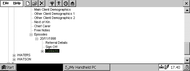
Figure 7 – Contracted Directory Listing
As can be seen in Figures 6 and 7, if the user has the item Contact open and taps on the – sign, closing the Contact, the system highlights the word Contact. The user then, seeing the word highlighted, taps only the New icon causing various things to happen yet none of them being what they expected.
Error messages: Error messages are at best unhelpful and at worst confusing. Many of the error messages read like a programmer’s test statement, as seen in figure 8 below, including data likely to confuse the user.
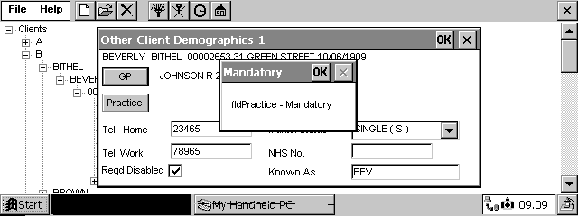
Figure 8 – Example of an error message
The users should not need to know that fld is an abbreviation for field, nor should they need to know what a field is. According to Schneiderman’s Error message guidelines (Schneiderman, ref. 10), the designer should choose user-centred phrasing as well as being constructive, indicating what the user needs to do. What seems obvious to an IT literate individual is not so obvious to a panic-stricken novice.
Contrast problems with the PDA: The PDAs, having been bought approximately two years prior to the clinicians going live, had become outdated and rather inferior. The screen is a monochrome display with a limited contrast range. As a result of this, the user tends to increase the brightness so that they can read what is written on the screen. This can cause difficulties. The user has built up a mental model of the way in which the system works. That mental model tells them that if they wish to close a window down, they must tap on the X at the top right of the window. But as can be seen in figure 7, the X is disabled, yet if the brightness is set high, the X appears to be enabled. On seeing this, the trainer tried to suggest a change to the user’s mental model explaining that the user had to read the message and tap on OK to confirm that s/he has read it. But the first mental model was stronger and the users kept repeating the mistake.
Another example of the software making visible to the user unnecessary information can be seen on launching the system. As is evident in all of the example figures, the user sees the menu bar and the icons across the top of the screen The user need only see three of these pieces of information:
Of the next four icons on the screen, only the first icon is useful to the users.
Therefore of the nine options on the screen, only three are needed by the user, the other six simply adding to the user’s confusion.
Consistency
Guidelines not adhered to: Common Windows guidelines have not been adhered to, that is, double tapping on a field highlights the field, but on numerous occasions does not allow the field to be altered by over-typing. Standard keyboard editing techniques, for example CTRL X to cut, do not work in all fields.
Inconsistently within error messages: Error messages do not conform to a consistent standard either in the format of the message or in the action taken by the program on acknowledgement of the message having been read. At one point in the system, on acknowledging the fact that a field has been omitted, the program takes the user to the screen containing that field in order that the user can correct the error. However this is not always the case. This leaves the user confused by the inconsistency within the system.
Help is consistently unhelpful: The users see a Help option on the menu and select it expecting to see some guidance. They do not since users are not expected to make mistakes. This obviously indicates that the designers considered the software to be so easy to use that no on-line help was needed.
Not all data echoed back in the same way: In figure 1, tapping the activity button allows the user to choose from a range of activities, yet when that choice is accepted by the user, it is not echoed back to the screen. The user doubts himself because tapping on both the Location button and the Other Staff button, echoed his choices back to the screen, yet this one does not. An example of the completed screen is evident below:
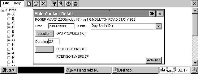
Figure 9 – A completed Main Contacts Screen
Not all data reacts in the same way: A date field, accessed when the rest of the form has been completed, reacts differently when the rest of the form is empty. Anomalies such as these cause even IT literate users a great deal of confusion. This makes error correction very difficult with this system.
Inconsistencies in Error handling: On starting a new Face to Face Contact screen, (see Figure 1) the system automatically generates that day’s date in the date field saving the user time. But if the user erroneously entered that screen and wishes to exit from it, on tapping the X to close down that screen, the following screen appears:
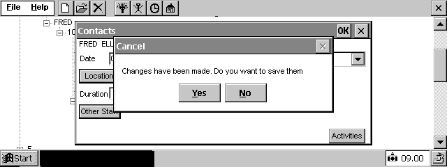
Figure 10 – ‘Changes have been made’ message
The user has not yet entered any data, so is confused at the message which appears on the screen. Its appearance is due to the fact that the programmers automatically generated the data, but did not make an exception of this screen when the user pressed the X to close the screen down with out saving changes.
This screen (figure 10) confuses the user further: If the user selects Yes in answer to the heading ‘Cancel’, s/he would expect the operation to be cancelled. However, what would happen is that the changes made by the user would be saved because the Yes/No choice actually referred to the message ‘Changes have been made. Do you want to save them?’ and not to the heading ‘Cancel’.
The importance of Time
One last area that is worthy of consideration is that of time. Not only were the users, tasks and environment not considered, neither was the time needed to up/download the data onto the main computer nor the time taken to complete those tasks mentioned above.
Selection is not always the best method: It to takes the user nine taps on the screen to reach the form that performed the most frequently used task (entering in face to face contacts). So although it is more often better to select than to type, this system is an example where this is not the case. The metaphor chosen was that of a directory structure, which forces the user to tap their way through the levels before reaching the point at which they can perform their most frequently used task. So as is obvious below, the design has not been considered with respect to the time taken to complete the most commonly performed task.
To consider this in a little more detail, we shall use the FIP sheet screen (figure 1, repeated below for ease of reading) since this is the task most frequently performed by the user.
Figure 1 (repeated)
Date field: To save the user time, the date field is set with that day’s date as its default. But, the technique for selection of that field to alter the date neither adheres to Windows standards nor reacts consistently in the same way at all times. This is mentioned in the consistency section.
Shift field: The majority of the clinicians work only on one shift, so rather than forcing the user to choose one from the three in the list, a default shift tied to that user would save the clinician time.
Location field: The user is offered around three hundred locations to choose from. Had the designers talked to the clinicians they would have found that the majority of clinicians use only five locations. A far better design would have been one offering, at the start of the list, the last five locations used by that user.
Other Staff field: This field, like the location field, offers hundreds of names to choose from yet the majority of the clinicians only perform joint visits with the same clinicians. A facility with, at the start of the staff list, the last five staff chosen by that user would help speed up the selection process.
Activities field: At present, the user is only offered four activities to choose from so there is little chance of them making mistakes in choosing the activities. As mentioned in the feedback and consistency sections, when the user saves these activities away, their choices are not echoed onto the Main Contact Details screen. Since all other choices made in the same way are fed back to the user, there is an expectation that this will also feedback. When it does not, the user thinks they have made a mistake and wastes time tapping the activities button again. The Activity/ies chosen should be echoed back to the Contacts screen. This is important because a later version of the software will be updating the range of activities from four choices to several hundred. If the activity is not echoed back to the Contacts screen, the user will waste even more time revisiting the Activity screen and in particular waiting for all the selections to be ‘loaded in’ and displayed on the screen.
As can be seen by the problems above, the user wastes time and causes more errors than need be the case. The more searching and entering the user must do the higher likelihood there is of them making mistakes.
The above section describes the most frequently accessed part of the system, yet one of the greatest difficulties faced by the user is when a new patient has to be registered.
Any patient, whose details are not on that clinicians hand held computer, has to be entered onto the machine. This entails working through four linked screens (figures 2,3,4 and 1) with no way of backtracking when a mistake is made. This is made more hazardous by the nature of the clinician’s job; they are frequently disturbed by phone calls, appointments etc, all of which interfere with their train of thought. Dropping out of the screens before completion loses all the data previously entered, giving an error message and creating an ‘orphan’ record that the user has no rights to delete. The last of the four screens contains a date that references back to a date on the previous screen. This fails on Don Norman’s suggestions on Designing for Error (Norman, ref. 8). He states that the designers should ‘make it possible to reverse actions or make it harder to do what cannot be reversed’ and ‘make it easier to discover the errors that do occur and make them easier to correct’
Discussion
One could question that if mistakes such as these highlighted above can be made on a small system, it does not augur well for larger more complex systems. Although it could be argued that errors made in this system are not catastrophic, the effect of repeated errors caused the user’s confidence to reduce and their stress levels to rise, causing them to make even more mistakes.
Systems similar to the data collection project discussed above are becoming more common in the NHS with clinicians entering and maintaining their own patients’ records. Both designers of these systems and managers considering the use of systems such as this have much to learn about designing to minimise errors. Human-Computer Interaction has an important place in these systems.
Future Work
The training of the clinicians will soon be completed, allowing for follow-up work to take place. A review meeting has already been organised to feed the usability problems through to the designers and programmers of the system.
The author is becoming aware of similar systems already in place in other NHS Trusts around the UK and has organised to view and evaluate some of these systems to allowing comparisons to be made.
A follow-up questionnaire is being completed by the clinicians at the end of their final training session. These will be used with the follow-up interviews mentioned in the next paragraph to ascertain in more detail, the difficulties faced by the clinicians in using the hand held computers and their attempts to minimise their problems.
The findings above have been noted through expert review and user observation in a training situation, together with unstructured interviews. It is therefore proposed to perform some follow-up structured interviews and design some screens to prototype on a range of clinicians. However since they will have learned how to cope with a less than ideal interface, it is suggested that it be a time-based test.
Appendix
Figure 1 – Entry form for FIP Details
Figure 2 - New Client Registration form
Figure 3 - GP Form generated from Figure 2
Figure 4 - Referral Form generated from Fig. 3
Figure 5 – Screen to select Client’s diagnosis
Figure 6 – Directory listing of client’s record
Figure 7 – Contracted Directory Listing
Figure 8 – Example of an error message
Figure 9 – A completed Main Contacts Screen
Figure 10 – ‘Changes have been made’ message
References
1. Department of Health (1992) Getting Better with Information: an IM&T strategy for the NHS in England, HMSO, London
2. NHS IM&T (Information Management and Technology) strategy, 1998
3. Eric Bergman and Earl Johnson, ‘Towards accessible Human-Computer Interaction.’ In Jakob Nielsen (Editor), Advances in Human-Computer Interaction, Volume 5, Ablex Publishing Corporation, New Jersey. Also at
www.sun.com/tech/access/updt.HCI.advance.html4. Fields, B., Wright, P. and Harrison M. Applying Formal Methods for Human Error Tolerant Design.’ In Taylor and Coutaz (1995), pp185-195.
5. Microsoft Accessibility Guidelines, at
www.microsoft.com/enable/dev/guidelines.htm6. Paul Booth, An Introduction to Human-Computer Interaction (p121), Lawrence Erlbaum, 1993.
7. Lon Barfield, The User Interface Concepts and Design (pp108-112), Addison Wesley, 1993
8. Donald A. Norman, (1988), The Psychology of Everyday Things, Basic Books.
9. Clayton Lewis, and Donald A. Norman, (1986) Designing for Error. In D. A. Norman, and S. W. Draper, (Editors), User-Centred System Design, Lawrence Erlbaum Associates, Chapter 20.
10. Ben Schneiderman, Designing the User Interface; Strategies for effective Human-Computer Interaction, Third Edition, Addison-Wesley.
Biography
Barbara McManus, Dept of Computing and Dept of Health Informatics, University of Central Lancashire, Preston, Lancashire, PR1 2HE, England. Telephone: +44 (1772) 893288 (Computing), +44 (1772) 893872 (Health Informatics), Facsimile: +44 (1772) 892913, Email:
b.mcmanus@uclan.ac.uk.Barbara McManus has lectured in Human Computer Interaction since the early 90s in England, Finland and Sweden. She is presently seconded to Health Informatics part-time, where she has spent much of the last year training clinicians in the use of PDAs