Cascading Style Sheets
This part of the tutorial will show you how to add in Cascading Style Sheets (CSS) to your Django project/application. It will also go through a few ways to customize the CSS.
If you are not familiar with CSS then visit the W3C website and go through their introduction to CSS tutorial: http://www.w3.org/Style/Examples/011/firstcss.en.html
For further examples, check out: http://www.w3schools.com/css/css_examples.asp
Adding a CSS to Rango
To get started you will need to create a css file (called basic.css), and reference the css file in your rango/base.html.
First create a css folder in the static folder, and then create another folder in the css folder called basic. Create a file called basic.css in this folder. By putting the css files in the static files folder they will be accessible in the templates via {{ STATIC_URL}}/css/basic/basic.css
To the rango/base.html template add in the following HTML in the HEADER section:
<HEADER>

        ...

<LINK href="{{ STATIC_URL}}css/basic/basic.css" rel="stylesheet" title="basicstyle" type="text/css" />

</HEADER>
Now that the style sheet is referenced you’ll be able to add some CSS to control the presentation and layout of the application.
Some Basic CSS Examples
In basic.css you can add in and try out the following CSS examples. The basis of CSS is the select and apply pattern.
Changing Background Color
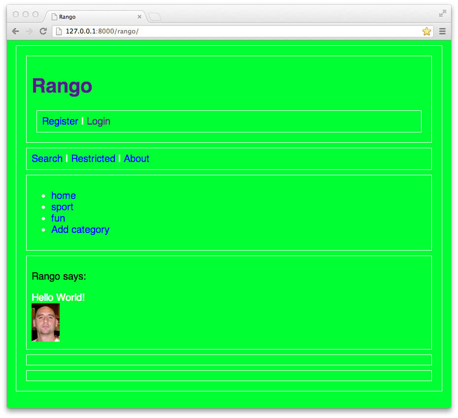
In the following example, body is the selector (meaning that all elements in the html with the body tag will be selected). Then with the curly braces are the actions to be applied, in this case the background-color is set to turn green.
body
{
        background-color: #00FF33;

}
See http://www.w3schools.com/cssref/css_colors.asp for a color reference, and pick a color that you like.
And for more examples on how to manipulate the background using CSS see http://www.w3schools.com/css/css_examples.asp
Changing Text Color
Update the basic.css as follows:
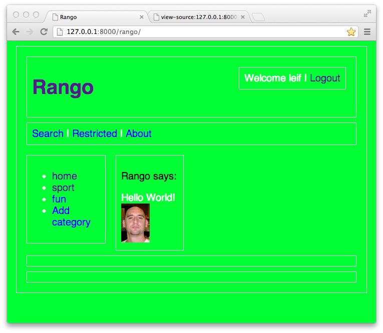
body {
                background-color: #00FF33;
                color:#FFFFFF;
}

p {
        color:#000000;
}
Now all the text within body (that is not a link) has been turned white.
However, since there are no <P> tags, no text has been turned black. Add <P> tags around the text “Rango Says:” in rango/index.html.
Now you will notice that the text “Rango Says:” is now rendered in black, even though the text is within the <BODY> tags. This is because CSS tries to apply the most specific application, so in this case, the <P> tag color style overrides the <BODY> tag color style.
Changing Text Decoration
Text can also be decorated using the text-decoration style, where an overline, line-through, underline or none can be applied.
a
{
        text-decoration: none;
}
This piece of CSS, selects links denoted by the <A> tag and removes the default text-decoration which is the underline. This example shows how the cascade comes into effect, since the basic.css is defined after the default css, then the style within basic overrides the default styles. Note that the order in which you add style sheets to your header will also influence which styles are applied, too!
To change the font you can add in a font style:
body
{
background-color: #00FF33;
        color:#FFFFFF;
        font: 20px bold ariel,sans-serif;
}
The font style lets you set following individual styles in one command font-size (in pixels (px), percentage (%), etc ), font-family (e.g. “Arial,sans-serif” or “Helvetica,sans-serif” ) and font-style (e.g. normal, italic, oblique) and font-weight (e.g. normal, lighter, bold, etc).
Adding Borders using the Box Model
CSS uses a Box Model to describe the design and layout of HTML elements. Content is first surrounded by Padding, and then a Border, and then a Margin. Borders can be added around elements using the border-style and border-width styles.
Add a solid border of 1 pixel width around all the <DIV> elements with:
div
{
        border-style:solid;
        border-width:1px;
}
To provide some space between the content within a <DIV> and a <DIV> using the padding style, and to add space between <DIV>’s use the margin style:
div
{
        border-style:solid;
        border-width:1px;
        padding:10px;
        margin:10px;
}
The index page should look pretty spaced out now.
See: http://www.w3.schools.com/css/css_boxmodel.asp for more details about the Box Model.
Floating
CSS lets you float elements horizontally (but not vertically). Elements that are after floated elements will “flow” around, so that if the screen size changes the elements will move about. So for example, if the screen was resized to a smaller size, the element will move down.
Let’s float the DIV with id page_sidebar to the left, and set its width to be 20%, and the DIV with id page_content to also float left.
#page_sidebar
{
        float:left;
        width:20%;
}

#page_content
{
        float:left;
}
In rango/base.html you may have noticed that a number of DIVs were created with ids, i.e.: page_header, page_user, page_navbar, page_sidebar, page_content, and page_footer. In the CSS you are able to directly reference these elements using the id tag as a selector as shown above.
The problem with the above styling is that the footer is now on top of the sidebar and content panes. So we need to instruct the footer to clear other elements.
#page_footer
{
        clear:both;
}
Positioning
There are a number of ways to position an element the default ordering, fixed, relative and absolute.
The default ordering is already applied. Now to move the page_user div to the top right, there are a number of options.
Try using the fixed positioning:
#page_user
{
position:fixed;
top: 21px;
right: 29px;
}
This should neatly place the Login and Register details in the top right. However, because the fixed position has been used, if the user scrolls then the page_user DIV will stay in the same spot. Try make the browser window small enough so you can scroll and try it... Doh!
The fixed position style is neat if we want things to stay in the one spot but not so good if we need them to move with the page.
Instead, try using the relative positioning:
#page_user
{
position:relative;
top: -110px;
width:30%;
left:70%;
}
The position is relative to where it would be by default (which is underneath the page_header DIV). Here we have controlled it’s size, shifted to the left and moved it up by using a negative value assigned to top. Try scrolling now and adjusting the size of the window, hopefully it should stay in the top right hand corner and move when the window scrolls.
Alternatively, you could use float and position:
#page_user
{
float:right;
        position:relative;
top: -100px;
}
Using Free CSS Templates
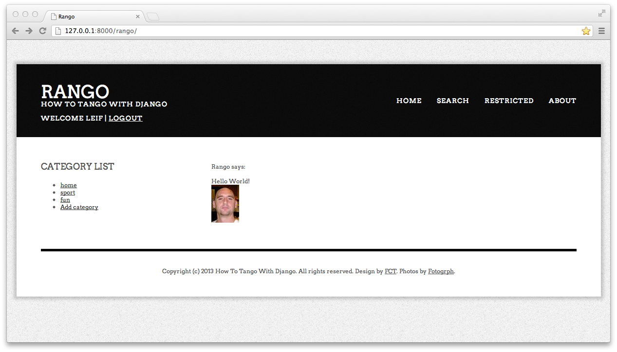
Designing and Creating CSS Templates from scratch takes quite a while, especially when done manually. However, http://www.freecsstemplates.org provides numerous free CSS templates that can be used instead.
Go to http://www.freecsstemplates.org and download the template direction. Save the direction folder within your css folder.
To use this style within Rango, you will need to do a few things.
First, you will need to create a template called base-direction.html in templates/rango, in this template add the following html and Django template code:
<!DOCTYPE html PUBLIC "-//W3C//DTD XHTML 1.0 Strict//EN" "http://www.w3.org/TR/xhtml1/DTD/xhtml1-strict.dtd">
<!--
Design by Free CSS Templates
http://www.freecsstemplates.org
Released for free under a Creative Commons Attribution 2.5 License

Name       : Direction
Description: A two-column, fixed-width design with dark color scheme.
Version    : 1.0
Released   : 20130121

-->
<html xmlns="http://www.w3.org/1999/xhtml">
<head>
<meta http-equiv="Content-Type" content="text/html; charset=utf-8" />
<title>Rango</title>
<link href="http://fonts.googleapis.com/css?family=Arvo:400,700" rel="stylesheet" type="text/css" />
<link href="{{ STATIC_URL}}css/direction/default.css" rel="stylesheet" type="text/css" media="all" />
</head>
<body>
<div id="wrapper">
        <div id="header">
                <div id="logo">
                        <h1><a href="/rango/">Rango</a></h1>
                        <p>How to Tango with Django</p>
                        <p>
                        {% if user.is_authenticated %}
                                Welcome {{ user.username }}  |
                                <a href="/rango/logout/">Logout</A>
                        {% else %}
                                <a href="/rango/register/">Register</A> |
                                <a href="/rango/login/">Login</A>
                        {% endif %}
                        </p>
                </div>
                <div id="menu">
                        <ul>
                                <li><a href="/rango/">Home</a></li>
                                <li><a href="/rango/search/">Search</a></li>
                                <li><a href="/rango/restricted" >Restricted</a></li>
                                <li><a href="/rango/about/" >About</a></li>

                        </ul>
                </div>
        </div>
        <div id="page">
                <div id="content">
                        {% block content %}{% endblock %}
                </div>
                <div id="sidebar">
                        <div id="tbox1">
                        {% block sidebar %}{% endblock %}
                        </div>
                </div>
        </div>

        <div id="footer">
                <p>Copyright (c) 2013 How To Tango With Django. All rights reserved. Design by <a href="http://www.freecsstemplates.org">FCT</a>. Photos by <a href="http://fotogrph.com/">Fotogrph</a>.</p>
        </div>
</div>
</body>
</html>
At this point it is good idea to make a copy of base.html, to say base-old.html, and then replace the template/html code in base.html with the following line:
{% extends 'rango/base-direction.html' %}
Now all your pages that inherit from base.html, will inherit from base-direction.html. This saves you from having to update every template file to inherit from base-direction.html.
Have a look at your application. Wow, impressive, huh?
Using a CSS Toolkit
The Free CSS templates are great - but most of them are fixed width. So it is better to use a CSS toolkit that is more responsive. A number of CSS Toolkits are available which also include Javascript/JQuery components to provide additional functionality. For example:
- Twitter’s Bootstrap CSS Toolkit, http://twitter.github.com/bootstrap/
- Zurb’s Foundation CSS Toolkit, http://foundation.zurb.com
- See http://speckyboy.com/2012/08/21/15-more-responsive-css-frameworks-boilerplates-worth-considering/ for many more response CSS frameworks that you can use.
Using Twitter’s Bootstrap CSS Toolkit
Below is an example of how the Bootstrap toolkit can be included into your Django project.
First download the Bootstrap toolkit and save it into your static folder.
Create a template called, base-bootstrap.html in templates/rango. THe following code is based on the Fluid example http://twitter.github.com/bootstrap/getting-started.html#examples:
#
<!DOCTYPE html>
<html lang="en">
<head>
<meta charset="utf-8">
<title>Rango</title>
<meta name="viewport" content="width=device-width, initial-scale=1.0">
<meta name="description" content="">
<meta name="author" content="">
<!-- Le styles -->
<link href="{{STATIC_URL}}bootstrap/css/bootstrap.css" rel="stylesheet">
<style type="text/css">
body {
padding-top: 60px;
padding-bottom: 40px;
}
.sidebar-nav {
padding: 9px 0;
}
@media (max-width: 980px) {
/* Enable use of floated navbar text */
.navbar-text.pull-right {
float: none;
padding-left: 5px;
padding-right: 5px;
}
}
</style>
<link href="{{STATIC_URL}}bootstrap/css/bootstrap-responsive.css" rel="stylesheet">
</head>
<body>
<div class="navbar navbar-inverse navbar-fixed-top">
<div class="navbar-inner">
<div class="container-fluid">
<a class="btn btn-navbar" data-toggle="collapse" data-target=".nav-collapse">
<span class="icon-bar"></span>
<span class="icon-bar"></span>
<span class="icon-bar"></span>
</a>
<a class="brand" href="/rango/">Rango</a>
<div class="nav-collapse collapse">
<p class="navbar-text pull-right">
{% if user.is_authenticated %}
Welcome {{ user.username }} |
<a href="/rango/logout/" class="navbar-link">Logout</A>
{% else %}
<a href="/rango/register/" class="navbar-link">Register</A> |
<a href="/rango/login/" class="navbar-link">Login</A>
{% endif %}
</p>
<ul class="nav">
<li><a href="/rango/">Home</a></li>
<li><a href="/rango/search/">Search</a></li>
<li><a href="/rango/restricted" >Restricted</a></li>
<li><a href="/rango/about/" >About</a></li>
</ul>
</div><!--/.nav-collapse -->
</div>
</div>
</div>
<div class="container-fluid">
<div class="row-fluid">
<div class="span3">
<div class="well sidebar-nav">
{% block sidebar %}
{% endblock %}
</div><!--/.well -->
</div><!--/span-->
<div class="span9">
<div class="hero-unit">
{% block content %}
{% endblock %}
</div>
</div><!--/span-->
</div><!--/row-->
<hr>
<footer>
<p>© How to Tango with Django 2013</p>
</footer>
</div><!--/.fluid-container-->
<!-- Le javascript
================================================== -->
<!-- Placed at the end of the document so the pages load faster -->
<script src="http://twitter.github.com/bootstrap/assets/js/jquery.js"></script>
<script src="http://twitter.github.com/bootstrap/assets//js/bootstrap-transition.js"></script>
<script src="http://twitter.github.com/bootstrap/assets//js/bootstrap-alert.js"></script>
<script src="http://twitter.github.com/bootstrap/assets//js/bootstrap-modal.js"></script>
<script src="http://twitter.github.com/bootstrap/assets//js/bootstrap-dropdown.js"></script>
<script src="http://twitter.github.com/bootstrap/assets//js/bootstrap-scrollspy.js"></script>
<script src="http://twitter.github.com/bootstrap/assets//js/bootstrap-tab.js"></script>
<script src="http://twitter.github.com/bootstrap/assets//js/bootstrap-tooltip.js"></script>
<script src="http://twitter.github.com/bootstrap/assets//js/bootstrap-popover.js"></script>
<script src="http://twitter.github.com/bootstrap/assets//js/bootstrap-button.js"></script>
<script src="http://twitter.github.com/bootstrap/assets//js/bootstrap-collapse.js"></script>
<script src="http://twitter.github.com/bootstrap/assets//js/bootstrap-carousel.js"></script>
<script src="http://twitter.github.com/bootstrap/assets//js/bootstrap-typeahead.js"></script>
</body>
</html>
It takes a bit of time to wrangle with the particular CSS Toolkit that you use - but once you’ve got it up and running it is usually fairly straightforward to customize.
In rango/index.html update the sidebar to include the Bootstrap specific classes when presenting categories:
{% block sidebar %}


<UL class="nav nav-list">
        <LI class="nav-header">Category List</LI>
        {% if cat_list %}
                {% for cat in cat_list %}
                        <LI><A HREF="/rango/cat/{{ cat.url }}">{{ cat.name }}</A></LI>
                {% endfor %}
        {% else %}
                <LI>No categories at present.</LI>
        {% endif %}
        <LI><A HREF="/rango/cat_add"> Add category</A></LI>
</UL>

{% endblock %}
Looks pretty neat, eh!?
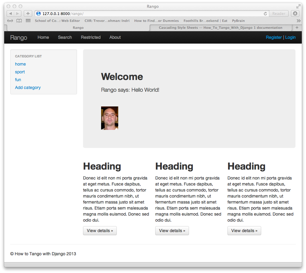
Now reduce the size of the web browser and see how it responds as it gets smaller and smaller, until it stops at the size of a mobile phone screen display.
Also, note that most CSS Toolkits use a grid based layout to position units. The bootstrap toolkit uses classes call span to control the size of elements with the grid layout, see http://twitter.github.com/bootstrap/scaffolding.html#gridSystem for more details.
Exercises
- Since the Free CSS templates follow the same format it is pretty easy to vary the style. Download another Free CSS template, for example, illustrative, and move the folder into the static/css folder. Now, create a new base template called, base-illustrative.html. Use the index.html provided in the illustrative download as a guide to creating base-illustrative.html for your application.