Continuous Uncertain Interaction
Figures
High quality, original versions of the figures from the thesis are available from this page. All original images are copyright John Williamson 2006. You may use these in your own publications, talks etc. as long as appropriate citation is made. You may also modify these figures. If you do so, please make it clear in the caption (or equivalent) that the figure is a modification of the original.Figures in the thesis which are reproduced from other sources are listed, but are not available from this page -- a reference to the original paper is instead provided.
Images are in png format for bitmap originals, and in eps format for vectors. Most vector images are also available in svg or ai (Adobe Illustrator) versions. The svg images can be opened and edited with Inkscape. A few images are originally in dia format. A few others are in sxd format, which can be opened by OpenOffice. You can convert the eps format images to other vector formats using pstoedit along with Ghostview on most platforms.
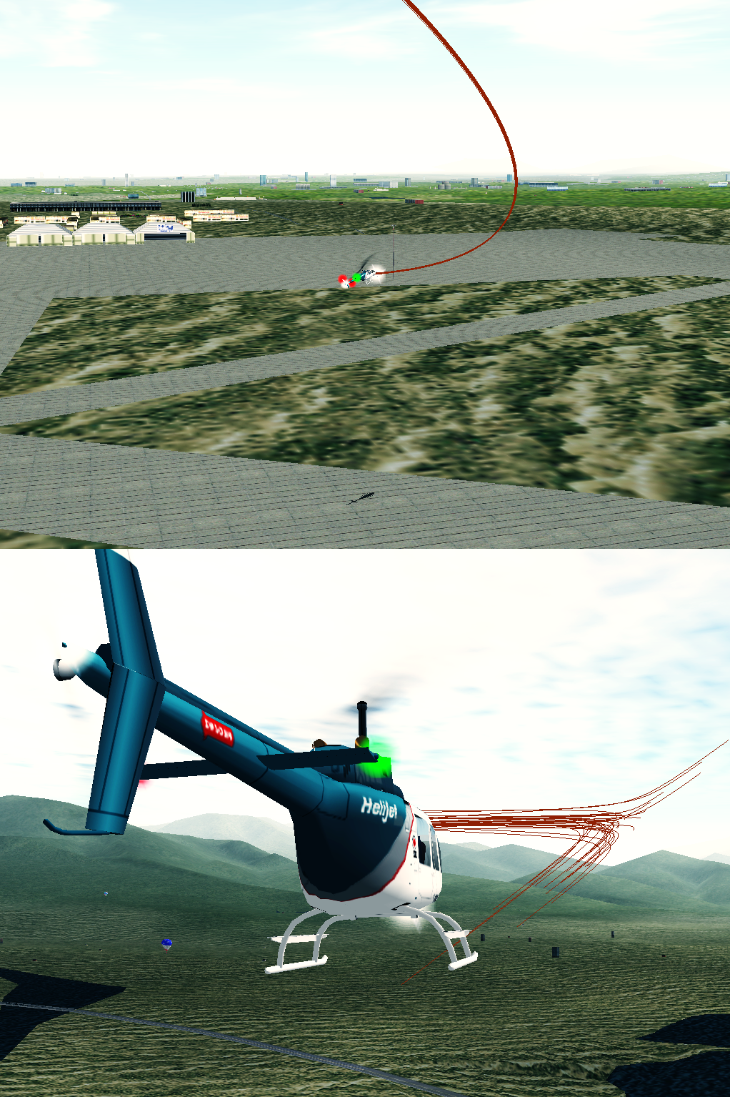
Jump to:
Chapter I: Introduction
Chapter II: Theory and Definitions
Chapter III: Dynamic Probabilistic Feedback
Chapter IV: Predictive Uncertain Display
Chapter V: Augmented Dynamics
Chapter VI: Active Selection
Back to the main thesis page.
Chapter I: Introduction
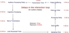
 | 1.1 The evolution of the human-computer interface. From the rigid, time delayed
interactions of the punch card interface, to the conventional GUI, and
beyond to tightly-coupled extensions of the mind. SVG | EPS |
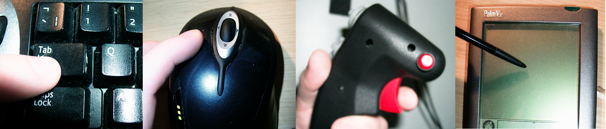
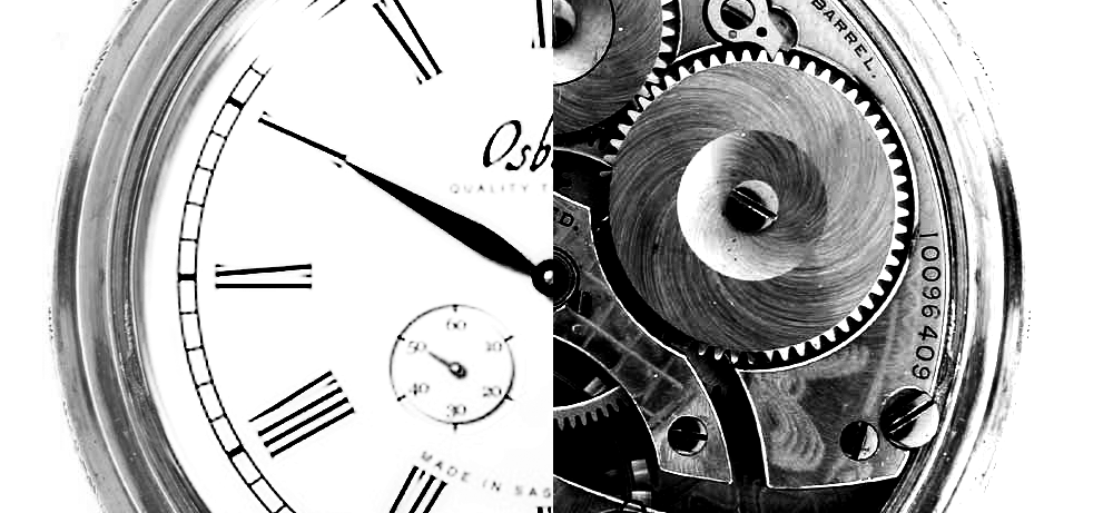
 | 1.2 A Morse key; an example of a highly refined physical interaction device.
This device has evolved over a period of a century, and is extremely effective
at transforming intentions into sequences of Morse code; the weighting,
bearings, spring tensions and shape of the device have all been carefully
adapted to provide the optimal dynamics to maximise the transfer of
information. Building interfaces which have this quality of interaction, but
also the flexibility of software control, is a major challenge. PNG |
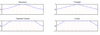
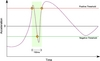
 | 1.3
The effect of delays on control. (a) Very short delay: simple comparison of
current state and desired state is sufficient. (b) Medium delay: a model of
the system dynamics must be introduced to compensate. (c) Long delay:
capacity of the delay exceeds complexity of model and control becomes
bursty. All real world systems have some delay in both directions, but the
lengths of the delays may be significantly different. SVG | EPS |
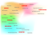
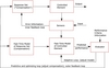
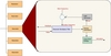
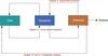 | 1.4
An overview of the structure of the thesis. Chapters III and IV discuss
feedback from the goals; Chapter V explores feedback from the inference
process to the interface dynamics; and Chapter VI describes general techniques
for building selection systems. SVG | EPS |
Chapter II: Theory and Definitions
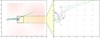
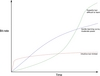 | 2.1
Bit-rate curves for different interfaces. Many interface design decisions
involve trading off ease-of-learning against ultimate interaction rates. SVG | EPS |
 | 2.2
A basic negative feedback control loop. The error signal is fed back to
maintain control. SVG | EPS |
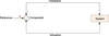
 | 2.3 The human-computer interaction as a closed-loop control process. The
“imaginary path” between the intention of the user and the actions of the
system is shown as a dashed line. Real communication must take place
through the interface, via the control loop. The circles indicate comparator
units. AI | EPS |
 | 2.4 The interface divided into the evidence space, the goal space and the state
machine. Only the input side of the interface is illustrated, the feedback
paths being omitted. SVG | EPS |
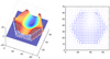
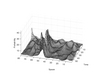
 | 2.5 The changing entropy H(x)
across regions of the goal space, shown
here for a three goal system. Entropy is
shown as the dotted surface above the
simplex – distance from the surface indicates
entropy at that point. It reaches
its maximum of 1.584 bits at <1/3, 1/3, 1/3> and drops to zero at the vertices. PNG |
 | 2.6
The plots at the top show four example densities
on a two dimensional space. The contours show the total probability at each point (i.e. sum of all three goal probabilities). The red line is the path of a test trajectory, beginning at the lower right. (a) shows a Gaussian/squared exponential kernel $e^{\frac{-x^2}{\sigma^2}}$, (b) a Cauchy kernel $\frac{1} {\pi \left( 1+ \frac{x}{\sigma} \right) }$, (c) a Laplace/double exponential kernel $\frac{1}{ e^{\sqrt{\frac{x}{\sigma}}} }$, and (d) a raised cosine kernel $1+\cos\left( \pi \frac{\sqrt{x}}{\sigma}\right)$. The lower plots show the goal space trajectories corresponding to the example path on the 2-simplex for each of the p.d.f's. These densities transform spatial (i.e. sensed) measurements into positions in the goal space (distributions over goals). SVG | EPS |
 | 2.7 Time-dependent utility of information and the arrival of evidence. Each
curve shows the utility of information as a function of time (solid green,
fixed for all three cases) and the arrival of evidence for that piece of information
(dotted blue). In (a) evidence arrives at nearly the same time as the
maximal utility of the information; effective control is possible in this case.
(b) shows a situation where the system under control is very predictable;
evidence for the state of the system is accumulated well in advance. In (c),
information is not reliable until long after the event has occurred, and is
no longer useful at that point. Such a system cannot reliably be controlled. SVG | EPS |
 | 2.8 Some roughly estimated delays in an interaction, for an audio display. The
upper bound time is 2145ms, the lower is 57ms. For a visual display, the
transmission time would drop to almost zero and the visual processing
delay in the brain would increase by »20ms. SVG | EPS |
 | 2.9 The interface as a series of nested control loops. Layers move outward
from physiological loops to complex learning behaviours. SVG | EPS |
 | 2.10
Some potential sources of uncertainty in the control process.
AI | EPS |
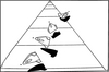
 | 2.11
Terminal events in conventional interaction devices. In each case, a single
button style motion is used to trigger the action. Evidence accumulates
throughout the interaction, but is not used until this action occurs,
and when it does occur, it is treated as if it were absolutely certain.
PNG |
| | 2.12
The transfer functions used for mouse control in Windows XP. Taken
from the Microsoft website ( http://www.microsoft.com/whdc/device/
input/pointer-bal.mspx , retrieved 10th of June 2006). The mouse control
panel has four “speed” settings which select one of these transfer
functions. This function is applied after any on-mouse filtering. |
 | 2.13
Oscilloscope traces for two different buttons being pushed. Note that
the behaviour is quite complex, with noise and ringing around the transient.
Debouncing algorithms are needed to clean up these signals for
button controls. The top trace in both cases is the raw signal values; the
bottom indicates the corresponding logic states. These two images are
taken from Jack Ganssle’s debouncing guide ( http://www.ganssle.com/
debouncing.pdf , retrieved 15th April 2006). |
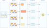
Chapter III: Dynamic Probabilistic Feedback
 | 3.1
Exposed mechanics.
Good feedback should reveal
the workings of a system in a way
users can model.
PNG |
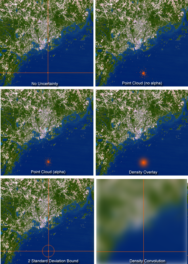
 | 3.2
Some postulated visual uncertain displays in a map navigation example.
Left to right, top to bottom: Single point, no uncertainty; point cloud (no
alpha); point cloud (alpha blended, anti-aliased); density alpha overlay;
outline of two standard deviation bound; world convolved with position
density.
PNG |
 | 3.3
The granulation process (shown here for three grains). A number slices
are taken from a set of original sounds. Sample positions are chosen
by some process, here by sampling from a p.d.f. These slices are then
enveloped (to eliminate clicking artifacts), pitch adjusted and spatialized
according to the densities for each parameter. All of the slices are
summed together to produce an output sound stream. In practice many
hundreds of grains are active simultaneously.
AI | EPS |
 | 3.4
Some possible enveloping windows for granular synthesis. These are
applied to waveform sections to eliminate clicking artifacts. The effect of windowing a
sine wave is illustrated.
EPS |
 | 3.5
Multiple models in a recognition task are directly sonified via granular
synthesis.
AI | EPS |
 | 3.5
Image from the mixture of Gaussians demo. A number of Gaussian densities
are arranged in a 2d state space, each with its associated waveform.
The probability of each source given the current cursor position is sonified.
In this image, isoentropy contours are shown. The colours indicate
the mixture of probabilities at that source.
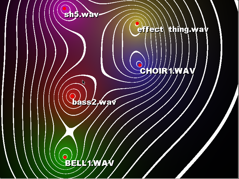
PNG |
 | 3.5
(a) Audio densities are sparse and non-overlapping, leading to a jumpy
sound. (b) Densities are adjusted so as to cover the entire inter-interval
region. Sound is smooth and clean
AI | EPS |
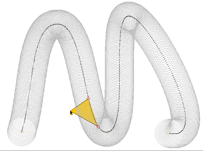
 | 3.5
An image from the arc length mapping demo. The dark path indicates
the mean positions, while the outer circles indicate the one standard deviation
bound. The current position along the path is given by the triangle
extending from the cursor; as the mouse moves closer and further
the potential positions contract and expand respectively. Audio is produced
corresponding to the section of the curve highlighted by the two
endpoints.
PNG |
Chapter IV: Predictive Uncertain Display
 | 4.1
Quickened display for helicopter hover manoeuvres. Adapted from Hess
and Gorder [1990]. The acceleration, velocity and current position of the
aircraft are displayed on a map to aid in low speed movements. The
dashed black line is not part of the display. It indicates the path an object
would take given the velocity and acceleration vectors shown here (with
1 acceleration unit = .07 velocity units)
AI | EPS |
 | 4.2
Kelley’s postulated predictor model for spacecraft manoeuvres. This display
is intended to be based on a fast-time model of the process; a simulation
approach to predictive control, based upon Ziebolz’s (Ziebolz and
Paynter [1954]) work. Reproduced from C. R. Kelley. Manual and Automatic Control: A Theory of Manual Control and Its Applications
to Manual and to Automatic Systems. Academic Press, 1968. p.147
|
 | 4.3
Monte Carlo propagation example. Shown are ten particles being propagated
through a dynamic system (vector field shown in blue), starting at the points
marked with black circles. At each step the deterministic dynamics are applied, followed
by the noise diffusion process. The right hand side shows a close up of the
process. Particle positions at each step are marked in red. The dynamics step is shown
as a green line, the noise step as a magenta line. The initial condition is centred on a
saddle point, leading to a strongly bimodal terminal distribution.
SVG | EPS |
 | 4.4
Artillery fire as an an analogy to adjustable time horizon Monte Carlo
prediction horizons. Higher angles (up to 45o) have greater range (in
time) but increased diffusion.
SVG | EPS |
 | 4.5
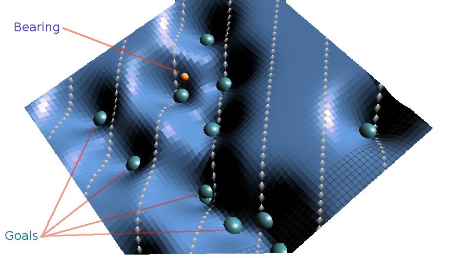
Simulated surface with goals distributed across it. The dynamics of the
system are defined by the landscape. In this case, each goal has a smooth
depression around it (leading to an attractor at that point). The solid blue
spheres mark the centres of the goal distributions. Control is effected by
virtually “tilting” the surface (i.e. by adjusting the effective gravitational
vector)
PNG |
 | 4.6
The ball-bearing simulation model. The ball-bearing can freely move
over the surface. The mouse alters the orientation of the surface, and thus
the effect of gravity on the motion of the bearing. Predictions are shown
in red. The predictions at the time horizon are highlighted in green. There
are a number of waveforms distributed on the surface; the centres of the
density associated with them are shown as blue solid circles (at the centre
of each depression).
PNG |
 | 4.7
InterTrax head tracker used for the manipulation of the time horizon in
the rolling object demo. Tilting up and down extends and retracts the
prediction horizon.
PNG |
 | 4.8
bearing_timeseriesPredicted and actual states in the rolling ball simulation. Actual and predicted
positions for the bearing are shown. This shows prediction at
approximately two seconds ahead (frame rate is slightly variable but is
around 40Hz. 80 step ahead prediction is used)
EPS |
 | 4.9
Predicted and actual states in the rolling ball simulation (2d projection of
the trajectory).
EPS |
 | 4.10
Visualization of the Monte Carlo sampled predictions in the X-Plane
simulator. The “strands” extending from the helicopter body represent
future possible paths for the aircraft
PNG |
 | 4.11
Dependencies and densities in the helicopter goal model. Arrows indicate
dependencies. Densities are represented as filled semicircles. The
oval objects are goals which are sonified. This graph is simple to evaluate
as dependencies flow from left to right, and the left variables are
known (they are samples from the Monte Carlo process).
SVG | EPS |
 | 4.12
GPS position variation while the unit is at standstill in a two minute
period. Units are of degrees (the area shown corresponds to approximately
27 x 39 meters). This data is recorded in a clear area away from
obstructions, at around 55 degrees north with the MESH GPS device
(using a standard GPS chipset) and an external antenna. Both jitter and
long-term drift are apparent. Noise would be even more pronounced in
heavily built up areas.
EPS |
 | 4.13
A shadow map computed for a region of the Maynooth campus in Ireland.
This is estimated via a raytracing technique given the height of
the surrounding area, and the angle of GPS satellites.
PNG |
 | 4.14
A likelihood map computed for a region of the Maynooth campus in
Ireland. This is based on building positions. Entrance into buildings is
not modelled in this example.
PNG |
 | 4.15
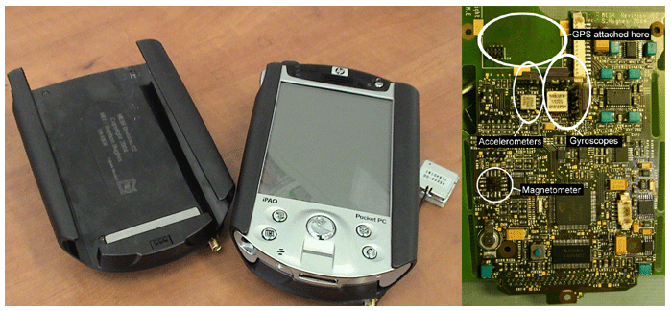
PocketPC augmented with GPS sensor pack. The sensor pack include
GPS, 3-axis accelerometers, 3-axis gyroscopes, 3-axis magnetometers,
capacitive touch sensing and vibrotactile display.
PNG |
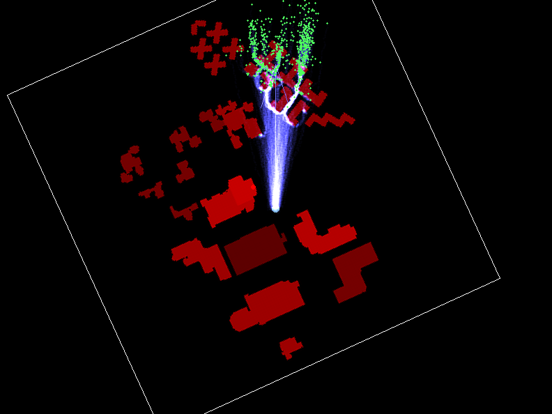
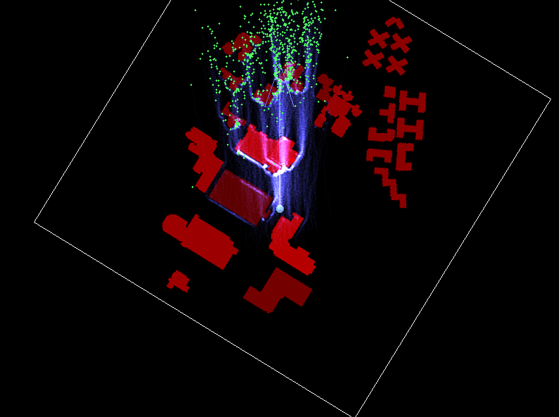
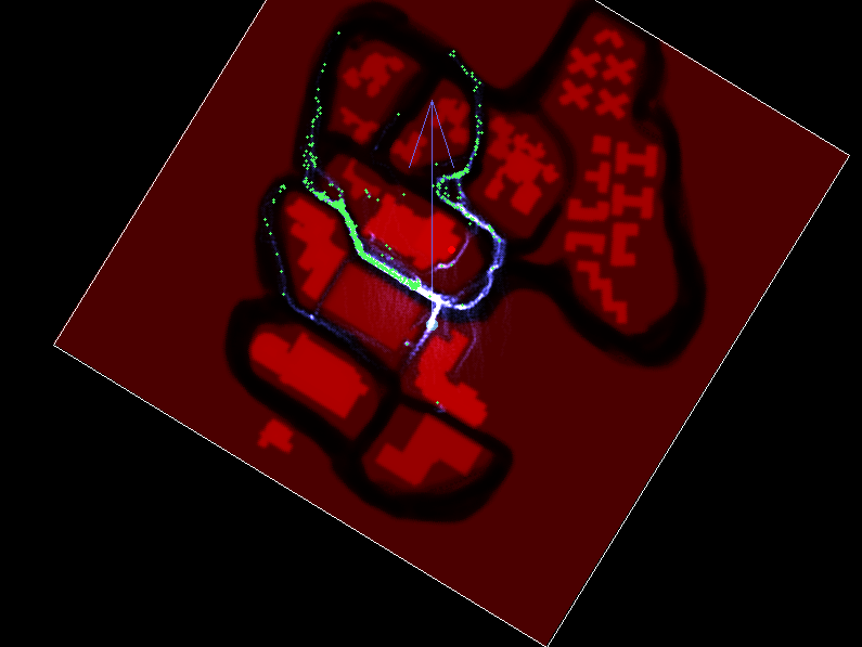
 | 4.16
GPS Monte Carlo navigation application. This image is from a desktop
mockup with simulated GPS input. The GPS enabled version runs on the PocketPC
but does not have such visualisations. The first shows predictions with a likelihood
map designed for walking behaviour. The second figure shows the effect of changing
to a likelihood map suitable for bike navigation, where movement is more tightly constrained
to pathways. The lower two figures illustrate the effect the shadow map has on
prediction. The first of these two is in a relatively non-occluded area, and predictions
begin, and remain concentrated. The second has poor satellite visibility; predictions
are initially diffuse, but coalesce as obstacles reduce the likely movement paths. They
subsequently re-diverge in open space. (4 separate images)
PNG 1 PNG 2 PNG 3 PNG 4 |
 | 4.17
True GPS position and artificially disturbed GPS position during the
navigation experiment. The true position is shown in blue; the readings
after the introduction of noise are shown as red points. Hollow green
circles indicate the targets the participant had to locate.
EPS |
 | 4.17
Position and heading of a typical user during the navigation task. Positions
are shown as blue points; the arrows indicate the heading sensed
by the inertial sensors.
EPS |
 | 4.18
Time to complete task in mean and uncertain display cases. Time is
reduced for all participants except the first in the uncertain display condition.
EPS |
 | 4.19
Heading signal energy in mean and uncertain display cases (energy is computed as sum_{t=0}^T \frac{dk^2}{dt} \frac{1}{T}) . Energy is reduced in the uncertain display condition.
EPS |
 | 4.20
Energy in the 0.1–2Hz band of the heading signal for the period after a
63% reduction in error (i.e. the fine-tuning phase). The blue box plots
show the energy for the mean condition, while the green show the uncertain
condition.
EPS |
 | 4.21
Boxplots of acquisition times for orientation acquisition. Again, blue
represents the mean condition, green the uncertain.
EPS |
 | 4.22
Variance of error for orientation acquisition. Blue shows the variance of
the error (true angle-sensed angle) for the mean condition, green for the
uncertain.
EPS |
 | 4.23
Time series for a typical experimental run in the mean noisy case. The
start and end of the acquisitions are marked, along with the point at which 63% of
the error was removed (this was the criterion used to determine the end of the gross
movement phase).
EPS |
 | 4.24
Time series for a typical experimental run in the uncertain noisy case.
The start and end of the acquisitions are marked, along with the point at which 63% of
the error was removed. Compared with Figure IV.24, there is less wild overshooting in
this case, although participants occasionally “hover” just outside the capture zone.
EPS |
 | 4.25
Histogram of error for one experimental trial in the mean noisy case.
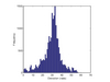
EPS |
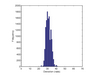 | 4.26
Histogram of error for one experimental trial in the uncertain noisy case.
The distribution is significantly narrower than that show in Figure IV.26
for the mean case.
EPS |
 | 4.27 (a)
Illustration of the basic elements of a one-dimensional particle filter.
Each time step involves deterministic dynamics, diffusion and importance sampling.
The similarity to the Monte Carlo prediction methods is apparent. The major difference
is the introduction of an importance sampling step.
SVG | EPS |
 | 4.27 (b)
Illustration of the basic elements of a one-dimensional particle filter.
Each time step involves deterministic dynamics, diffusion and importance sampling.
The similarity to the Monte Carlo prediction methods is apparent. The major difference
is the introduction of an importance sampling step.
SVG | EPS |
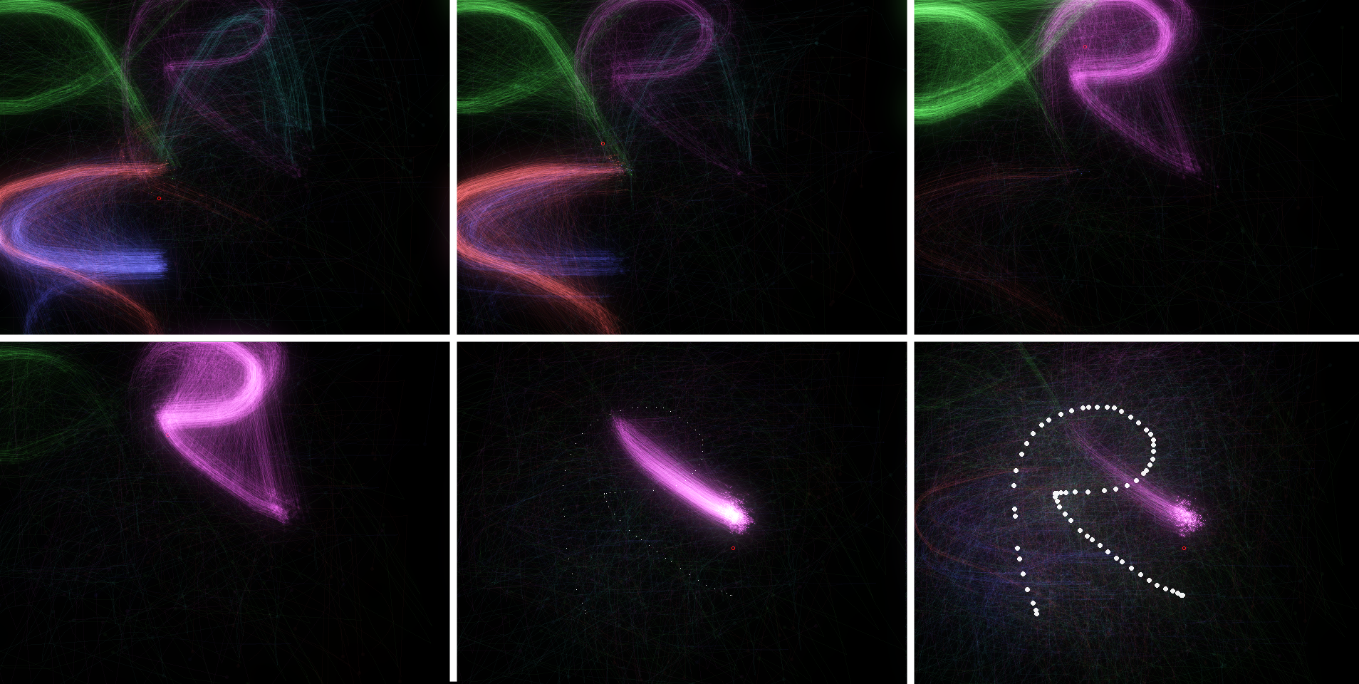
 | 4.28
Sequence of screenshots from the particle filter gesture recogniser during
the performance of an “r”-shaped gesture. The states of the particles
are drawn as partially transparent circles, with lines extending showing
the future state of the particle. The result is nebulous display of the
distribution of particles.
PNG |
Chapter V: Augmented Dynamics
 | 5.1
Feeding the results of the inference back into the control loop.
DIA | EPS |
 | 5.2
The visual space (a)
and motor space image (b) of a
dialog box with variable controldisplay
ratios. The “save” button,
which has higher utility to the user,
is enlarged in motor space. From
R. Blanch, Y. Guiard, and M. Beaudouin-Lafon. Semantic pointing: improving target
acquisition with control-display ratio adaptation. In CHI ’04: Proceedings of the SIGCHI
conference on Human factors in computing systems, pages 519–526, New York, NY, USA,
2004. ACM Press. |
 | 5.3
An example of how introducing “helping” dynamics into the system can
improve control performance. This figure shows a simulated acquisition task in which
an operator – modelled as PID controller controlling a second order system with saturation,
strong drifts and Gaussian noise – attempts to acquire a target (the circular
region to the right). In the unaided case (left), many of the acquisitions miss the mark
(only »25% acquire the target). When the simulated surface shown at the far right is
introduced (a smooth “dimple” around a path heading towards the target), the acquisition
is significantly cleaner (centre figure), with more than 80% of the acquisitions being
succesful. This is equivalent to an increase of target size of » 360%.
(three separate images) EPS 1 EPS 2 EPS 3 |
 | 5.4
The Quikwriting text entry system. Text is entered
by moving back and forth from the octagonal sections.
Taken from K. Perlin. Quikwriting: continuous stylus-based text entry. In UIST ’98: Proceedings of
the 11th annual ACM symposium on User interface software and technology, pages 215–216,
New York, NY, USA, 1998. ACM Press. |
 | 5.5
TCube text entry. Entry is based around pie
menus, which the user can pop up at any position on screen.
From D. Venolia and F. Neiberg. T-cube: a fast, self-disclosing pen-based alphabet. In CHI
’94: Proceedings of the SIGCHI conference on Human factors in computing systems, pages
265–270, New York, NY, USA, 1994. ACM Press. |
 | 5.6
Dasher continuous text entry system. Text is
entered as a continuous one-dimensional gesture. The sizes
of the targets are adapted according to a probability model.
Taken from D. J. Ward, A. F. Blackwell, and D. J. C. MacKay. Dasher - a data entry interface using
continuous gestures and language models. In UIST 2000. ACM Press, 2000. |
 | 5.7
Shark gestural text entry system. Words are
entered as continuous gesture on the virtual keyboard display.
The system then uses a language model to deform the
path to the path for the most likely word given the gesture.
Taken from P.-O. Kristensson and S. Zhai. Shark2: A large vocabulary shorthand writing system for
pen-based computers. In 17th Annual ACM Symposium on User Interface Software and
Technology (UIST 2004), pages 43–52. ACM Press, 2004. |
 | 5.8
SonicText. The joystick can move in eight
directions; each letter requires either a single directional
movement, or a directional movement followed by a “roll”.
Audio feedback is presented during the interaction to reduce
the need for visual attention. From M. Rinott. Audio-tactile interactions with mobile devices. Master’s thesis, Interaction
Design Institute, IVREA, 2004 |
 | 5.9
The Cirrin text entry interface. Text is entered
as a continuous movement, entering and leaving one segment
of the circle to produce a character. The layout is chosen
to reduce user effort for likely words. From J. Mankoff and G. D. Abowd. Cirrin: A word-level unistroke keyboard for pen input.
In UIST ’98, pages 213–214. ACM Press, 1998. |
 | 5.10
TiltText Tilting text entry with accelerometers.
From K. Partridge, S. Chatterjee, V. Sazawal, G. Borriello, and R. Want. Tilttype:
accelerometer-supported text entry for very small devices. In UIST ’02: Proceedings of
the 15th annual ACM symposium on User interface software and technology, pages 201–204,
New York, NY, USA, 2002. ACM Press |
 | 5.11
Unigesture tilt text entry. Orientation is divided
into seven zones plus one for space. Users tilt the
device into a zone for each character; the system disambiguates
the letters at the end of a word. From V. Sazawal, R. Want, and G. Borriello. The unigesture approach. In Mobile HCI 2002, pages 256–270, London, UK, 2002. Springer-Verlag |
 | 5.12
The TUP touchwheel text entry system. The
user can type by tapping on the circular pad. The system
estimates the most likely letters given the position of the tap
and a language model. From M. Proschowsky, N. Schultz, and N. E. Jacobsen. An intuitive text input method for
touch wheels. In CHI 2006, pages 467–470, 2006. |
 | 5.13
Keypad text entry. Letters are coded as sequences
of digits. In the T9 system, each letter is coded as a
single digit, and the entire word decoded at the end. PNG |
 | 5.14
PocketPC augmented
with XSens miniature linear
accelerometer. PNG |
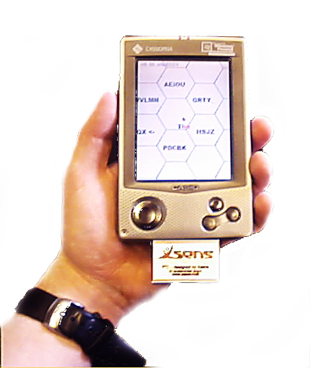
 | 5.15
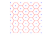
The hexagonal grid
is formed by taking the Voronoi
tessellation of the hexagonallyarranged
points (heavy black
points). Transitions detection
is simply a matter of observing
changes in the nearest hexagon
centre point.
EPS |
 | 5.16
The default layout of letters in Hex.
AI | EPS |
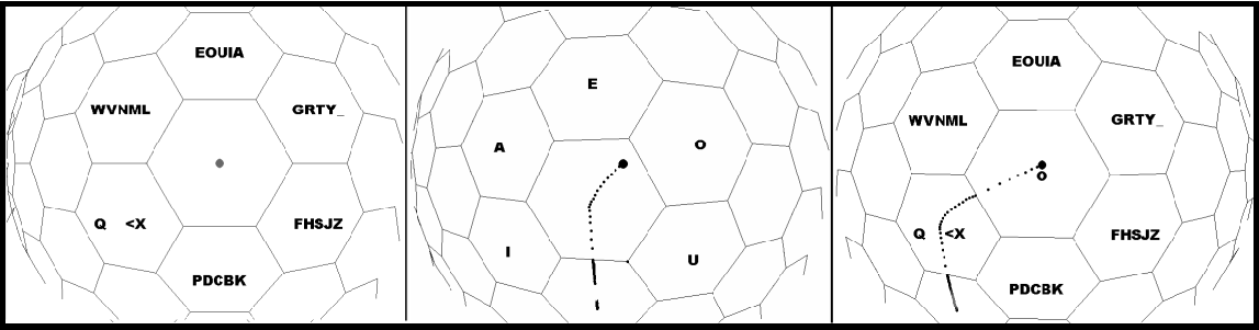
 | 5.17
A series of images from Hex in action. “O” is being entered. The cursor
history is shown as a series of black dots.
PNG |
 | 5.18 The trajectories corresponding to words using the layout given in Figure
V.16. These are created by fitting a cubic spline through the medians of the transition
edges which would create the word.
ZIP (8 zipped EPS files) |
| | 5.19
The transfer function applied to the control input in Hex
AI | EPS |
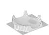
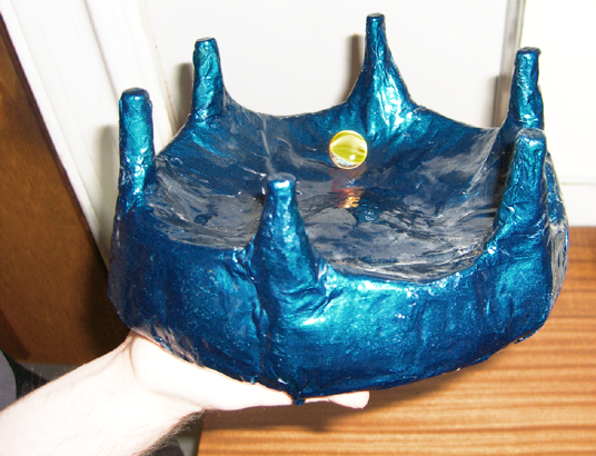
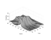
 | 5.20 A real physical model showing the
design of Hex; rolling a marble (the cursor) across
the undulating surface defined by the language
model.
PNG |
 | 5.21
A vector field, illustrating the virtual forces applied to the cursor in Hex
EPS |
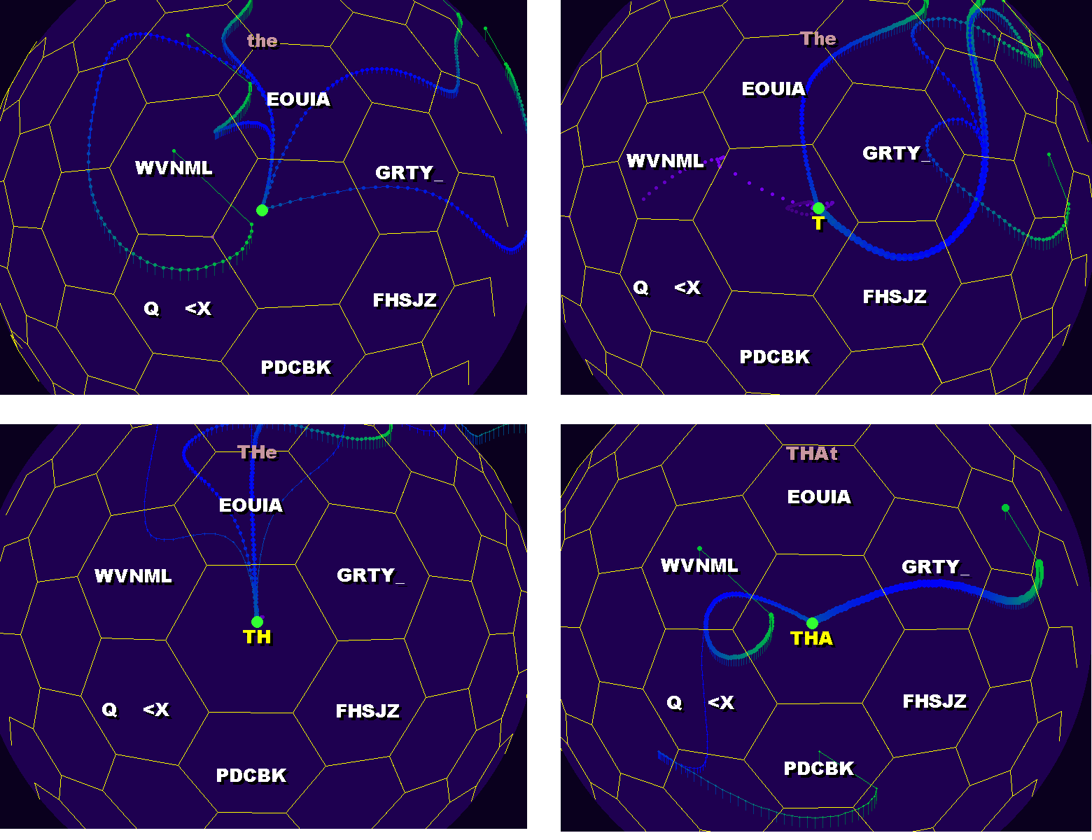
 | 5.22
Input and output trajectories for the word “the”. Overlaid spatial plots
are shown in the top two images; the lower quadrants show the time series.
ZIP (3 zipped EPS files) |
 | 5.23
Input and output trajectories for the word “squeak”. Overlaid spatial plots
are shown in the top two images; the lower quadrants show the time series.
ZIP (3 zipped EPS files) |
 | 5.24
Input and output trajectories for the word “take”. Overlaid spatial plots
are shown in the top two images; the lower quadrants show the time series.
ZIP (3 zipped EPS files) |
 | 5.25
Transitioning through a vertex is ambiguous. Very slight changes initial
position or heading lead to distinct jumps in state. Therefore, the physical
model prohibits transitions in this region.
AI | EPS |
 | 5.26 A section of the Hex language model (probabilities are from a short test training set, not from the true corpus). The probability of jumping to a new character given a prefix is shown along the edges. Black dots indicate pruned regions of the tree. DIA | EPS |
 | 5.27
Some example virtual landscapes in Hex, showing how the probability affects the virtual surface. These are snapshots of the landscape during an interaction.
ZIP (9 zipped EPS files) |
 | 5.28
The simple shake detection algorithm used in Accelerometer-Hex. The
z-axis signal is shown at the right. The red line indicates the positive
shake threshold, the green the negative. If a the series crosses the positive
threshold going upwards, the negative going downwards and then the
positive going upwards again within 150ms the movement is considered
a shake. Crossing the first threshold locks the state of Hex until 150ms
has passed, minimising the effect of unrecognised shakes on disturbing
the state.
SVG | EPS |
 | 5.29
Monte Carlo sampling display on the desktop version of Hex. Sampling
is performed over the language model, given the current prefix. Spline
paths for each sample word are drawn on the surface; the thickness of the
line displays the probability of that path. For clarity, this example shows
only two predictions, and the top-ranked predicted word is shown at the
top centre.
PNG |
 | 5.30
Cubic spline word trajectory generation. The knots are at the centres of
the hexagons and at the medians of the edges the path goes through.
SVG | EPS |
 | 5.31
An optimised layout of letters in Hex. This minimises the jerk of word
trajectories for the training corpus.
SVG | EPS |
 | 5.32
Hex in the form of hierarchical control loops. The world is sensed via
accelerometers, which control the landscape dynamic system. This is modulated by
the language model, which infers users goals. Hex has no adaptation, but if it did, the
adaptation process would modulate the inferential mechanism.
SVG | EPS |
 | 5.33
Cloud plots of trajectories in Hex, to produce the word “the”. (a) shows
ten trajectories with the normal physical model, (b) shows the effect of
removing the dynamics model (variance is increased here), (c) shows the
effect of doubling the forces strength, creating a tighter but jumpier result,
and (d) shows the effect of inverting the language model probabilities,
significantly impairing the ability of the user to control the system.
AI | EPS |
 | 5.34
Hex used with EEG brain computer interface control. In collaboration
with the BCI group at Fraunhofer First IDA.
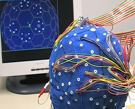
PNG |
Chapter VI: Active Selection
 | 6.1
Some traditional selection mechanisms.
SVG | EPS |
 | 6.2
Asymmetry in the communication channels between an interactor and a
computer. Human sensory channels have much higher bandwidth than
the actuation channels.
SVG | EPS |
 | 6.3
The agents as independent interactors. Each user interface goal (a vertex
in the goal space) is now an active agent.
AI | EPS |
 | 6.4
The structure of an agent loop.
SVG | EPS |
 | 6.5
One postulated user model, from R. J. Jagacinski and J. M. Flach. Control theory for humans : quantitative approaches to
modeling performance. L. Erlbaum Associates, Mahwah, N.J., 2003. (p.205), in
turn adapted from T. B. Sheridan and W. R. Ferrell. Man-machine Systems: Information, Control, and Decision Models of Human Performance. M.I.T. Press, Cambridge, USA, 1974. (p.254)
|
 | 6.6
Another postulated user model, with a general predictive controller.
Adapted from C. R. Kelley. Manual and Automatic Control: A Theory of Manual Control and Its Applications
to Manual and to Automatic Systems. Academic Press, 1968. (p.140).
EPS |
 | 6.7
Costello’s (Costello
[1968]) surge controller. The error
phase plane is shown (error against
derivative of error). When the current
state lies outside the diamond,
bang-bang (full on or full off) control
is applied, until the signal enters
the central region, where proportional
linear control takes over.
SVG | EPS |
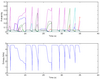
 | 6.8 (a)
Step responses for first and second order lags with various parameters.
Such responses (combined with delays) are often good fits to human tracking behaviour.
EPS |
 | 6.8 (b)
Step responses for first and second order lags with various parameters.
Such responses (combined with delays) are often good fits to human tracking behaviour.
EPS |
 | 6.9
Compensation with first-order and second-order lags, for a single dimensional
mouse tracking task. The first plot shows a generated disturbance signal (red),
and the observed control input (blue). The sum-of-squared error between these signals
is 3.19x10^4. The middle plot shows the effect of compensation with a 100ms delay and
a first-order lag (with an optimised lag parameter). The fit is much closer with an SSE
of 1.58x10^4. The bottom figure shows the application of a second-order lag and delay.
The fit is extremely close with an SSE of 1.00x10^4. The second-order system (with an
appropriate perceptual delay) models the dynamics of the operator well.
ZIP (3 zipped EPS files) |
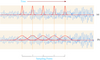
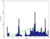
 | 6.10 Some frequency components in human motion. Several bands are dominated by signals which do not relate to intentional control activity (with respect to the system). SVG | EPS |
 | 6.11
Controlled and uncontrolled agents and a computed Gaussian fit, for
a single dimensional tracking task using mouse motion and a Brownian noise disturbance.
Top-left shows the histogram (blue) and Gaussian fit (green) of an agent (the one
the user is trying to select) without applying the control inputs. The effect of applying
the control inputs to the agent is shown to the right, where the variance is markedly
reduced. The lower pair of figures show the same process for another agent present
during the selection task. Exactly the same control inputs were applied to this agent;
however since the disturbances are independent there is relatively little change in the
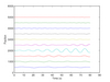
distribution of offset.
ZIP (4 zipped EPS files) |
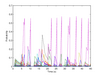
 | 6.12
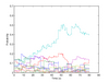
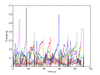
Probability and entropy time series for a selection task. The top panel
shows the probability of each agent, and the entropy (óni
=0pi log pi) is
shown below in blue. The gradually changing likelihoods of the hypotheses
are visible. Selection events are indicated by the rapid increases
in entropy (the vertical jumps in the lower diagram).
EPS |
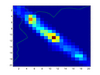 | 6.13
Simple computation of the mutual information between a onedimensional
display (position on screen) and control variable (mouse input) during a
tracking task using simple histograms. The joint probability p(x,y) is shown as colour
level. The marginals p(x) and p(y) are shown in green. The mutual information is
ÓxÓy
p(x,y)
p(x)p(y) . The left figure uses shows a controlled agent; the right shows a second
agent which was not being controlled. The mutual information between the disturbance
and sensed signals in the controlled case is 2.17 bits, while it is 1.11 bits in the
uncontrolled case (although the bit measure is strongly dependent on the estimation
procedure). This technique becomes less effective in higher dimensions (longer time
windows, or high-DOF inputs).
EPS 1 EPS 2 |
 | 6.14
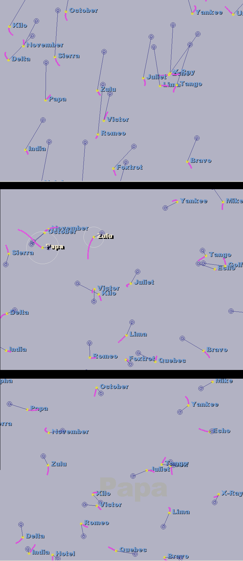
A sequence of images from Brownian motion selection example, from
the initial state, through partial selection, to the completion of the selection
process. Here, there are a number of objects (labelled with names
from the phonetic alphabet) with smooth random disturbances. Correlating
the mouse motion with the object motion results in selection.
PNG |
 | 6.15
Probability and entropy time series for the Brownian motion selection
example. The probability of each agent is shown, with the overall entropy shown below
in blue. The lower figure shows a close up of the time series, where the continuous
change of probabilities is visible. Green ’*’ symbols mark succesful selection events.
The sharp drops in entropy happen when selection has occured and the state is reset.
Each selection was separated by approximately 0.5–1 second; the visible onset of the
increase in probability occurs about half a second after selection behaviour begins.
SXD EPS |
 | 6.16
Probability time series for the 100 agent Brownian motion selection
example. The lower figure shows a close up of the time series. Green ’*’ symbols mark
succesful selection events.
SXD EPS |
 | 6.17
Probability time series for the 1000 agent Brownian motion selection
example. The lower figure shows a close up of the time series, highlighting one single
selection where many hypotheses become likely before fading away as new evidence
arrives. Green ’*’ symbols mark succesful selection events.
SXD EPS |
 | 6.18
Time series from the “saccadic” disturbance function, for one dimension
in orientation space. The function features plateaux with smooth, rapid
transitions between the levels
EPS |
 | 6.19
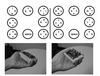
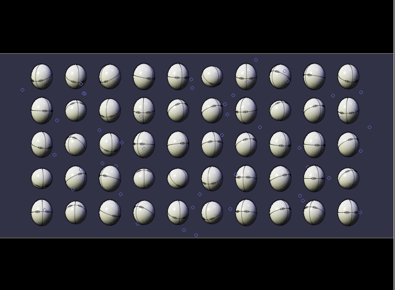
Here, there are again a number of objects (the “eggheads”), with relatively
rapid but infrequent perturbations to their state. The orientation
offset of all heads can be controlled with the input device. Maintaining
a head in the “looking straightforward” position causes selection.
PNG |
 | 6.20
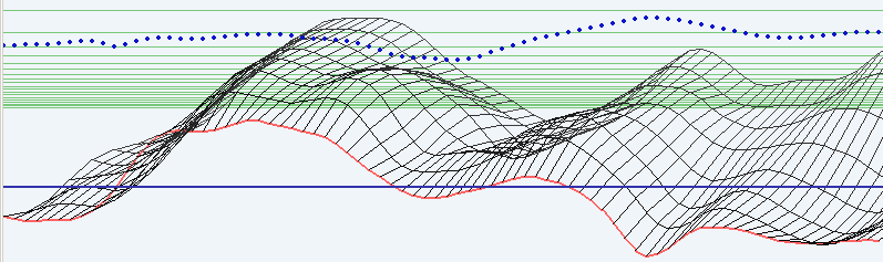
Probability time series for the “eggheads” orientation selection example.
The probability of each agent is shown. The lower figure shows a close up of the time
series, where the continuous change of probabilities is visible. Green ’*’ symbols mark
succesful selection events.
SXD | EPS |
 | 6.21
Probability time series for the “eggheads” orientation selection example.
with 200 objects. The lower figure shows a close up of the time series. Green ’*’ symbols
mark succesful selection events.
SXD | EPS |
 | 6.21
Probability time series for the “eggheads” orientation selection example.
with 200 objects. The lower figure shows a close up of the time series. Green ’*’ symbols
mark succesful selection events.
SXD | EPS |
 | 6.22
Probability time series for the “eggheads” orientation selection example.
with 200 objects using a joystick for input . The lower figure shows a close up of the time
series. Green ’*’ symbols mark succesful selection events.
EPS |
 | 6.23
An image of the continuous selection interface. The red line shows the
current state of the agent function. The black gridded surface extending
backwards is a prediction of the future state of the selection line.
Vertical mouse movement moves the entire surface up and down. Stabilising
one part of the display increases the likelihood of interest in that
neighbourhood; this is displayed via the circles visible at the top of the
image, which represent the log likelihood at each sample point.
PNG |
 | 6.24
Perlin noise examples, showing the flexibility of the function. Left to
right, top to bottom: 2 octave function with low persistance; 2 octave with high persistance;
4 octave, low persistance; 4 octave high persistance; 6 octave low persistance; 6
octave high persistance; 4 octave, medium persistance with an “octave” size of 1.6 instead
of 2 (i.e. with dense frequency bands); 4 octave, medium persistance, octave size
of 3.9 (widely spaced frequency bands).
ZIP (6 zipped EPS figures) |
 | 6.25
Probability time series for the continuous selection mechanism with a
long length-scale. The rising ridge near the centre indicates the increasing
probability of interest in that region. In this example, the interactor
is attempting to select a region near x = 40. Probabilities are smooth in
both space and time.
EPS |
 | 6.26
Probability time series for the continuous selection mechanism with a
short length-scale. Here, the interactor is selecting a region near x = 50.
The localisation is tighter than that of Figure VI.25.
EPS |
 | 6.27
A physical resonant system. Weights are suspended from a bar by cord
of varying length. It is easy to excite modes of the system such that one
weight vigorously oscillates while the others stay relatively steady.
PNG |
 | 6.28
A resonant interface setup for selection. Input signals are passed
through a bank of high-Q bandpass filters whose centre frequency drifts
randomly, at a rate determined by their current energy. This type of interface
exhibits time-varying dependence on feedback.
SVG | EPS |
 | 6.29
Probability time series from the one-dimensional resonant interface,
where the fourth agent (light blue) is being selected. In this case selection
would have been declared around t = 30, however the process
was allowed to continue for the purposes of illustration.
EPS |
 | 6.30
Position time series from the example one-dimensional resonant interface
during the selection of the fourth agent from ten (light blue). The
sinusoidal resonance of the agents is apparent.
EPS |
 | 6.31
Probability time series for the footpedal selection example. As in the
Brownian motion time series, each sharp drop indicates a selection
event. Bit-rates of approximately 0.35 bits per second. are obtained.
EPS |
 | 6.31
footpedals used in this example. From CH Products.
PNG |
 | 6.32
Some example two dimensional salience maps, for a three class synthetic
data example. Each class is drawn from a Gaussian distribution (with different
covariance). Data points are shown as ’+’, ’*’, ’.’ symbols, one for each class; contours
give the salience density. Labelled data is used for illustrative purposes; it is not a requirement.
ZIP (3 zipped EPS files) |
 | 6.33
Proxy agents and intention agents in exploration. The intention agents
identify aspects of the data the user is interested in; this is used to
weight the combination of salience maps into a single map, which the
proxy agents explore and visualise/sonify.
SVG | EPS |
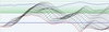
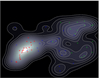
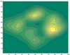 | 6.34 Markov Chain Monte Carlo exploration example. This is a 2-
dimensional example for ease of display. (a) shows data points in a space, with a Parzen
window kernel density estimate overlaid as contours. (b) shows a (Gaussian) density
around the isocontour p = 0.2 of the density in (a). (c) shows the MCMC process (with
Cauchy proposal density) where the estimated goal is the density shown in (b), overlaid
on the original data. The process walks the boundaries of the data density. (d) shows the
MCMC process with increased proposal width (this would correspond to higher goal
entropy). (e) shows the MCMC process relaxing back to a exploration of the data point
density
ZIP (5 zipped eps files) |