
Text
The term font is used to describe the style or shape of the characters that are used in printed texts. Here are some examples of popular fonts:
Here is an Applet that shows a number of different fonts, point sizes and styles. The code for this program and the design of the Applet are discussed later on in this course.
More details are available on http://www.microsoft.com/opentype/free.htm and http://fonts.apple.com. The fact that two of the world's major computer firms devote so much attention to typography is an indication of how important this subject really is. It is also important to understand that the fonts available to a programmer will vary from device to device. Typically, platforms access to a number of default fonts. Others can be bought and installed as required.
As fonts vary between machines and AWT is supposed to be platform independent, the font class only provides access to a restricted subset of default fonts. These default fonts form part of the font class and they are listed below. Because fonts differ between platforms, the following table also names the corresponding typefaces that are used to present the fonts provided by AWT. So for instance, if a Java program called for a Dialog font and it was run on a Macintosh then the Geneva typeface would be presented to the user:
| Java | Windows | X (UNIX) | Macintosh |
| Dialog | MS SansSerif | b&h-lucida | Geneva |
| DialogInput | MS SansSerif | b&h-lucidatypewriter | Geneva |
| Courier | Courier New | adobe-courier | Courier |
| Helvetica | Arial | adobe-helvetica | Helvetica |
| TimesRoman | New Times Roman | adobe-times | Times Roman |
| Symbol | WingDings | itc-zapfdingbats | Symbol |
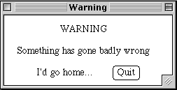
Here is an ammended method from the previous example that sets the font to "Geneva" before printing the warning into the frame.
/*
* Simple warning program
* Author: Chris Johnson (johnson@dcs.gla.ac.uk)
* Last revision date: 5/1/2000
* Produces a simple warning on the screen.   Illustrates the
* use of a frame and of a simple event handler in AWT 1.1
*/

import java.awt.*;
import java.awt.event.*;

public class CloseableSimpleWarning extends Frame
{

static private final int frame_height = 150;
static private final int frame_width = 250;

    void writeWarning(String message) {
           Font g = new Font ("Geneva", Font.PLAIN, 14); /* access new font */
           setFont(g);                                   /* apply it to current frame */
	   add (new Label(message));
    }

       public CloseableSimpleWarning()
       {
		addWindowListener(new
			WindowAdapter()
			{
				public void windowClosing(WindowEvent e)
					{System.exit(0);}
			}
		);

		setBackground(Color.red);
		setForeground(Color.black);
		setTitle("Warning");
		setSize(frame_width, frame_height);
		writeWarning("Help");

	}


        public static void main(String [] args)
        {
                CloseableSimpleWarning f = new CloseableSimpleWarning();

                f.show();
        }
}
Font.PLAIN refered to a style constant. For each of the pre-defined fonts these include Font.PLAIN, Font.BOLD, Font.Italic and Font.BOLD + Font.Italic. The last of these is bold and italic combined.
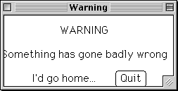
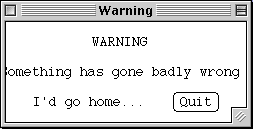
The 14 in the previous example, referred to the point size of the font. This determines the size of each of the characters being used. One point is a seventy-second of an inch. This is critically important if text is to fit the space that has been provided for it in an interface. If we look at the output from a program with a TimesRoman font on a Macintosh, we can see that all is well. However, if we look at the output for Geneva or Courier, we can see that the surrounding frame must be resized if the text is to fit the window. This is because the size taken up by a word is partly determined by the point size but also by the shape of each of the characters in the font. For example, Courier is a fixed-pitch font. This means that each of its characters has the same width. In contrast, TimesRoman is a variable pitch font where characters such as `m' take up more space than `i'. For this reason, it is important to correctly position text on the screen. The FontMetrics class in AWT, therefore, provides methods for finding out the width of characters so that Frames and windows can be re-sized appropriately. Further information about the FontMetrics class is presented here.
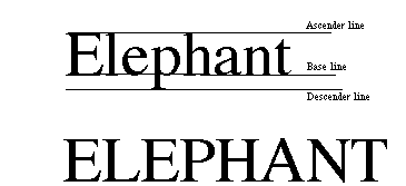
The shape of the word, as it appears in a particular font is also important. Look at the shape of these words. The distance between the ascender, base and descender lines has an important impact upon the shape of the word as a whole. When UPPER CASE IS USED FOR PROLONGED PASSAGES, THE SHAPE OF THE WORDS MAY BECOME HIDDEN THROUGH THE CONTINUED USE OF ASCENDING SPACE AND THE COMPLETE ABSENCE OF DESCENDING GLYPHS. Underlining a word has a similar effect - the line may hide the descending glyphs that are important for extracting the shape of a word. One the other hand, it is possible to use upper case sparingly and underlining SPARINGLY to emphasise key terms and concepts. The human perceptual system cues-in on changes (in shape, size, colour etc) rather than absolute values. We get use to the repeated presentation of upper case text but our attention will be drawn to individual words and phrases that make use of it. This explains why many programming textbooks argue that identifiers should be written in a mixed case, for example using LeadingCapitals. This provides important ascending glyphs that help programmers to recognise the characteristic shapes of frequently used identifiers.
The previous discussion reinforces the underlying theme of this course, AWT and Java provide programmers with many different tools for altering font size and shape. Learning how to implement these changes is trivial in comparison to understand WHY you might want to use a font or a case in a particular situation.
Up to this point, we have mainly been concerned with text output. As you would expect, AWT also provides extensive support for text input through the TextAreas and TextFields classes. However, a word of warning, these facilties rely heavily on the machine specific features of the native architectures. In the Java jargon, they are "heavyweight components" and rely heavily on peer facilities. In practice, this makes them difficult to extend without getting into the low level, machine dependent, programming of the peers. TextArea and TextField are subclassed of TextComponent. This superclass supplies getText(), setText(), setEditable(), selectAll(),getSelectedText(), isEditable(), getSelectionStart(), getSelectionEnd() methods. A select() method can also be used to select text between a beginning and an end position.
Finally, TextComponent provides a select() method that lets you select text between beginning and end positions that you specify. Here is a brief example using TextField of the TextComponent class:
The code to implement this (rather boring) applet is as follows:
/*
* Author: C.W. Johnson
* Date: 11/10/98
* Simple text field applet
*/
import java.awt.*;
import java.applet.Applet;

public class TextDemo extends Applet {
    TextField textField;


    public void init() {
        textField = new TextField(20);
        add(textField);
    }
}
Here is a similar example using the TextArea component.
The code for this applet is available here.
These two classes can be put together to form a more interesting applet that copies the text from a TextField to a TextArea. Type into the top of the following two boxes and then hit return. Also, try to edit the text that should appear in the TextArea below the TextField where you have just been typing.
The code for this is slightly more complicated and can be found here (V1.0 code for comparison). one of the reasons for the additional complexity is that a layout manager has to be used to set the TextField correctly above the TextArea. The design of a good layout for a form based user interface is a common problem in human computer interaction and so it is worth looking at these next.
Labels
We used a label in the SimpleWarning example but it is worth recapping the main elements of this class. The Label class provides a means of presenting the user with unselectable text. Labels can be aligned to either Label.RIGHT, Label.CENTER or Label.LEFT. By default, they are left aligned. You can specify the colour and font of the text used. The following Applet illustrates the use of this class. The code that implements this program shows the relative simplicity of this class. It requires no changes to run in either 1.0 or 1.1.