
Drawing
The AWT Graphics class helps programmers to paint and fill shapes. It can also be used to draw strings and images as well as manipulate graphical regions. we have already used graphical components several times. For instance, the simple HelloWorld application contained the following:
public void paint (Graphics g){
	g.drawstring("Hello World", 80, 120);
}
Notice the way that this program overload the paint() method - this is by far the easiest means of altering the appearance of a graphical object.
This is, typically, called as a result of AWT issuing update() requests on a partcular component.
The image of a Component may also be painted when it first appears on screen or when it is uncovered by another window.
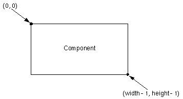
Graphical images are created with respect to a coordinate system in AWT. Each Component has its own integer coordinate system, ranging from (0, 0) to (width - 1, height - 1). Each unit represents one pixel. This is illustrated by the following diagram from Mary Campione and Kathy Walrath, Java Tutorial.
Within these coordinates it is possible to draw a range of objects using the AWT package. These are implemented by the following methods:
Here are sections of the code that draw various filled and an unfilled rectangles:
	rectangle = new Canvas(); // first create a canvas to draw into

	rectangle.drawRoundRect(new_x, new_y, width, height, 30, 30);

	rectangle.draw3DRect(new_x, new_y, width-1, height-1, true); // true here if raised
        rectangle.fill3DRect(new_x+3, new_y+3, width-7, height-7, false);
In the first case, a rectangle is drawn at coordinates (new_x, new_y) and with the width and height specified elsewhere in the code.
The final two parameters to the call refer to the number of pixels in the width and height of the arc at the four corners of the rectangle.
The second line of code illustrates how a raised three dimensional rectangle can be used to frame another (unraised) three dimensional rectangle that is created by the final line.
Finally, it is important to note that the rectangles drawn here are very different from the AWT Rectangle class.
This is intended to represent areas and regions of the screen and is quite different from the graphical images that we have drawn.
A lot more could be said under this section. For instance, there are various methods for setting the color of graphical objects. These are illustrated by the Color Palette applet at the end of this part of the course. Similarly, more could be said about the use of the graphics class to support animation techniques. This is the subject of a course in its own right. For more information about this then check out the latest version of Mary Campione and Kathy Walrath's Java Tutorial at java.sun.com.
Scrollbars
Scrollbars are sliders that can be used to maniuplate a value. One particular instance of this is when a scrollbar is used to change the X or Y coordinates of users view on an image or canvas. This form of scrollbar is associated with scrollpanes in AWT 1.1. This provides additional support that was not available in AWT 1.0 and it greatly simplifies coding.
In AWT 1.1, a scrollbar can be declared an initialised as follows. The second line initialises the pane to contain a child component which could be a canvas:
	scrollPane sp2 = new ScrollPane(ScrollPane.SCROLLBARS_ALWAYS);
        sp1.add(aComponent);
The SCROLLBARS_ALWAYS parameter can only be used when you create the pane.
It enables programmers to specify whether the scroll bars appear even when the image or other content can easily fit in the associated screen space.
Other alternatives are SCROLLBARS_AS_NEEDED and SCROLLBARS_NEVER.
You might use SCROLLBARS_NEVER if you don't want the user to directly control what part of the child component is shown.
Here is the complete listing for a scrolling applet to hold an image.
You may also need more fine grained access to scroll bars. You can do this by accessing the more "primitive" scroll bar classes that were originally released in earlier versions of AWT. A scrollbar can be declared an initialised as follows:
Scrollbar redScroll = new Scrollbar(Scrollbar.VERTICAL, 0, 128, 0, 128);
as can be seen, each scrollbar has a number of associated parameters:
public void paint(Graphics g) {
        g.translate(-tx, -ty);
        g.drawImage(image, 0, 0, getBackground(), this);
}
However, for most applications the scrollable pane class provides the necessary functionality.